Intro
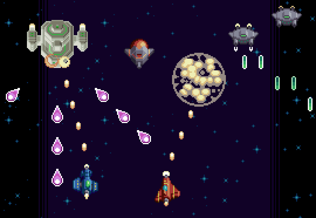
Short for ‘shoot em’ up,’ ‘shmup’ seems to be today’s most common term for this classic video game genre. When I was a kid we just called them shooters, but that term is now associated with the first person variety of shooting stuff. So what’s a shmup all about? Gameplay and visual style varies upon design, but generally I think of a shmup as game where you control a small sprite in a conventional 2D space where you must shoot up hordes of enemies while dodging a multitude of attacks. This simple concept provides a welcome entry point for inexperienced game developers, and a wellspring of potential to the creative mind; the perfect playground for kenetic game design.
As I said, shmups come in many flavors, but in this lesson I focus my designs within a consistent style in order to create a feasible well developed game concept. Drawing from my experience developing Thyrian Defenders, I present a vertical scrolling arrangement with a space themed aesthetic. However, the fundamental ideas presented here translates across a wide variety of shmups.
As I have much experience in the shmup department, this will likely span into a multi part series. For this first lesson I’m focusing on sprite design, projectiles, and some basic enemy behaviors.
Support
Before we get started, I’d like to ask for your support. If you think I do a good job and enjoy my content, please consider becoming a patron, or making a donation. Not only does your support help me continue creating content, but it also grants you access to a treasure trove of exclusive materials!
Resolution
If you are intending to create a game with your designs, it’s important to have a resolution/screen size in mind from the outset. Resolution not only effects the aesthetic, but also the gameplay. As far as visuals, the smaller the resolution the blockier the graphics will be, as the pixels will be more noticeable. Nothing wrong with that if you are a pixel lover, what’s more, it takes less time to create small assets. On the other hand, increasing resolution exponentially increases the amount of time it takes to create assets. The pixel art aesthetic is all about reading the intention within the clusters. If the resolution is so high I can’t recognize the pixels, I don’t really see the point of it being pixel art. In regards to the common 16:9 screen ratio, I think the golden range is from 320x180px to 640x360px. For this tutorial, my designs are based on a target screen size of 480x270px.
When it comes to gameplay, the size of the player’s sprite in comparison to the overall screen size is the critical factor. A small character on a large screen will accommodate fast paced gameplay and lots of elements on screen, while a character that fills a large portion of the screen will permit fewer sprites on screen, and less time to anticipate attacks due to the tight space.
Player Ships
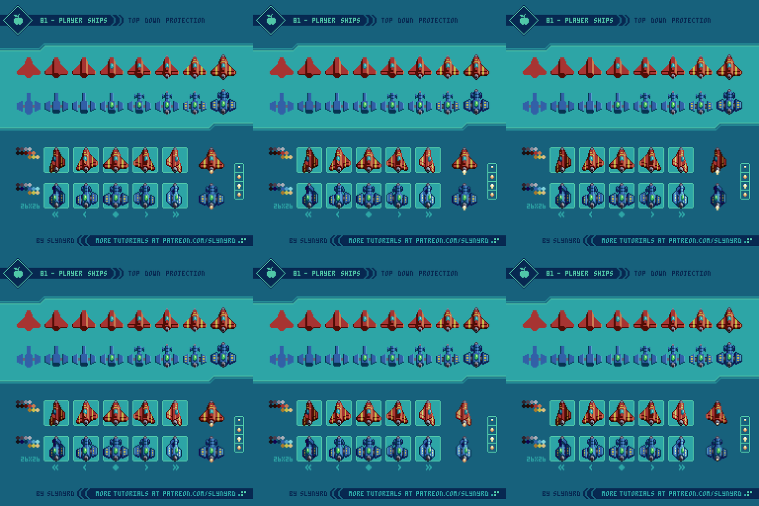
With all that considered let’s get started with the player sprite. Depending on the theme of your shmup the player might be a helicopter, a flying robot, or a witch on a broom. I’m keeping things pretty traditional and using space planes, which can operate in space or atmosphere.
As I mentioned before, the size of the player’s sprite in relation to the screen is key. If too large it will make you an easy target, but if too small it will be hard to keep track of, and may lack character. Choose what you think will best accommodate the style of gameplay you have in mind.
To bring alive the feeling of flight it’s essential to show some degree of roll when moving side to side. At minimum, one left and right frame in addition to the center frame can get the job done, but I like to have two frames for each side of increasing degree of roll. This makes the animation appear smoother, and allows two different degrees of roll determined by the speed of lateral movement, which is particularly nice if the game supports analog input.
As in my example, a directional light source coming from the side requires unique frames for each side. This gives a realistic feeling of depth, but all sprites and environments in the game must have the same lighting treatment in order to preserve the illusion.
Try to make a distinct, yet simple ship design. The more complex and detailed it is the harder it will be to animate. I like to put some kind of striping on the wings to give it more character, and it helps emphasize the depth of the roll if animated well. Also, thruster animation is a must!
Enemy Units
Now we need some things to shoot. Enemy units make up a large portion of the game design and should be crafted with care. Every unit should bring something new to the experience both in visuals and behavior.
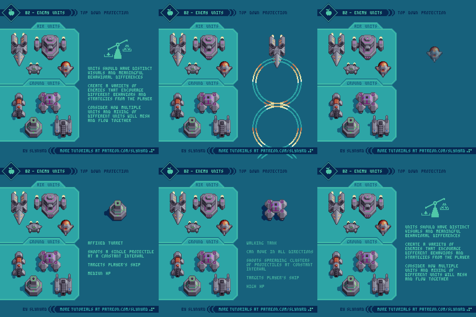
I’ve designed a batch of units that have overall visual consistency to imply they are all part of the same faction, yet they are distinguished in shape and color. These are not intended to be a complete set for a specific level, just some general types that fit the space them and could be plugged in anywhere. If I have a specific environment concept, I would introduce unique units that better fit the theme of the specific stage. In the end, I would also like to have greater variation in size by including several larger units and an occasional miniboss. Furthermore, I consider these as familiar types that can be used throughout the game, which could evolve with subtle iterations to keep things fresh. Such designs make for a good starting point, allowing you to quickly scrap together a variety of sequences and groupings to get a feel for the action.
In terms of behavior, each unit should bring new meaning to the experience by encouraging different strategies from the player. The following are several characteristics to consider with unit design.
Speed - The speed at which the unit itself moves and the speed of its projectiles, if it has them. Fast moving units are often counter balanced with lower HP and meek projectiles, while slow units typically have high HP and greater firepower.
Hit Points - Higher HP enemies are usually isolated instances and will need to stay on screen longer for the player to be able to destroy them, while low HP enemies can make brief appearances and often come in groups. Units that take a single shot to kill I refer to as popcorn. These rarely present much challenge, but bring a greater sense of action to the overall experience.
Size - A wide spectrum of size across the enemy roster keeps things interesting. The bigger it is the more fun it is to kill. However, small enemies are also satisfying to kill when you are greatly outnumbered. Large enemies tend to have high HP and firepower, but slow movement, while small enemies typically have low HP and fast movement.
Geometry - Perhaps the most impactful characteristic is the movement paths of the units and projectiles. Break things down into geometric concepts such as straight lines, zig-zags, loopty loops, s-shapes, spirals, and so on.
Color - Depending on specific game mechanics color can be more or less meaningful. Furthermore, certain colors might signify certain attributes. Special mechanics aside, a wide array of colors keeps things interesting. I stuck to a gray base for my generic examples, but I would probably splash more paint on them depending on how they contrast with a specific environment.
Projectiles
You can’t call it a shoot em’ up if it doesn’t involve a great many projectiles.
Reading projectiles and making precise evasive maneuvers is the heart of a shmup’s challenge. Therefore, the most important aspect of projectile design is visibility. While it can be fun to befuddle the player within chaos, the projectiles should always be readable across all backgrounds.
To keep things visually stimulating, projectiles should come in a wide variety of shapes, sizes and colors. The following are keys to creating fun and highly visible projectiles.
Color - Usually projectiles are the most vivid objects on the screen. Use bright saturated colors to set them apart from the background. Same as with enemy units, color might signify meaning depending on special mechanics. Regardless, I like to match the projectile color with the unit color.
Size - The bigger it is the easier it is to see, but the more space it takes up on screen. At a certain point large projectiles look goofy and ruin the overall aesthetic. On the other hand, super small projectiles tend to get lost in the action are less impressive. Include a wide variety of sizes for interest. Generally, the bigger it is the more damage it causes.
Shape - Unique shapes can help projectiles stand out, and provide more visual interest than simple balls.
Outlines - In order to keep projectiles readable on top of all backgrounds, outlines are almost certainly necessary. For insurance, I sometimes use a double outline made of a bright and dark color. Since I don’t intend to have swathes of white or super bright areas in the background, I often use white outlines. This also, sets them apart from all other sprites, which use dark outlines.
Flashing Effect - This not only improves visibility, but also make the projectile feel alive and dangerous. Simply alternating between two frames gets the job done. The more the frames contrast the more intense the effect. However, too much contrast can make it harder to track when it’s moving quickly. Experiment with many colors and sequences.
Rotation/Motion - Subtle expansion and contraction can be applied to any shape for a pulsing effect. Rotation can be applied to shapes like stars, squares, and oblong ovals. You can also try to make them appear to spin on the z axis for a 3D effect.
Explosions
With all this shooting things are bound to go kaboom!
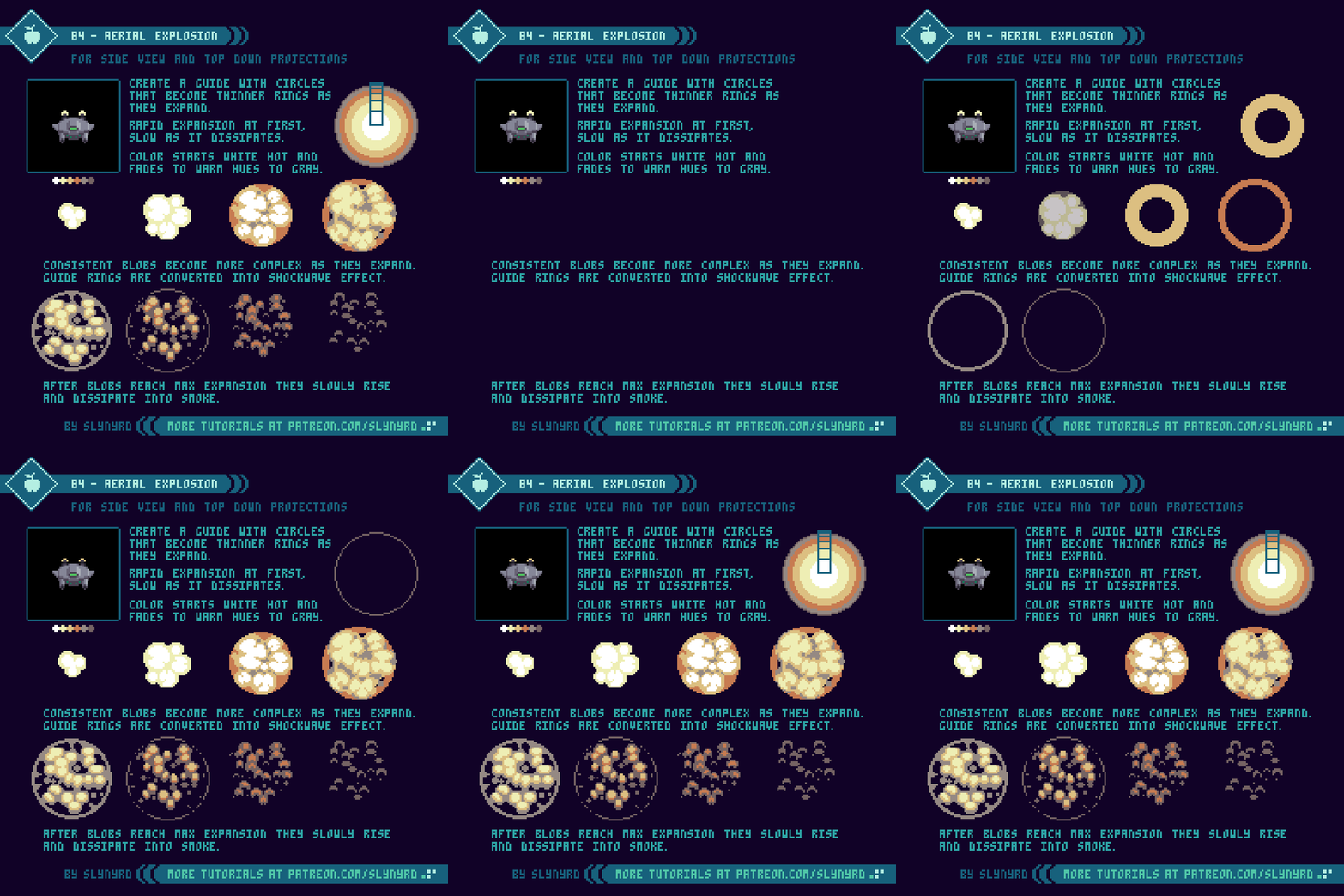
This explosion is designed for a top down projection, but can also work in the side view. Its symmetrical expansion is best suited for aerial units, but doesn’t look too shabby on the ground units either.
I like to start with circles that expand into thin rings, which allows me to easily establish the overall size and expansion rate. I also like to incorporate the dominant colors in this first step. Once I have my circle guide I convert it into organic fiery blobs. Some trial and error will be required for polished motion within the clusters, but as long as you adhere to the circle guide the overall expression will be preserved. The following are some key tips.
Start by making circles that become thinner rings as they expand.
Hot air expands quickly and slows as it cools. Therefore, the explosion expands rapidly at first, and slows significantly before it dissipates.
The color starts white hot and fades to warm hues, then to gray as it dissipates into smoke.
The blobs start as consistent shapes and become more numerous and complex with expansion, as the darker areas encroach into them.
Once the blobs reach max expansion they slowly rise and dissipate into smoke.
The rings from the guide can be converted into a shockwave effect with minor modification.
Final Thoughts
I’ve learned a great deal from developing Hyper Echelon over the past several years, and I’m excited to pass on the knowledge in the hope to inspire many more awesome shmups. The concepts described in this tutorial should provide a solid base to begin designing a shmup on, but there’s a lot more I’d love to cover. Bosses, environments, and power ups are just a few more huge aspects to the game design. I feel a sequel coming!
RESOURCES
Was this article helpful? If you find value in my content please consider becoming a Patron. Among many other rewards, Patrons can access resources to compliment my tutorials. But most importantly, you allow me to continue making new content.
Assets featured in this Pixelblog are available in Space Shooter Assets Pack
Source file used in the making of this Pixelblog is available in Tutorial 83 Source File
Get caught up on all my downloads
If you're not ready to commit to the subscription model of Patreon, make a one-time donation and receive exclusive art and resources. Help continue the content by providing me a living. Thank you!
-By Raymond Schlitter


