Intro
Continuing my exploration of 8-bit aesthetics, I present a new vision of one of the most iconic franchises on NES. Released in North America way back in 1987, Castlevania immersed me in a way that shouldn’t have been possible with such limited hardware. The castle setting, epic music, and unforgettable character designs all came together to form a unique gothic aesthetic that perfectly suited the whip slashing gameplay. Today, these games look just as good as they did back then, if even better. Castlevania is a shining example of how less can be more, how technical limitations can result in genius. Analysis of art made within the strict restrictions of old hardware provides highly valuable insight to the pixel artist. For this study, I focused mainly on Castlevania 3, which I think has the most refined graphic presentation of the 8-bit trilogy. To keep the aesthetic in line with the originals, I used the official NES palette for all graphics in this lesson, but I don’t strictly adhere to the true technical limitations. To round out the vision, I cover player sprites, enemies sprites, and tiled environments.
Vampire Hunter
Pardon the nudity, but the goal here is to provide a base model one can build their own design upon. For the creation process I referenced the actual Trevor Belmont sprite from Castlevania 3, reworked all the frames, and included some extras. After stripping down Trevor, I found the base anatomy was done quite well, but I was still able to make improvements to the positioning, and bring out my own expression within the clusters and colors.
As for my own extras, I added the ability to move while crouching, and I gave the attack a bit of flair. Instead of just one frame with the whip extended, I broke it into a smear and overshoot, respectively seen in the 3rd and 4th frames of the attack.
The crouch frame is reused for the jump animation. If you attack while jumping it uses the regular attack frames. I played around with making unique jump frames, but the repurposed crouch frame still looked better. No need to add extra frames.
Take note of how the actions fit precisely in a 16x16px tile map. The jump height is 2 tiles. When you get hit you get knocked back 2 tiles. Stair movement goes in half tile whole step increments, as it would look really odd if you could stop the player in mid step.
To make your own kick ass vampire hunter, try recreating these frames with stylings and gear of your choice. Technically, moving sprites on the NES are limited to 3 colors, plus one shared color across all sprites. Admittedly, I’m adding some extra colors here and there to add graphical interest, while cautiously maintaining a seemingly authentic retro aesthetic.
Monsters
One of the most memorable aspects of Castlevania is the diverse cast of enemy characters. All manner of undead, possessed, and blood sucking creatures make an appearance in the harrowing halls of Dracula’s castle. I took a stab at creating some fiends that would be right at home in Transylvania. When creating these sprites I made sure to use multiple references, not just the relevant game sprites.
BLOOD BAT
Of course, we have the necessary bat enemy for a vampire story. I referenced ultra slow motion video of bats in flight, and used this knowledge to revamp the standard bat enemy from the games. This also lead me to add one extra mid-wing frame for more natural flight motion, whereas the original reuses one generic mid-wing position.
POSSESSED PINCHER
The Possessed Pincher was inspired by the cat enemies in the first level of Castlevania 1. I wanted to try something a little different, and I think dobermans can look viscous. However, by using photo references, my initial design looked like a normal dog. Possessed eyes and evil colors tell you he is no longer man’s best friend.
FISHMAN
The Fishman always makes an appearance somewhere in the bowels of the castle. In order to understand all the details they were trying to depict in the 8-bit sprites, I took a look at several iterations of this creature, including concept art, and modern iterations. Considering all these designs, I made my own version based on the Castelvania 1 original. I really wanted to bring out his fishiness, so I made him green and emphasized the gills and fins.
FUNNY BONES
Lastly, I figured I must include a skeleton to round out the examples, as so many iterations have appeared throughout the series. I referenced photos of skeleton models alongside various game sprites to snap up this old clacker. At first, I was only going to make a simple two frame walk, but after iterating several poses I noticed some stances seemed to be in a taunting position ripe for laughter.
Tiles
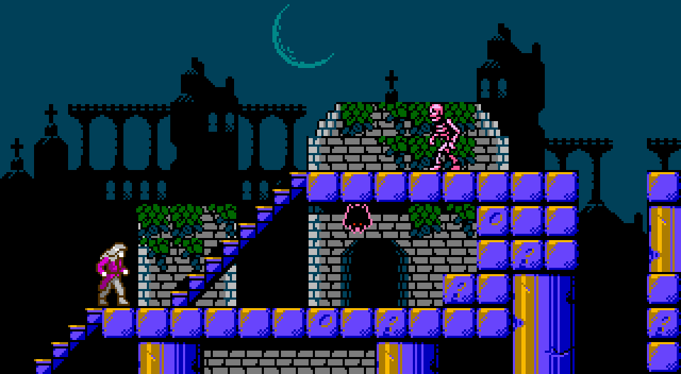
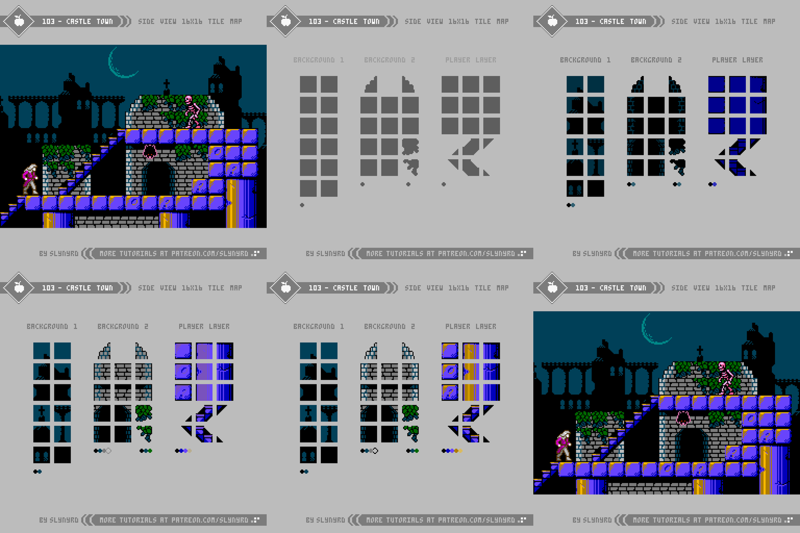
Arguably the most significant and memorable character in the entire Castlevania series is the castle setting. Including ivy covered courtyards, dank dungeons, and steam filled clock towers; every scene in the game oozes atmosphere and personality. Albeit, somewhat flat in presentation, even the 8-bit versions encapsulated all this gothic glory with simple variations of tiles. Well, it all seems simple in the end, but designing with lo spec restrictions requires a surprising amount of thought, as every pixel and color choice can effect dramatic change.
KEY POINTS
The following are some general tips for making retro inspired sprites based on actual games.
Bend the rules - Unless you’re an ardent purist, don’t worry so much about adhering exactly to the technical limitations of the past. However, if you intend to preserve the ‘look’ of your retro inspiration don’t push it too far. I’m just talking about a few extra frames or colors here and there.
Use multiple references - Use multiple references, including real world examples when applicable. If your only reference is a sprite from another game, it’s hard to imagine your own iterations.
Break down the sprite into sections - It’s good to quickly capture the overall rough form of a sprite, but as for the details, I find it helpful to focus on one section at a time. Especially larger humanoid sprites can feel overwhelming at first, but once you have a nice head, the torso comes easier, and so on.
Don’t trace over sprites - Observe and recreate in your vision on a blank canvas, otherwise it will just come out pretty much the same as the inspiration. If you’re completely lost and don’t know where to start, tracing can still be a good learning practice, but I would not recommend it if you want any originality.
Consider the display - Console games used to be designed to be displayed on CRT monitors, which gave the pixels a softer look. Due to this, some pixel clusters found in old sprites may appear harsh in hi definition. Don’t be afraid to clean things up and make what looks right to your eye on a sharp display.
Final Thoughts
The one thing I kept thinking as I made this lesson is how it looks much easier than it actually is. I first thought this 8-bit exploration would be a fun diversion from my typical style, but it’s actually quite advanced. Finding the perfect combination of colors and clustering with such limited options, it’s like solving a puzzle. After close inspection, I’m even more impressed with the quality of Castlevania’s design. In some cases, I found it difficult to make meaningful changes that feel like they actually improve upon the original. Some of the questionable cluster work found in originals was likely due to the fact these games where designed to be displayed on a CRT.
It’s a bit off brand for me to do an overt clone of a specific game, however, I’ve found it very enjoyable and insightful to study. Moving forward, I’m definitely interested in analyzing more masterworks from the past. What games would you like to see my take on?
RESOURCES
Please consider supporting my work by becoming a Patron. Among many other rewards, Patrons can access resources to compliment my tutorials. But most importantly, you allow me to continue making new content!
Alternatively, you can support me by making a one-time donation directly on my homepage, and receive exclusive art and resources.
Assets featured in this Pixelblog are available in Castlevania Study Assets Pack
Source files used in the making of this Pixelblog are available in Castlevania Study Source Files
Get caught up on all my downloads
You made it to the end of the article. Thank you for reading!
-By Raymond Schlitter


