Intro
Stoic sentinels of the field plant their roots where they stand to hold vigil between sun and earth for generations. These mighty servants of nature generously provide both shelter and sustenance to all manner of crawling, flying, and slithering forms of life. Beautiful in its breadth of greenery, for both form and goodness of provision. Wether standing among like kind in a sea of green, or a singular keeper of a field, reverence should be held for these wooden guardians. From tiny seed of life to towering giant, all miracles of nature are symbolized in this great gift from god we call tree.
As I write this in late May I’m inspired by the rebirth of green life surrounding me. Celebrating the season of photosynthesis, I present a completely tree themed Pixelblog. Particularly, this lesson focuses on top down designs using a highly efficient modular method I first explored way back in Pixelblog 2. In this update I refine and expand on the technique with a variety of leaf styles, and the introduction of the conifer tree.
Deciduous Tree
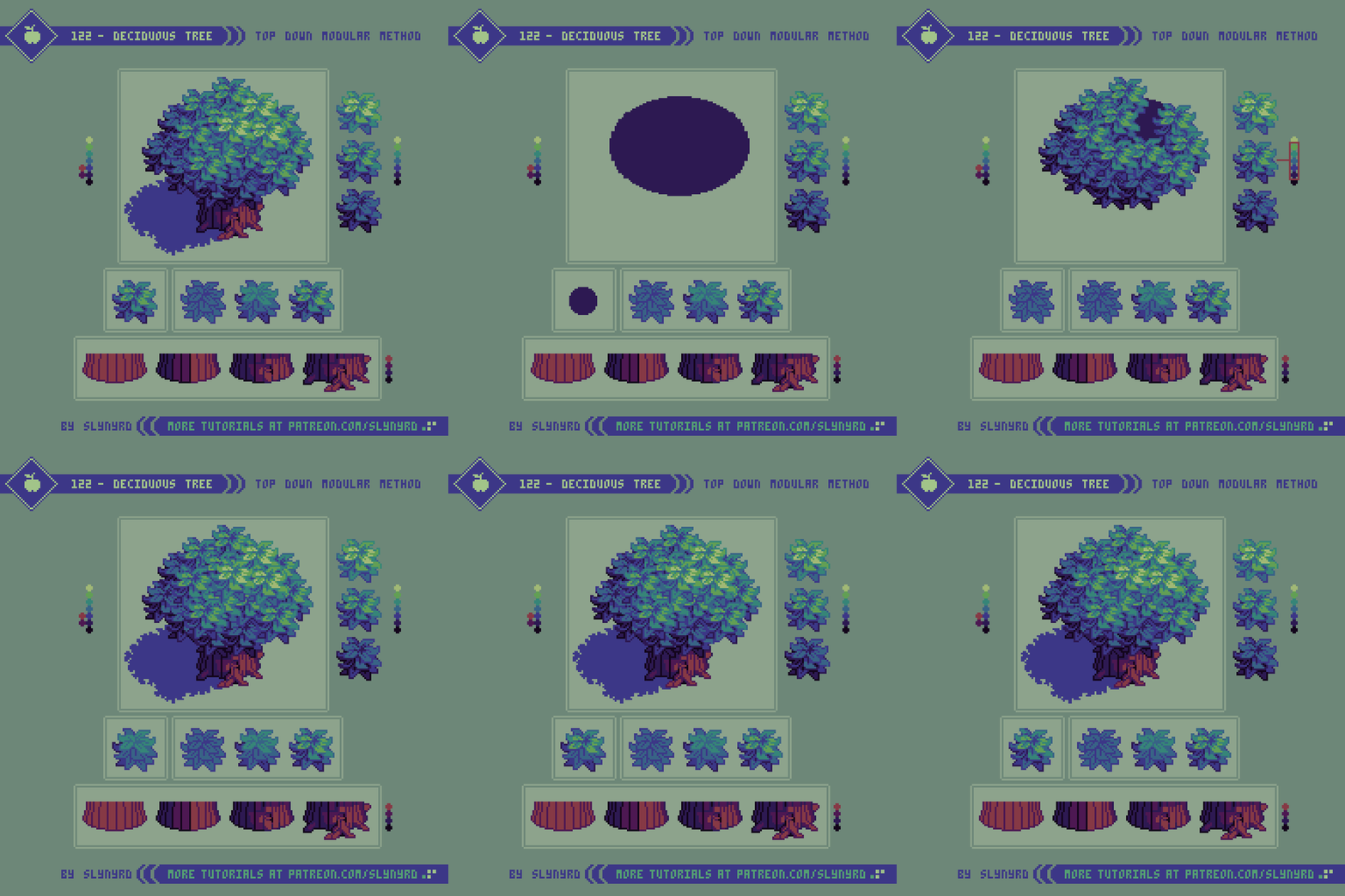
It all starts with a bundle o’ leaves.
The goal here is to create a single textural unit that comprises all the foliage. Seems easy enough, but great care should be taken with the design of this bundle of leaves. Leaf shapes should be varied but consistent in form. The best way for me to stay consistent is to base the leaves around a basic geometric shape. In the above example, the base form is a trapezoid, specifically a rhombus. Subtle modifications give a touch of waviness for a more natural feel.
The repetition of similar forms is key to maximize the clarity of the texture, while even balance among the distribution of shapes helps hide the pattern that may result from repeating the bundle. That is to say, any uniquely shaped, or sized clusters will draw the eye, making the repetition of the bundles more apparent. Clusters consistent in shape, size and spacial distribution are key to achieving a pleasing overall foliage texture when the bundles are combined. Also, avoid making the bundle itself an awkward shape. Even ball shapes work great for me.
I start by making one bundle of leaves with medium color values. Construction of the bundle can be done with a variety of leaf shapes on separate layers. This allows flexibility to move things around and reorder layers until satisfied. Once I’m happy with the design, I make one darker variant and one lighter variant by shifting all hues up or down a notch on a shared color ramp. With these 3 color variants, I can layer the bundles in a natural fashion according to an implied light source, resulting in a mass of foliage with convincing 3D shape and depth. Take care of unsightly clusters and stray pixels as a result from overlapping the bundles. Placement and layer order of the bundles requires a fair amount of experimentation to find the perfect arrangement with minimal noise. Ultimately, the core bundle is fundamental to the appearance of the final tree. If you are unable to find a pleasing arrangement, it’s likely an issue with the design of the bundle. If the bundles are well designed it should be possible to create a perfect mass of foliage with no extra touch ups needed.
After that, the final step is adding the trunk and a drop shadow. The trunk is pretty straight forward, but if you have trouble visualizing it, start with a basic cylinder and add striping for the bark. The striping should be widest in the center and narrow towards the sides of the trunk. Break up the lines here and there, add a knot or an errant root for organic details. Size and orientation of the drop shadow is determined by the light source. It’s most practical for game design to center the shadow directly under the tree, so that it doesn’t run into other assets, but I like to cast it off to one side for a more dynamic look. Any issues this causes can easily be addressed with layer ordering.
Leaf Styles
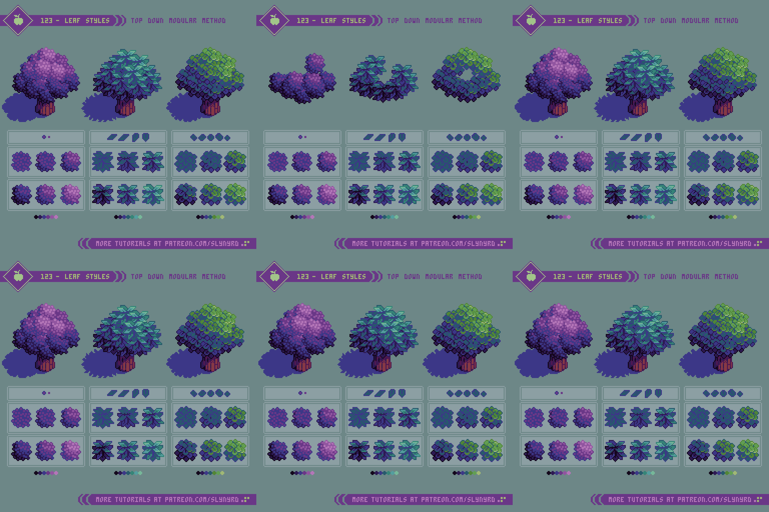
Now, let’s take the principles of the modular method and see how it holds up with different leaf styles.
The first example above utilizes a small 2x2px square as its base geometric unit. I allow the squares to touch in places but avoid overlapping, so that the square unit prevails even when new clusters are formed. Although there is little variation from this base square, the small size and simplicity of the shape prevents the texture from feeling tiresome. This texture works great to represent any vegetation with small leaves, or can appear as flowers determining on color.
The middle example is a more pure version using trapezoids like in Tutorial 123, however subtle wavy modifications are not applied here, resulting in a sharper, geometric texture. The sharp shapes clearly describe the leaf orientation and should be positioned in a natural manner, so they are pointing upwards at the top of the bundle and rotate downward towards the bottom of the bundle.
The last example above represents round shaped leaves by using circles as the base geometric unit. Orientation is slightly less critical here than with the trapezoid leafs. However, it’s a bit tricky to preserve nice circle shapes and still keep the bundle looking properly spherical. Coloring is critical to bring out the depth in all cases, but especially so when orientation is not strongly suggested from the clusters alone.
As for the coloring, I approach it in the same way I would shade a circle to look like a sphere. In all above examples, I start with making a crescent shaped selection along the bottom left of the bundle and use non contiguous paint fills one shade darker on each color. Then I make a smaller circle shaped selection on the upper right side of the bundle and fill with lighter colors. After these color fills some cleanup and hand placed highlights may be necessary to better define the leaves and reduce noise. 4 or 5 colors per bundle is plenty.
Conifer Tree
Now things are going to get a bit more prickly.
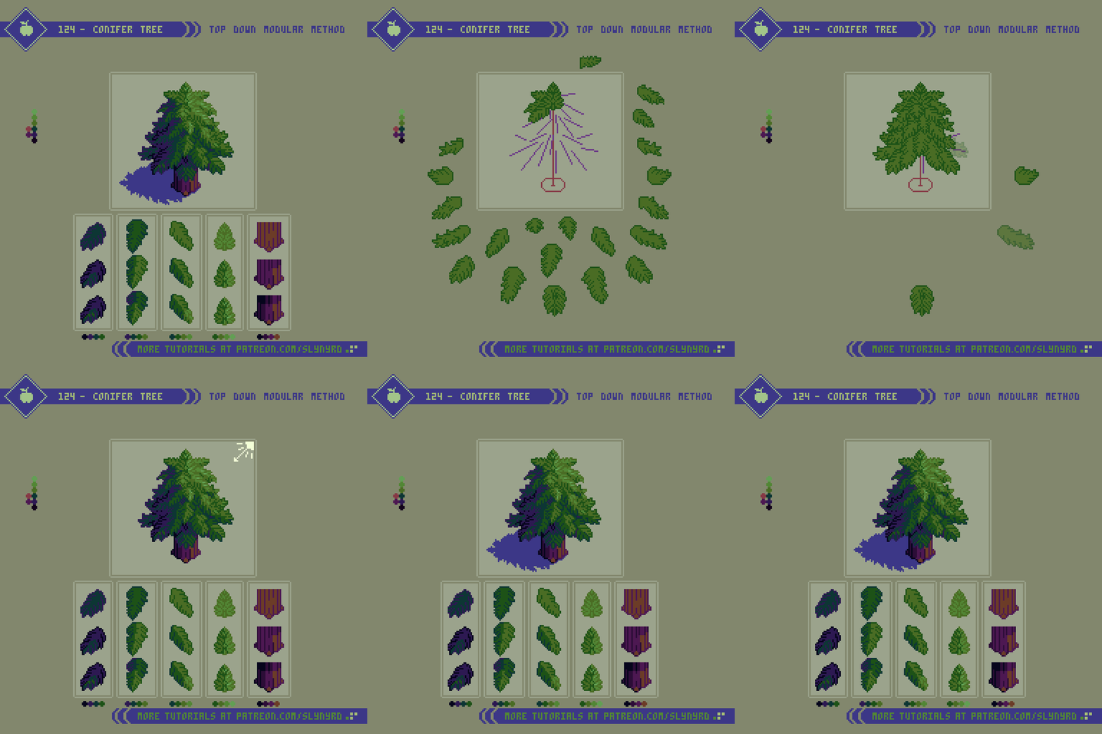
Technically, I can also call this a modular method, but it differs greatly from previous examples in that each module is unique and has specific placement. Furthermore, I cannot tout this as a shorthand for creating conifer trees, but it’s a great way to break down the subject if you have trouble visualizing the entire tree in a single layer from scratch. Personally, I’m not the best natural drawer, and it’s often easiest for me to understand a subject by breaking it down in a way that allows me to construct the image using layers. While somewhat tedious in execution, the realization of each visible branch ensures a convincing result.
Start by making a simple stick tree guide, then start making branches from top to bottom, as parts of the lower branches will be overlapped by higher branches. In my actual process of making this I started with the low branches and many of my details were covered up in the end. Work smarter not harder.
Orientation of the branches is critical to achieving a naturally shaped tree. First, make all the branches with the one fill color, and one outline color. The branches around the center are unique, but all the side branches can be reflected to fill out the opposite side at this point before shading. Once all the simple flat branches are placed, the shading can be rendered according to desired light source. Start the shading process by defining light, medium, and dark branches. The final shading details are a bit more complex than with a leaf bundle, as some branches should cast drop shadows on lower adjacent branches. Ultimately, observation and practice are the best ways to learn, so I’ll just shut up and let you look at the pictures.
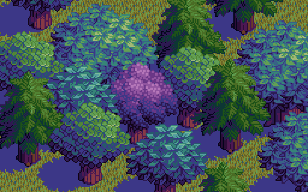
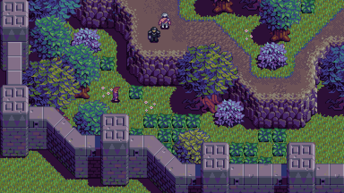
More examples of the modular method being utilized in my game project, Beast Planet.
Final Thoughts
Based on that intro, it’s clear I have a passion for trees. Part of it’s DNA, as humans have shared a beneficial relationship with trees from ancient times. However, much of my appreciation comes from growing up in a place where trees are sparse. Needless to say, it was a joy to put this blog together, but it’s not about self indulgence. We all love trees, and they are commonly featured in games and art. Furthermore, I’ve recently been designing top down trees for my game Beast Planet, and I wanted to share the evolution of the modular method, and other insights I’ve gained from practical application. While the fundamental method is much the same, compared to my first exploration in Pixelblog 2, the results looks much better this time around. This proves the importance of core pixel art skills, which I think is mostly about color choice and clustering. I hate to say it, but no matter how accessible I make my tutorials, heightened sensibility in these core skills can only be acquired through consistent practice. Maybe it’s time for a trip back to basics for a future Pixelblog.
RESOURCES
Please consider supporting my work by becoming a Patron. Among many other rewards, Patrons can download the assets featured in my tutorials. But most importantly, you allow me to continue making new content!
Alternatively, you can support me by making a one-time donation
Assets featured in this Pixelblog are available in Top Down Nature Assets Pack
Source files used in the making of this Pixelblog are available in Top Down Trees Source Files
Get caught up on all my downloads
You made it to the end of the article. Thank you for reading!
-By Raymond Schlitter
