intro
Our story starts in 1991. Out of nowhere, my two older brothers come home with the newly released Super Nintendo. When I first saw the box, my excitement dampened nearly to anger. Like any healthy 8 year old boy, I was ready to move on from the the kiddy Mario brand, to the blood and guts offered by Sega. However, I was quickly convinced they made the right decision when I discovered F-Zero, which was also brought home that day, along with U.N. Squadron, and the pack-in Super Mario World. You’d never believe it, but the console came with 2 controllers and a game. And that was expected back then. Of all that goodness, F-Zero made the biggest impression with its striking mode 7 graphics, and astounding music. Ultimately, this day would go down as one of my best gaming memories.
Jump to 1995. My friends’ interests are moving on to sports and girls, but I’m committed to this gaming stuff. I’m saving my own allowance, so I can get the new Sony Playstation on day 1. The launch would not disappoint. Toshinden was fun, but the pack-in demo disc had me in awe of the potential of the console. Of those demos, Wipeout was most impressive. Again, another anti-gravity racer pushing the envelope on the stage of new tech. When I finally got the full game, I was in ag racing heaven. The music sounded too cool to be coming out of a video game. One of the most remarkable aspects of the game was the graphic design created by the British studio Designers Republic. It was so fresh, and immersed me in the world with no need for in game narrative.
Jump to today. Looking at my occupation and interests, I realize how great the influence of these games has been on me. My love for Wipeout runs especially deep, and I have enjoyed the series over the years. Recently obsessed with the psx era titles, my inspiration has been renewed. As much as I’d love to make an ag racing game, pixel art doesn’t lend itself well to the genre. But that can’t stop me from making a pure art expression for my love of ag racing. Take a lap with me. By the end of the course you’ll have all the tools to create your own ag racing scene with parallax animation.
Hovercrafts
First things first, show me the hovercrafts. Not veering too far from my points of inspiration, these crafts may appear vaguely familiar. It’s fun to think about the manufacturer’s philosophy, performance aspects, and how they might inform the design. Keeping things basic, Delta is the all-rounder. Omni has good acceleration and handling but low top speed, while Mega is the inverse. Well, that’s how I imagine it, but love to see someone come up with more extreme designs.
I break down the main components of the craft in outline form. This can help simplify the design, and get something going fast without worrying about color palette. However, I typically have a palette in mind and jump straight to solid forms, as I find the outlines can complicate the coloring process. I feel I’m in the minority on this, so don’t let me dissuade you from outline sketching if it works for you.
For size reference of each craft, not including thrust trail.
Delta 46x25px
Omni 33x24px
Mega 59x21px
Marble Architecture
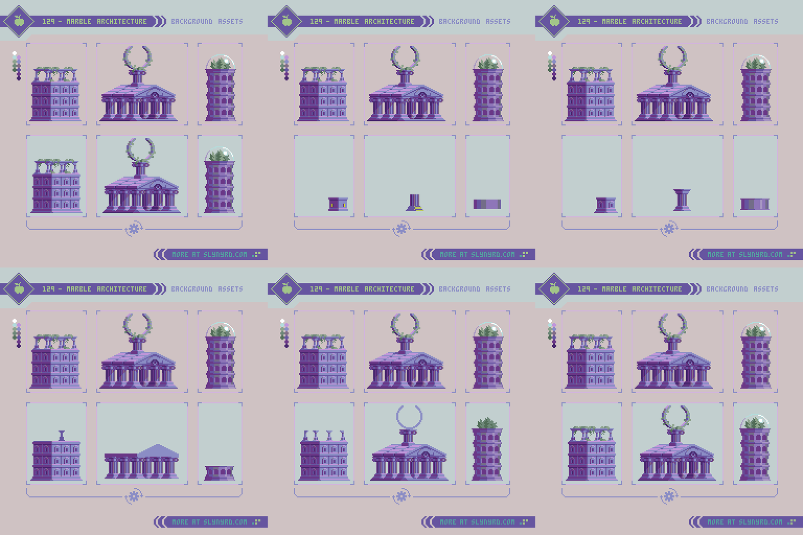
Equally important to the hovercrafts, any good ag racing fiction should be rich in world building, largely established by the race-side scenery. Some circuits feature outlandish sci-fi backdrops, while others represent a more believable vision of the future. Much like old school Wipeout, I tend to favor the latter vision with grounded elements that show a world not so distant from our own history. Furthermore, I went with the timeless aesthetic of Greek/Roman marble architecture. Combined with subtle hints of advanced technology, the style continues the spirit of olympic level competition into the future. I suppose you call this aesthetic marble punk. I love the atmosphere of this style and will definitely want to develop the vision more.
Note the building and temple are intended to be on the same plane, however the the darkest color and pink highlights are omitted from the tower to appear more distant.
Building 50x52px
Temple 75x72px
Tower 30x64px
Natural Scenery
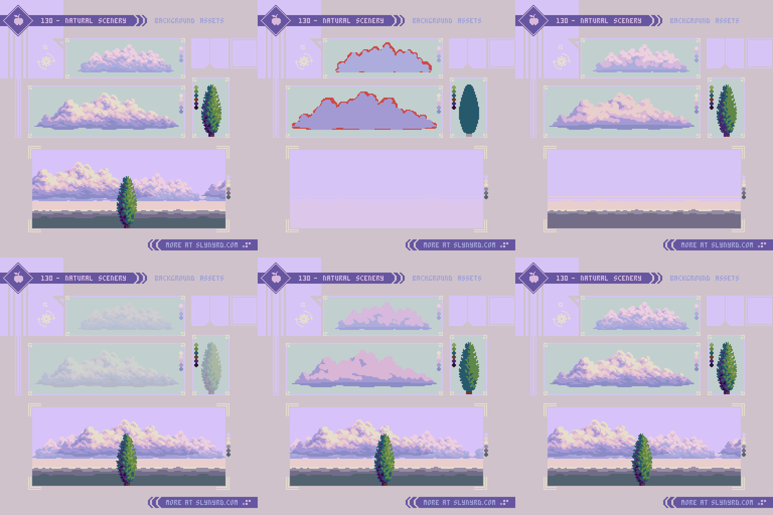
Well, we need a base environment to place things. Further driving the retro future Roman theme, I stuck with a simple natural landscape with proper italian cypress trees.
Understanding of atmospheric perspective is crucial to selecting the best colors to achieve depth in your landscapes. If you are not familiar with the concept you might want to take a detour to Pixelblog 11, for a jump start on landscape painting.
The approach for both the clouds and tree is the same. Rough shape, refine shape, shade with rough clustering, refine clusters. Admittingly, that last step is somewhat “draw the rest of the fucking owl”, but there’s no way around it. Get in there!
Small cloud 96x26px
Large cloud 144x37px
Parallax layers
With all assets complete we can create a parallax animation using my perfect loop technique detailed in Pixelblog 23. Understanding of that particular method will help make sense of the following breakdown.
In a nutshell, the parallax scrolling effect is created by making objects that appear closer to the viewer move faster, while the distant objects move slower. In order to do this, I make several layers of various length and drag them across the scene within a set number of frames. To make it loop perfectly the movement rate per frame must evenly divide with the canvas dimension along the axis of movement. Furthermore, the possible smooth movement rates are determined by the canvas. Choose dimensions wisely.
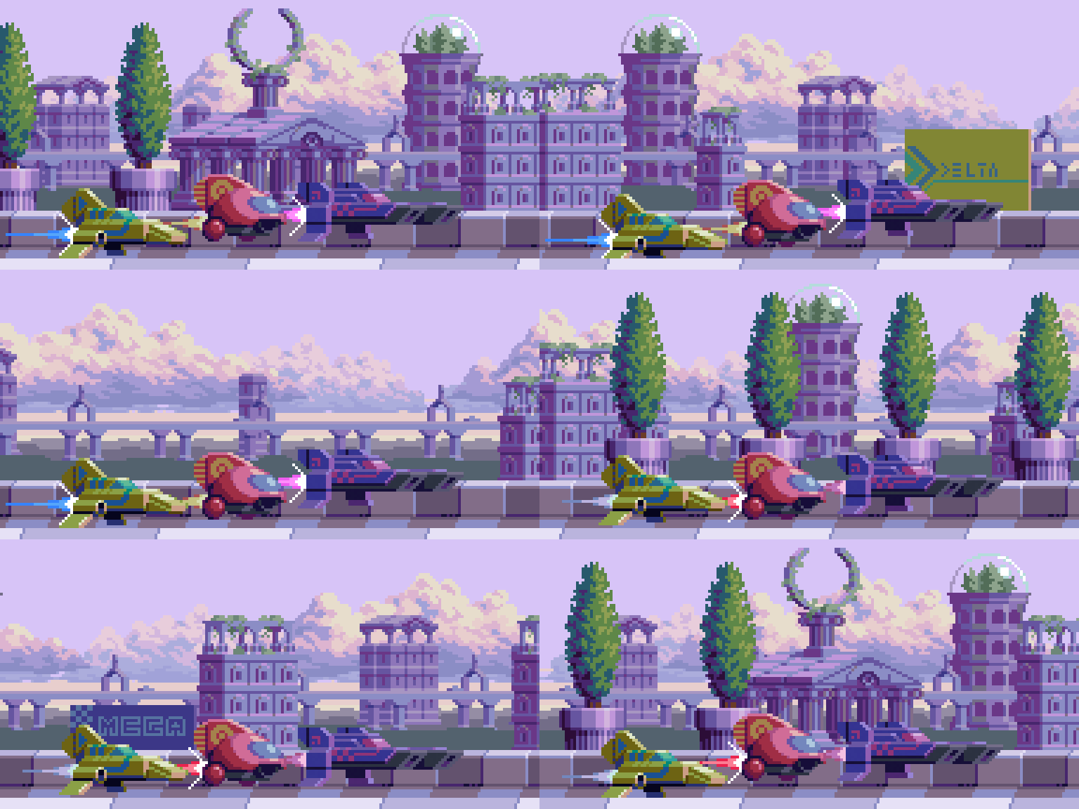
Here’s the breakdown of the above scene.
Canvas - 192x96px
Frames - 192 frames played at 0.05 per frame
Layers - 9 layers of different movement speed.
The following layers are listed from nearest/fastest to most distant/slowest.
1. racetrack foreground - 32 (pixels moved per frame)
2. racetrack - 24
3. Trees - 16
4. ground + buildings - 6
5. highway - 4
6. ground + buildings - 3
7. ground - 2
8. clouds - 1
9. clouds - 0.5 (moves 1px every 2 frames)
Final Thoughts
You’ve reached the finish line. I hope you enjoyed that as much as I did. While this installment doesn’t introduce any concepts I haven’t touched on before, the amalgamation expands on the possibilities with a showcase of earnest art.
As much as I enjoy designing pixel art in the context of practical game application, nothing is quite as satisfying as making unfettered pure art. But I still can’t help fantasying about the possibility of games. I’m not really into the manager genre, but ag racing would be the best theme to adapt, just for all the rad graphic design potential. No matter, useful assets in here for all types of applications.
While pixel art is often thought of as a medium restricted to low budget video games, it has the power to transcend to the sublime just as well as any respected medium. Nearing a decade of pixel art experience, it’s been exciting to see the evolution of the medium and rise in popularity. Now, more than ever, I’m inspired by what I’m seeing in the pixel art community. I can only hope to contribute to the momentum.
RESOURCES
Please consider supporting my work by becoming a Patron. Among many other rewards, Patrons can access resources to compliment my tutorials. But most importantly, you allow me to continue making new content!
Alternatively, you can support me by making a one-time donation
Assets featured in this Pixelblog are available in Anti-Gravity Racers Assets Pack
Source files used in the making of this Pixelblog are available in Anti-Gravity Racers Source Files
Get caught up on all my downloads
You made it to the end of the article. Thank you for reading!
-By Raymond Schlitter


