Intro
Texture can add a whole new level of richness, movement, and overall immersion to your work. However, creating texture with pixel art can be tricky, and If not treated with care, texture details will only add unnecessary noise. As a beginner, I was uncomfortable with texture and tried to stick to flat color fields as much as possible. Over time, I discovered simple principles that make it easy to approach all kinds of textures. So come along and let me ease your fears of texture.
Texturing Principles
Simplify - Break down the details into simple abstract shapes. Don't try to depict the fine details of every leaf and blade of grass. If you have the resolution to do so, you're probably not making pixel art.
Repetition - A good texture may only need a few simple clusters. Repeat these same clusters over and over but vary the pattern in which they are distributed.
Balance - The texture should feel balanced. A little detail here usually means you need a little detail there. It's all a balancing act.
Contrast - It looks more interesting to vary a texture, rather than have the same consistency across a large area. This can be achieved by placing texture details in select areas and leaving empty areas where the texture is implied. Or, you can achieve textural contrast with color variation. A perfectly homogenous texture can appear unnatural and too busy.
Avoid orphan pixels - Orphan pixels are single pixel units not connected to a cluster of the same color. They can distract the eye and are usually avoided. However, I permit them when they're not obviously floating alone and relate to a greater texture, in which case I don't consider them true orphans.
Here is a simple tutorial on making a grass texture, which illustrates all of these principles.
Wanna make tutorials like this? You'll need a tiny pixel font. Download this one here
Examples
These same principles can be applied to all kinds of textures. Let's look at some examples of textures I often use in my work.
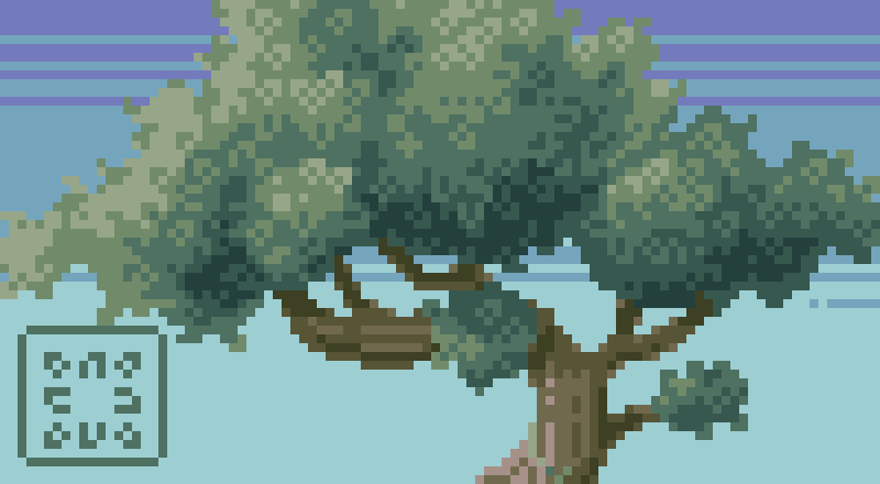
Free-Form Foliage - First, create a basic shape of the tree canopy by slapping down circles of various diameters with the pencil tool. Then go around the edges of the shape adding a few pixels here and there to give it a natural rough outline. Next, block out general areas of shadow and highlight. Finally, texture over the tree with repetitive leaf shape clusters like those illustrated in the lower-left corner of the above example. I call this the free-form technique.
The free-form technique is illustrated in this time-lapse video, albeit very quickly. For a more detailed view of the process, watch Pixelcast - 23.
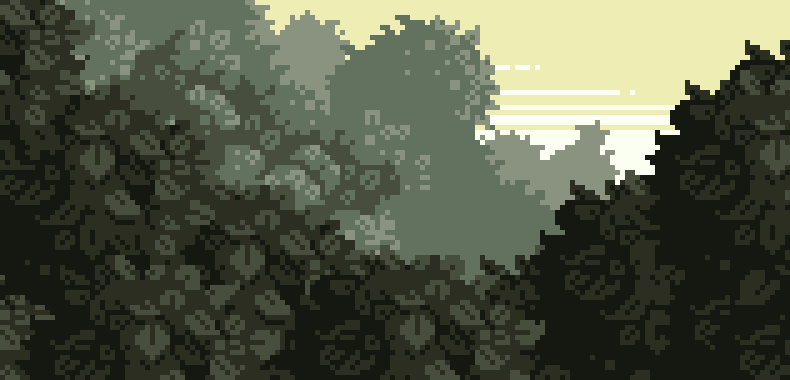
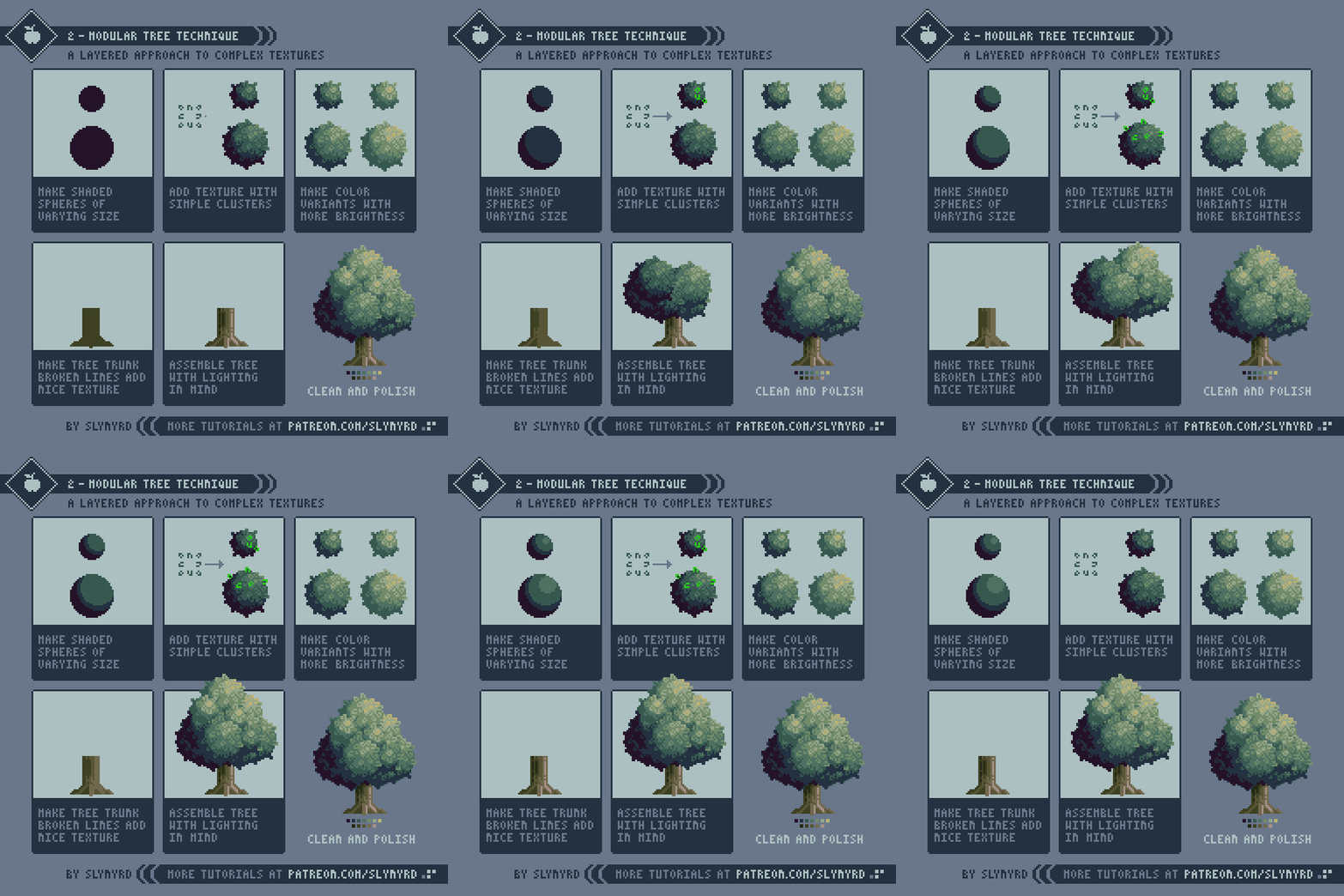
Modular Foilage - You can quickly create large areas of dense foliage using what I call the modular technique. This method only requires a few textural sprites, which you can then duplicate and layer into larger textured shapes. For example, the above image uses only one sprite repeated several times to create the foreground foliage. Now, let's look at the technique in more detail by making a simple tree.
This layered approach creates a consistent look often desirable for game assets. Better still, the sprite layers can be individually moved around to animate a wind effect. I haven't tried this technique for other textures besides foliage, but I imagine it's best suited for highly organic textures.
Wheat - This texture is made with lots of repetition and overlapping. It looks complex but it's really easy to make.
This same technique could be used for all kinds of tall grasses and crops. The main point I want to make here is that sometimes it's okay to have dense busy textures so long as you create interest using different colors or patterns.
Stars - First, create a palette of stars in various shapes and colors. Then repeat and spread them out in a tasteful manner keeping the afore mentioned principles in mind. Mix in complimentary star colors for an even deeper cosmic look. Watch me make a star pattern in Pixelcast - 21. The stars come in at 2:39.
Clouds - These are the dramatic fluffy variety I'm partial to. Start with making the basic cloud shape using a variety of diameters with the pencil tool. Then apply a highlighted texture to the clouds based on a series of overlapping arched shapes. Slipping in a subtle spiral shape here and there can really help communicate the light airy feel of the clouds. Watch me making clouds in Pixelcast - 22. The clouds start at 0:55.
Brick - Create groupings of solid blocks in recognizable brick patterns. It's important to keep the contrast rule in mind and leave some areas empty. Depicting every single brick would appear noisy and detract form the overall forms of the structure. Avoid emphasizing the outlines of the bricks, as this can look very busy. However, If you're going for a bit rougher look you can add an occasional shadow or highlight on select bricks. As you can see in the right-hand example, just a few bricks appear to be jutting out or sunken into the structure and it changes the whole nature of the texture.
Final Word
My repertoire of handy textures is always growing thanks to the foundation provided by these basic principles. I'm excited to see how other artists transfer the knowledge into creating their own textures.
RESOURCES
If you find value in my content please consider becoming a Patreon member. Among many other rewards, Pixel Insider members get extra resources to compliment my tutorials. But most importantly, you allow me to continue making new content.
Get caught up on all my downloads
If you're not ready to commit to the subscription model of Patreon, you can also make a one-time donation and receive exclusive art and downloads.
-By Raymond Schlitter


