INTRO
The ability to convey convincing perspective with simple abstractions is one of the greatest charms of pixel art. If you really analyze 2D pixel art games you will notice they don't necessarily follow real world perspective rules, yet they still capture a believable sense of depth. This can be attributed to the use of graphical projection. A graphical projection supplies a set of numerical rules to depict 3D objects onto a flat plane. Personally, I don't get caught up in the math. I rely more on my eyeballs than numerical precision. This liberal use of imagination gives me a unique style, which is largely distinguished by a few different graphical projections. For this tutorial I will explain my two most often used graphical projections by illustrating houses.
There are many different types of graphical projections but in most cases they should not be mixed in the same scene. So long as all elements in a scene follow the same set of rules the resulting uniformity will please the eyes. If you are interested in learning more about the technical side of graphical projections and the various types, I highly reccomend this comprehensive article by Matej 'Retro' Jan.
3/4 TOP-DOWN
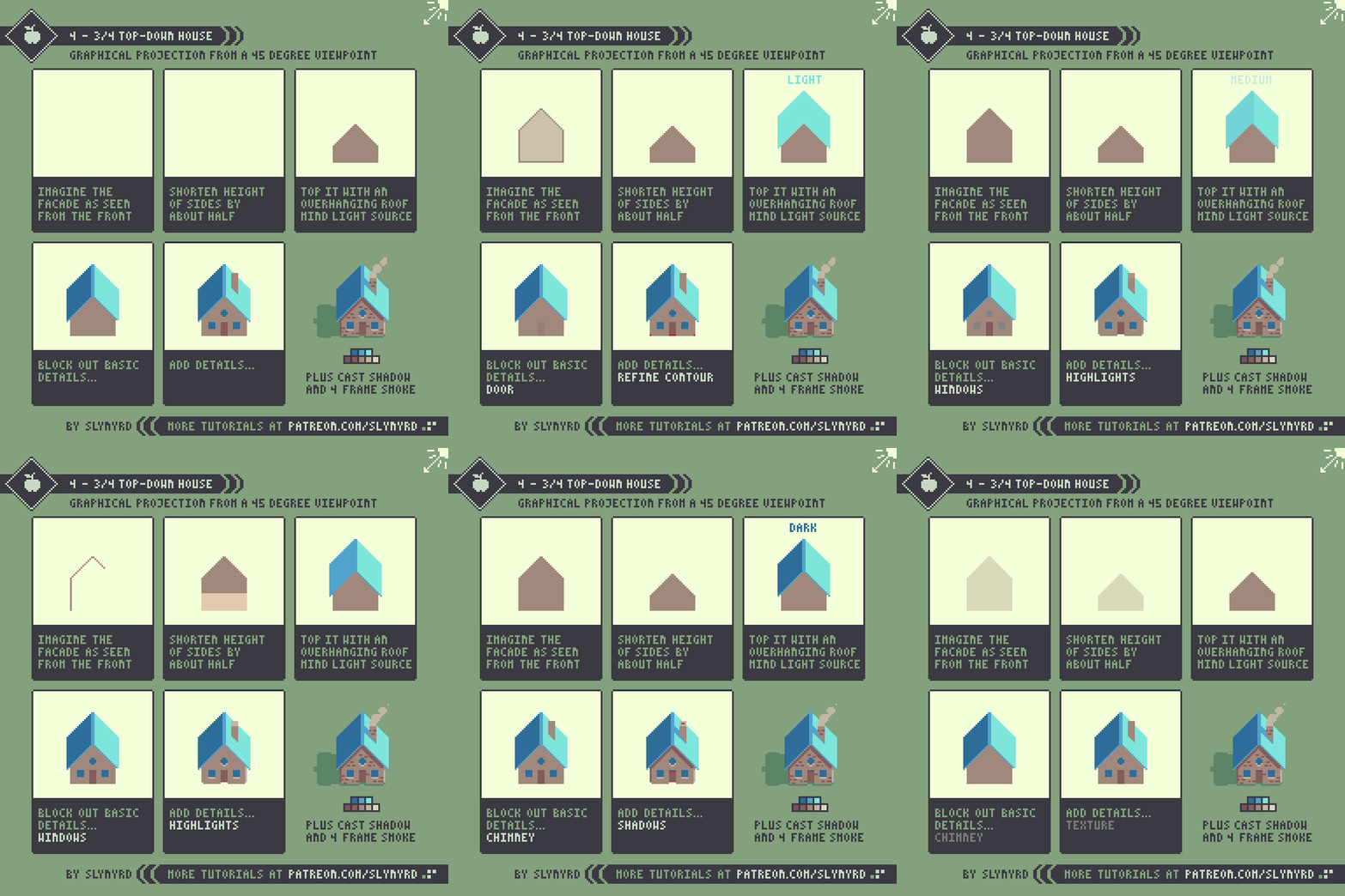
In this projection it's as if you are viewing the house from 45 degrees above. From such a vantage point you see about 3/4 of both the roof and facade. In my style the front of the house is shortened but the angles of the roof are not affected by the implied tilt and remain the same as they would appear from front on. Realistically, these angles would flatten as you ascend above the house and the walls would slightly angle outward, but I prefer the look of the clean angles. When it comes to pixel art, uniformity takes priority over realism.
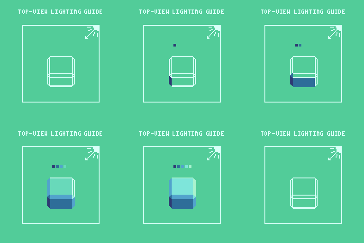
This is my common approach for lighting top down objects. The light could come from any corner but it's most natural to come from one of the top corners.
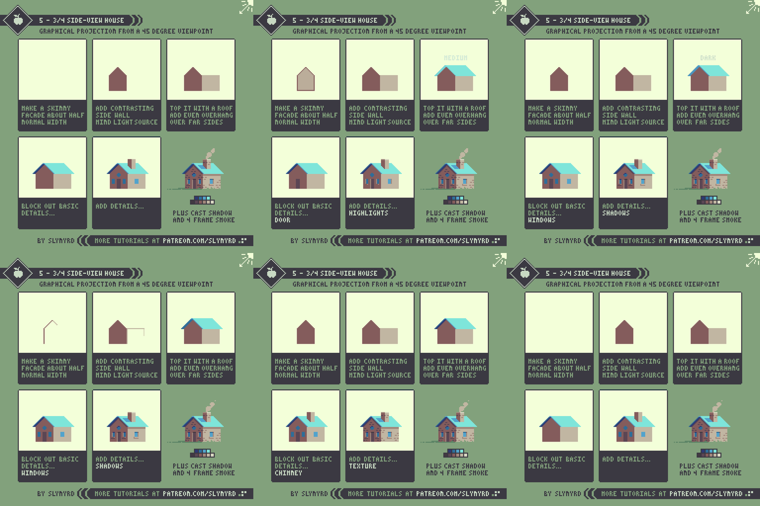
3/4 Side-view
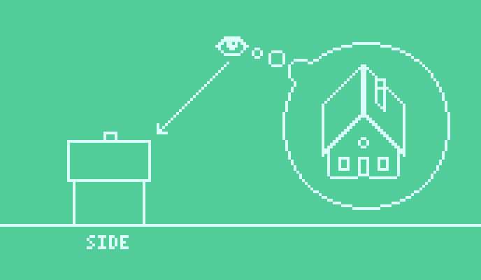
In this projection it's as if you are 45 degrees from the the center of the house, looking directly at a side corner. From this view you see about 3/4 of each wall. As the walls narrow the angles of the roof would actually become steeper. However, I also prefer to preserve the 45 degrees angles in this case. Of course, this limits how narrow the facade can be, as the roof must shorten to maintain 45s. But there's usually enough pixels to work with, and I show more of the facade than would be seen if truly squished in half. Most of the depth comes from lighting details.
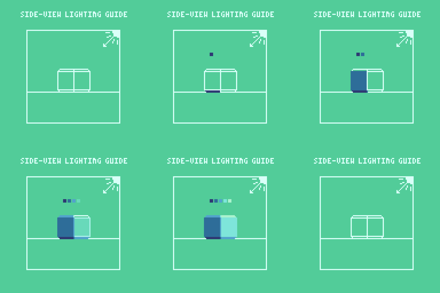
This is my common approach for lighting side-view objects. Sometimes I omit the strip in the center for a sharper corner, as is exhibited in the house below.
As you can see I don't use a precise science to achieve these projections. Using color to create strong lighting makes the simple geometry appear 3D. The satisfying sense of depth comes from contrast in light where sharp angles meet. If you analyze my art you will find this mechanic used over and over again. Seeing the forms pop out of the monitor with just a few slabs of color never grows old. Certainly, it has become a core feature of my style.
KEY POINTS
Uniformity - Make sure all elements in a scene follow the same rules and any wonky projection can look good. In other words, don't mix viewpoints.
Lighting - Most of the depth comes from lighting. Small ledges and outcroppings that catch different light angles can improve depth. Use strong lighting directed from a corner for dramatic results.
Work Solid - Drafting everything in outlines before coloring can be a good way to establish a complex structure, but you can often skip this step and immediately start making solid shapes with colors based on light source. Best to have a palette in mind for this to work well.
Palette - Use a simple palette with strong contrast from lightest to darkest colors.
Final Word
After you get the hang of these projections you can go on to create much more complex structures and apply them to all kinds of subjects. You can even use these techniques to create unique geometric expressions of organic subjects, like people, animals, vegetation, anything really.
RESOURCES
If you find value in my content please consider becoming a Patreon member. Among many other rewards, Pixel Insider members get extra resources to compliment my tutorials. But most importantly, you allow me to continue making new content.
All assets for this feature use colors from my custom palette Mondo.
Get caught up on all my downloads
If you're not ready to commit to the subscription model of Patreon, you can also make a one-time donation and receive exclusive art and downloads.
-By Raymond Schlitter


