Intro
Despite the limitations set on the medium, pixel artists have formed a diverse range of styles over the years and continue to evolve the art form today. Developing your own personal style goes a long way to finding commercial success. The consumer and potential employer are attracted to specialization. Furthermore, you need a brand to get noticed. But don't expect it to come to you over night. In order to properly form a style you must first explore and develop skill. Allow me to share an encouraging account of my own growing pains.
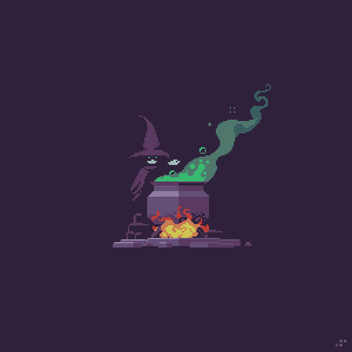
Think of style like an aesthetic concoction.
My Journey
If you've decided to focus on pixel art, half your journey is already over. Before I committed to pixel art I was all over the place in my creative endeavors. At one point my portfolio included logos, drawings, paintings, photography, and various digital mediums. My explorative nature was applauded by other creatives, yet I had a hard time finding jobs and selling my art. I thought the diversity was demonstrating my talent, but it was actually holding me back. I needed to find my thing.
Thankfully, I finally discovered my passion for pixel art and it became obvious where I should focus my effort. I had greatly narrowed my path but I had only just begun my adventure in the realm of pixel art. Just like everybody else I sucked at first and had no apparent style.
Eww, my first attempts at Pixel Dailies from March and April of 2015. We all gotta start somewhere.
Let me take you back to early 2015 and show you my first 3 attempts at Pixel Dailies. I had done a few sporadic experiments before, but this was at the point where I decided to focus on pixel art. Pixel Dailies and other pixel art communities are a great way to develop your skills in the company of other artists. It really helped give me the initiative, and I learned a lot about my art based on feedback and level of engagement.
'Octopus' - I think the size was restricted to 32x32px. I had never worked so small before and it really forced me to become aware of the clusters. You can see I made a lot of noob mistakes just like everybody else (pillow shading, doubles, excessive and ineffective color).
'Study' - The study was to create a Neo Geo Pocket style sprite. I used the Ryu sprite as a template and I was amazed how much character could be expressed with simple outlined clusters and limited colors.
'Akira' - This was just a theme with no restrictions. Being a huge fan of Katsuhiro Otomo's work, I couldn't pass up the challenge. Still pretty rough but you can see my aptitude for mechanical subjects, as I started to develop a better sense of light, giving the sprite more depth than my previous attempts.
More early work from April to May of 2015
Here are more assorted Pixel Dailies from my first few months practicing pixel art. Dithering, outlines, no outlines, chibi sprites, large sprites, isometric; you can see how I was exploring many different techniques just feeling out the medium with no particular style. There are some bright spots but I was still struggling with lighting, color, and making clusters do what I want. At this point I remember it was very difficult for me to work from scratch without literally tracing a reference to get started. Somehow I had aptitude for the isometric viewpoint right away, probably because of clear established guidelines.
In June of 2015, about 4 months after I started pixeling seriously, a style started to emerge.
At about the 4 month mark things were starting to come together in a more cohesive manner. Once I discovered the brilliance of minimal colors I was able to focus more on clusters and my lighting/shading improved dramatically. I can't stress enough the importance of limited color. Especially for a beginner, I recommend using only about 5 colors until you feel super confident in your shading and cluster work. Excessive color choices will only impede your development of the fundamentals.
At this time I was beginning to develop an affinity for certain colors, cluster patterns, and other aesthetic elements. Consequently a style started to emerge, however it was vague and I was still in exploration mode. Even though I was adept in certain techniques, I was not about to rest on my laurels. Even today I still strive to evolve.
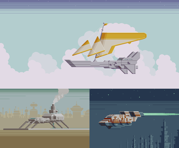
In July of 2015, I began to exploit the 1/2 sideview and my passion for mechanical design, which helped crystalize the core of my style.
Within the next month I discovered one of my favorite perspectives, which I now call the 1/2 side view. As far as I can tell the airship in the top image was the first time I used this skewed projection angle. I still use this perspective all the time and it's become one of the most prominent elements in my work. Also, notice a familiar theme emerging at this time?
Over the past couple years my style has continued to evolve but the foundation I established in my early development is still evident.
Although still a bit raw, the nucleus of my style had formed in matter of months. Through repeated refinement of techniques and subjects it became a legit style. To this day I continue to evolve my techniques and append new ones, but the core I established in those early days is still a huge part of my style. I learned to manage more colors, but limited palettes and minimalism is still a major slice of my brand. It's important to always continue exploring while keeping sight on your brand. But most importantly, make sure your work gives you pleasure.
What Defines STyle?
Every aesthetic choice you make including the subject matter plays into the definition of a style. Here are some of the elements that most strongly define a pixel art style.
Color - Color can have a deep psychological impact and usually determines the first, and overall impression of a work. There are endless ways to handle color; particular hues, color combos, saturation levels, brightness levels, color count. What are your color tendencies?
Cluster Work - Remember, clusters are any group of touching pixels with the same color. How you handle clusters can totally change the feel of a work. Lots of simple and repetitive clusters arranged in a controlled manner tends to create a clean or cute look. Widely varied spontaneous clusters creates a sketchy organic look. Clusters express your handy work.
Perspective - As you saw in my own account, frequent use a of a particular perspective can certainly distinguish a style.
Resolution - The size/resolution of pixel art impacts the overall look. Some artists like minimalistic super chunky pixels and others brave large canvases to deliver great detail. There's a range for diversity but the scale can tip too far at either end. Usually too high resolution brings out the pixel snobs, and that would include me.
Subject - What do you depict with your pixels? Cute characters, landscapes, mecha, monsters, or maybe non-objective designs? If a particular subject dominates your portfolio it certainly plays into your style.
Self ANAlysis
You don't just pick a style out of a hat, it comes from within. You should always be reflecting on what you are actually doing, and why. You might not know why at first but over time an aesthetic philosophy will form. The more conscious you become of your philosophy the more likely your creative decisions will result in a distinguished style. For example, I value clean lines over realistic perspective. This is just one guiding philosophy that answers why I so often use abstract projections to achieve depth. By analyzing your work you can see what defines your style, and why. The greater the sample size the more you can refine the definition, but it's not to be written in stone. Just as you change through life, your style undergoes refinement and evolution.
Inspiration
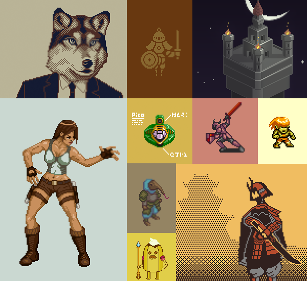
Developing a style requires exploration. The best way to explore is to analyze other artists and pixel art games. Let's take a look at some other pixel artists with evident style.
Formerly known as Nemk and now @deadlyyucca creates lovely minimalistic pixel art. I was especially impressed with her sci-fi scenes from a few years ago. The airy compositions and pale colors create a beautiful desolation. The minimalistic approach influenced me, and I'm pretty sure it was her work that turned me on to the 1/2 side-view.
Yur Gus (@yg_fool) creates exquisite scenes with natural colors. The whimsical painterly quality gives his scenes a story book feel. A mythical story book crafted by gods. Aim for this style if you want to kill yourself. Just kidding, but really I can't even estimate how many hours of work I'm looking at. A true artisan.
Valenberg (@MrValenberg) is decidedly married to the cyberpunk aesthetic and sticks to an appropriate color palette strongly featuring pink and blue. Rain soaked night cities, neon signage, hover cars, cyborgs, and cigarettes commonly grace his scenes. I appreciate the aesthetic, but what makes his work great is the cinematic quality of his compositions. A skill that makes him sought after for music videos.
Kirokaze (@kirokaze) is a prolific artist who makes a variety of scenes often presented as game mock-ups. He sticks to a consistent slightly muted palette, but often jumps between sci-fi and fantasy scenes, or somewhere in between. Every scene includes interesting narrative woven into the details, and the worlds feel well thought out beyond the boundaries of the canvas.
Johan Vinet (@johanvinet) is a gamedev centric pixel artist. His work exhibits quite a bit of diversity but he still has a style. I would say it's mostly defined my his enthusiastic use of vivid color and low-res cuteness. With very few pixels he manages to create expressive sprites with fluid animation.
I'm always hesitant to reference other artists because there are so many good ones and I don't want to leave anyone out, but it can't be helped. There are many more talented pixel artists out there worth analyzing. Get on the webs and check em' out!
Balance
While a unique style will help you get noticed, it's a good idea to remain flexible. Ideally, you could just make that one thing you really dig and everybody wants your thing. But you'll likely have more opportunities if you can adapt your brand across various styles and subjects. Usually a client wants to take advantage of your strength, but sometimes they might see a potential in your style you hadn't considered a part of your visual vocabulary. If you feel something is just too out of character it could potentially hurt your brand. However, stepping from your comfort zone often leads to a new discovery and it could evolve your style rather than muddle it. You can widen the spectrum of your brand and still have a recognizable style, but open it too wide and people can no longer see what makes you special.
Sprite Styles
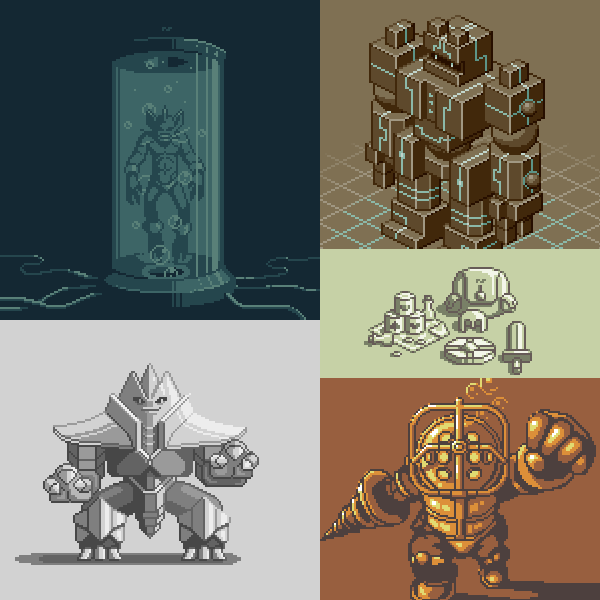
Often the overall style of a game or artwork starts with the sprite design. When deciding on a style for a game it's most important to make sure it suits the gameplay. Large sprites look cool but can be clunky to control and also require much more time to animate. Let's look at some simple examples of side-view sprites.
FINAL THOUGHTS
Reviewing my early days of development sure was a trip down memory lane. But I didn't write this article just to reminisce. Analyzing my path of progress should encourage and help you navigate the development of your own style. Just let it happen naturally and don't force it. Everybody develops at their own pace. My previous creative experience and intimacy with retro video games gave me a head start. If you're coming in with little to no creative experience it will require more time, but you can achieve your goals if the motivation is there. Explore as much as you can to discover the aesthetic elements that speak to and uncover your style, but never become complacent. There's always room to grow.
RESOURCES
Was this article helpful? If you find value in my content please consider becoming a Patreon member. Among many other rewards, Pixel Insider members get extra resources to compliment my tutorials. But most importantly, you allow me to continue making new content.
Get caught up on all my downloads
If you're not ready to commit to the subscription model of Patreon, make a one-time donation and receive exclusive art and downloads. Fan support is necessary to keep producing content. Thank you!
-By Raymond Schlitter


