Intro
As with any form of illustration, a good sense of light is key to capturing depth and atmosphere. Pixel art especially has a tendency to appear flat if light is not handled with care. Finding the right approach to light can be a delicate matter when working within low spec parameters. However, limitations can allow more flexibility in terms of abstraction, and subtle details go a long way.
What is light?
Light is what lets us see the world and affects the way we see color. Color is the way objects emit light. In terms of pixel art I'm referring to the management of color and clusters in order to simulate shadow, highlight, and mid-tones.
Light source
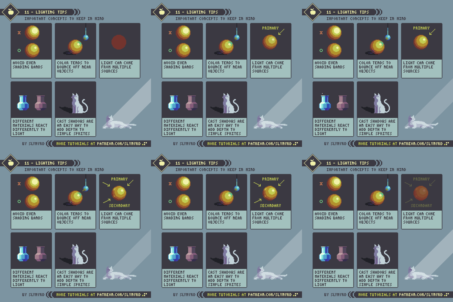
A light source should be established at the very start of any illustration. This will dictate the flow of shadows, tell you where highlights should be placed, and otherwise guide you with selecting color. Don't overthink it, context should always help you determine a light source. Often light comes from multiple sources at different intensities, but the most common and natural light source is from somewhere above. This always feels natural because the sun is usually above us, and most artificial light comes from overhead as well. Personally, I most often have primary light from the top right or left hand side of the composition. I feel this creates dynamic highlights and shadows while remaining balanced and natural. But this is just one simple approach. Light can come from any combination of sources, directions and intensities.
Mood
How do you want the viewer to feel when they see your art? Happy? Relaxed? Melancholy? Light is one of the biggest factors in determining mood. Changing the mood often involves changes to cluster work, but simple color selection can make all the difference.
Notice how I also play with the cast shadows to change the mood. Shadows can be stylized for the sake of expression but they also indicate the quality of the atmosphere. For example, If the air is hazy or if there is thick cloud coverage, light diffuses and cast shadows become less defined and soft. On the other hand, clear atmosphere keeps the light hard and makes crisp dark shadows. In outer space where there is no atmosphere shadows are elongated and razor sharp.
More Tips
Final Thoughts
Well, I've given you some simple concepts to approach light and shadow with confidence. The true nature of light can become much more complicated, but when it comes to pixel art I find the simple approach always works well. While my approach may be simple, the execution should be handled with care. Every detail is magnified under the minimal constraints. Sometimes it just a matter of finding the right level of contrast, adding some cast shadows, and bam, it suddenly jumps off the screen and immerses you.
Resources
If you find value in my content please consider becoming a Patreon member. Among many other rewards, Pixel Insider members get extra resources to compliment my tutorials. But most importantly, you allow me to continue making new content.
Get caught up on all my downloads
If you're not ready to commit to the subscription model of Patreon, make a one-time donation and receive exclusive art and downloads. Fan support is necessary to keep producing content. Thank you!
-By Raymond Schlitter


