Intro
Isometric pixel art is based on the isometric projection, which is a method for accurately ‘projecting’ 3D objects into fancy 2D. Unlike perspective drawing, there is no vanishing point in isometric projection. Furthermore, the 3 coordinate axis have equal foreshortening, eliminating the need to alter lengths based on the perceived distance from the viewer. This allows one to create 3D objects that accurately describe the complete form and all dimensions with efficiency. Traditionally, Isometric projection is used for technical drawings in engineering, architecture, and the assembly guide to your Lego set. However, these characteristics also make it a perfect style for game graphics. Marry it with pixel art, and something truly special happens. Let’s make some magic.
The Basics
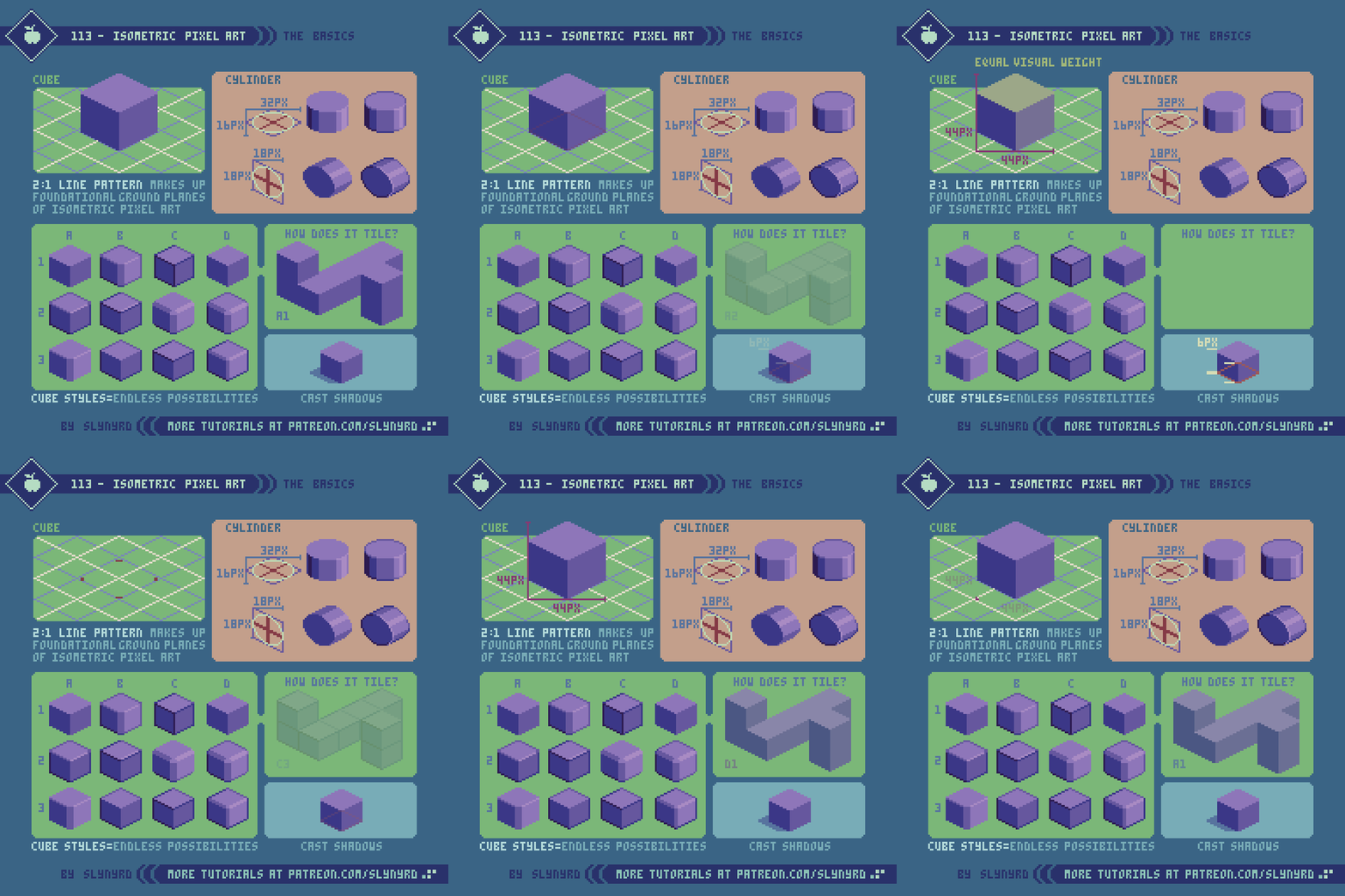
The ground planes of true isometric projection are laid out at 30º angles. Since a true 30º degree line in pixel art results in a jaggy rhythm, isometric pixel art compromises by using the 2:1 line pattern, which is closer to 26.5º. The 2:1 line pattern, or what I casually refer to as 2-step lines, make up the foundational ground planes of isometric pixel art. As long as you grasp how everything comes from a grid of 2-step lines, you can forget all the rest of the technical jargon and start banging out technically sound isometric pixel art.
The side ways circles can be especially difficult to try and eyeball. Start by making a grid from a skewed square, and cross. The circle makes contact with the square at the 4 end points of the cross. Pay attention to the shape of the cut out corners and how they reflect each other. Even with the grid it can be hard to eyeball the curves. As a Photoshop user, I draw a regular circle then skew it in free transform mode by holding option+command before pulling on a side node. Usually requires a little clean up after the transform.
Cube styles comes down to personal preference, but it should be noted some styles tile better than others. I personally prefer the look of the wide corners, as in A1. However, they require a bit of clever overlapping to tile well. D1, for example adheres more to the 2:1 grid and tiles perfectly, but those sharp corners are unnerving to me.
For more guidance on the basics, review Pixelblog 4.
Isometric Tiles
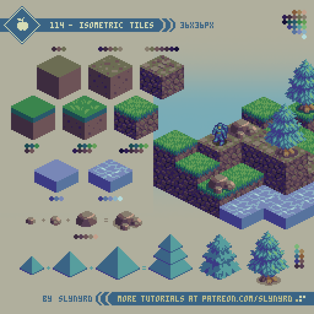
There’s a lot of variation possible with iso tiles, but it basically come down to picking out a cube style and texturing them to represent the desired environment. While it’s possible to create a complex set of iso tiles that includes slopes, I’m going to stick to cuboids, which can still make surprisingly varied and interesting environments. I use the word cuboid, as the tiles don’t need to be perfect cubes. So long as the top surface is uniform the height of the tiles can vary. You can even have tiles with no sides, but these can only go flat on the ground with no elevation. The cube is quite versatile, however, as it can be slid up and down in relation to other tiles to adjust the height as desired.
Note, the texture should be able to loop seamlessly along all 4 sides of each surface. Apply the same principles of creating a plain square tile to each of the 3 surfaces. For more tips on applying texture to tiles, check out Pixelblog 20.
The size also comes down to the look you’re going for. The bigger the more detail is possible, but the amount of work dramatically increases as well. Whatever size you go with, even dimensions are your friend. I arbitrarily ended up with 36x36 pixels based on the relationship with the sprite designs.
The tutorial depicts various styles of tiles from flat color, to more detailed texture (not a step by step progression). I think the flat color, and simple texture versions could be combined for a nice look, but stylistically don’t match well with the high detail versions. My example terrain is composed of only the max detail versions.
Even with organic objects like trees, I find it helpful to start with basic geometric shapes, then sculpt out the details. This is much easier than trying to freeform the whole object, and the foundational shapes help maintain a consistent iso look.
Isometric Mech
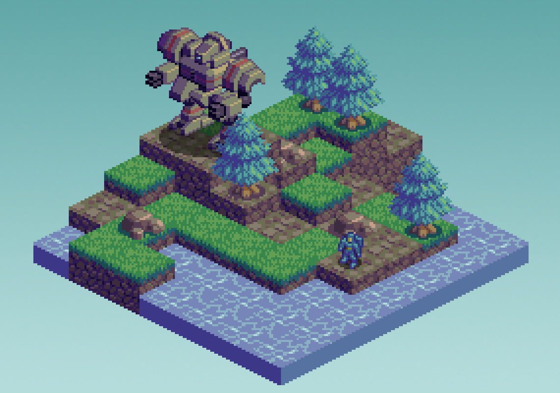
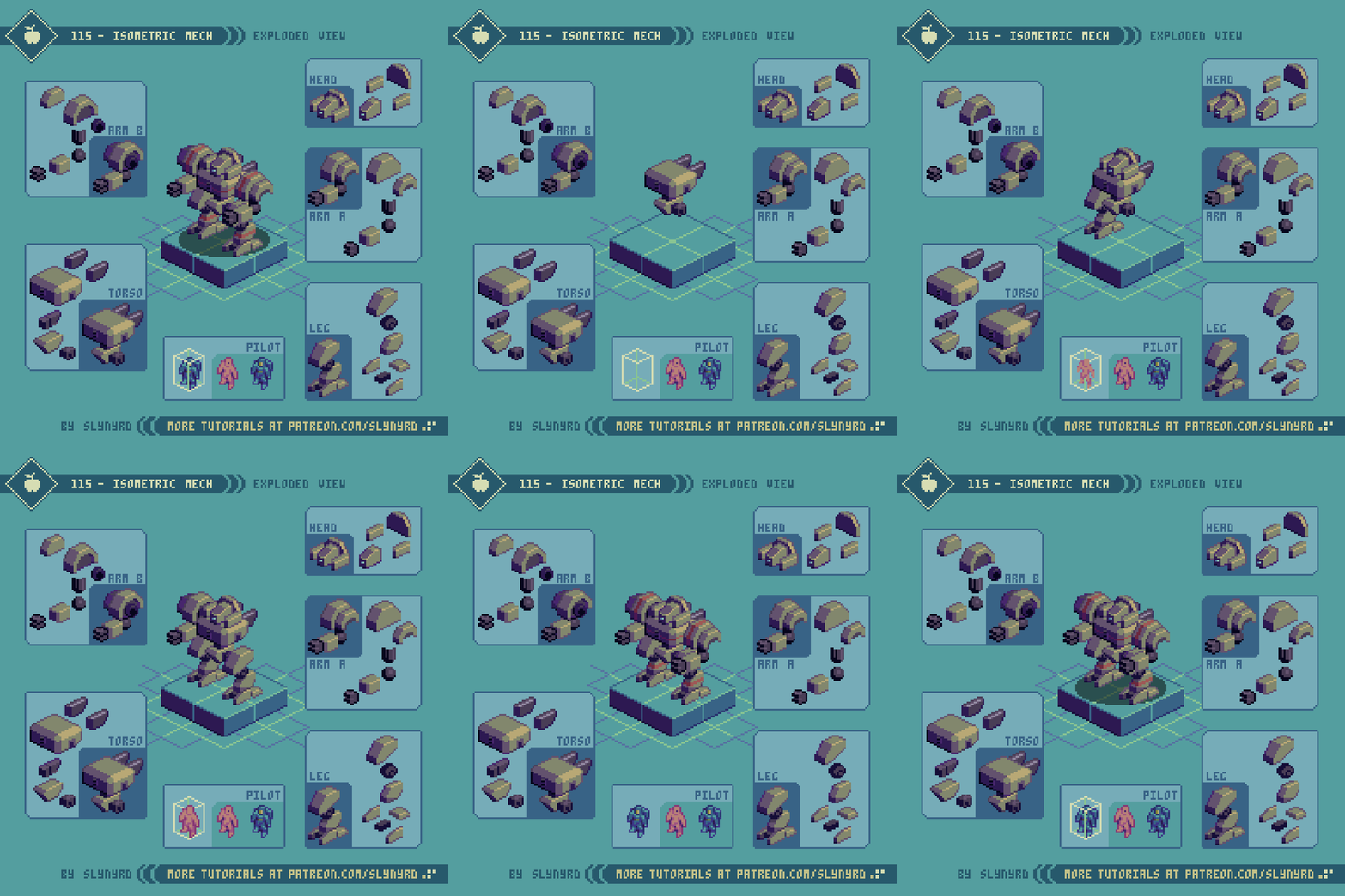
Your final test of this iso lesson, it’s a mech! At first look, the final sprite may appear like an advanced challenge, but when you break everything into separate pieces, you find fairly simple geometry that never strays too far from the foundational cube. Even though some information will be hidden in the final composition, it’s well worth visualizing all parts. The piece by piece layered approach also helps ensure a more sound final design, by offering the flexibility to easily move things around and swap out parts. I fidgeted a lot with the placement of all the parts, and it would have been very painful to render those edits on a single layer. Furthermore, it’s really satisfying to feel like you’re actually building something, and if you are so bold to attempt animating this beast, layers is the way to go.
As for drawing character sprites, I find it helpful to make a wireframe iso cuboid to help you keep things in line with the 2:1 pattern. Once you get the hang of it, you can simply imagine the shape without the need to draw a guide. As a general tip when making iso stuff, I always have a single 2:1 line in my composition as a separate layer that I use as a ruler to make sure things line up
FINAL THOUGHTS
Isometric pixel art can be a bit tedious to get into, but once you develop proficiency in drawing 2-step lines it becomes second nature. It’s well worth the effort, as iso pixel art is always a crowd pleaser, and opens up a lot of possibilities in games. However, the rotated viewpoint makes direct input gameplay a bit tricky, as the simulated perspective can make it difficult to gauge distances. Not the best choice for a platforming game, but great for turn based strategy games.
I got into iso art early on in my pixel art career. After a few studies I went for broke on very large detailed scenes. I developed a great deal of proficiency from the experience, but it was all built on the accessible fundamentals. If you can draw a cube, it’s possible to make a whole city!
All words aside, I feel iso pixel art is best understood simply by observing examples, and then mastered by actually doing. The basics can be picked up relatively quickly, and the challenge picks up once you attempt composing complete scenes. The key is accuracy, making sure things are properly spaced in relation to each other and everything lines up along 2-step lines. Don’t always trust your eyes. Count pixels and use a 2:1 ruler to make sure things are lined up that are supposed to. Start small, then go big!
RESOURCES
Please consider supporting my work by becoming a Patron. Among many other rewards, Patrons can access resources to compliment my tutorials. But most importantly, you allow me to continue making new content!
Alternatively, you can support me by making a one-time donation
Assets featured in this Pixelblog are available in Isometric Pixel Art Assets Pack
Source files used in the making of this Pixelblog are available in Isometric Pixel Art Resource Files
Get caught up on all my downloads
You made it to the end of the article. Thank you for reading!
-By Raymond Schlitter


