Intro
Coming into prominence in the 1980’s, the cyberpunk aesthetic has established itself in the visual arts over decades. With the mere mention of the word ‘cyberpunk’, one is prone to envision neon laden futuristic cities inhabited by robots, humans, and everything in between. Indeed, the aesthetic heavily focuses on city life and the cultural impact of advanced technologies. While these visions may appear optimistic on the neon lit surface, a closer look often reveals the oppression of the people by the societal structure and the very tech they are dependent on, giving rise to the famous catch phrase that best describes the cyberpunk aesthetic, ‘high tech, low life’. Furthermore, cyberpunk explores a broad range of themes, including artificial intelligence, robotics, class struggle, organizational corruption, consumer culture, existentialism, and loneliness. As an aesthetic that tries to predict the future, current expressions of cyberpunk evolve along the lines of real life tech. Frighteningly, dystopian elements from cyberpunk visions of the past have crept into our lives irl. How do you envision the next generation of cyberpunk?
Characters
It’s people and their technology that brings color and richness to an otherwise dark world composed of grimy colors.
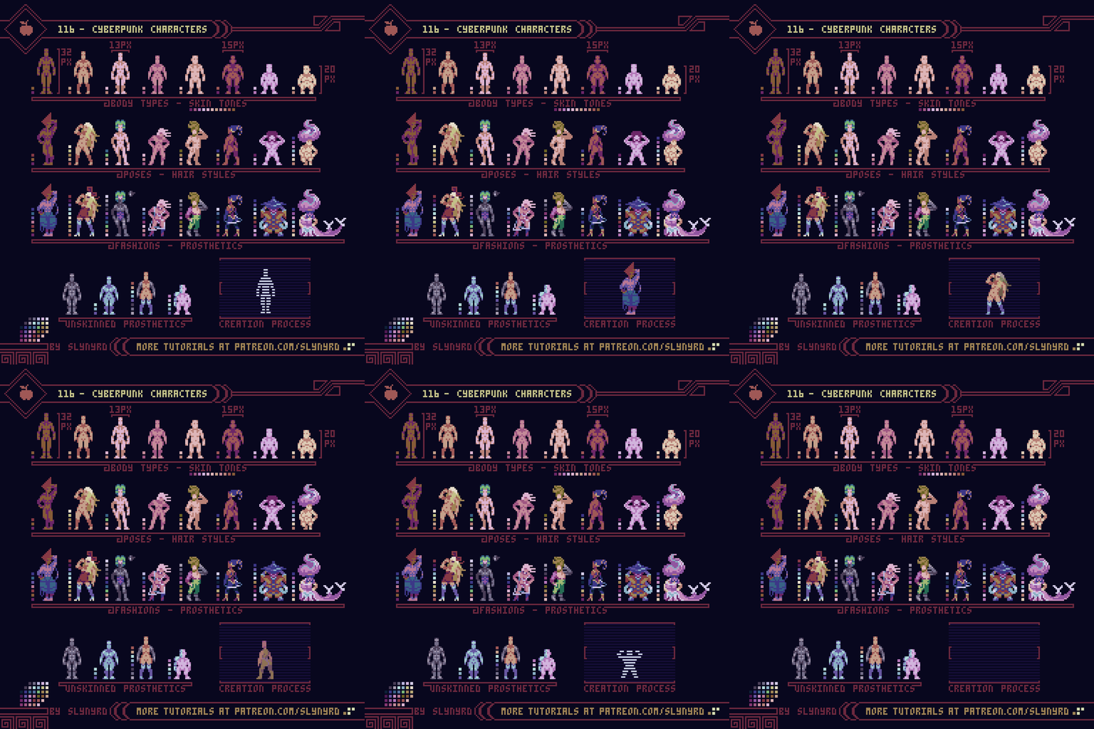
Cyberpunk characters represent a great melting pot of body types, skin tones, and cybernetic enhancements. Likewise, their fashions broadly range from baggy, identity concealing garbs, to skin tight numbers that show it all. Think of a future Tokyo, Paris, or some new imaginary city, but on steroids. In a universe that emphasizes our wanton desires and faulty egos, where does the fashion go in combination with the tech? Are people proud to show off their prosthetic body parts? Will skin ever go out of fashion?
To truly realize a character I found it best to start raw and simple, with a frontal nude. Next, you can play with different poses and perfect anatomy before finally clothing them. Working at an average sprite size of 16x32px, I was able to blob out the body proportions by eyeball. Posing takes some trial and error, but perfect placement of the pixels is never far off when working with so few.
For a more technical approach to anatomy, check out Pixelblog 17
Miscellaneous
Cyberpunk signatures that fill the streets of 20XX.
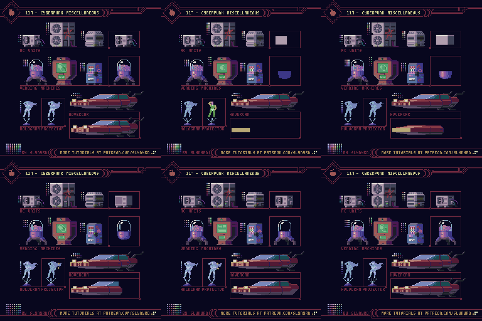
Despite the self induced environmental hazard of the city, we can only continue to live along the standards we’re accustomed to, and always consume more. The constant drone of thousands of AC units heard across the city only adds to the oppressive nature of the musky air. Flying cars add a romance to the city, but in reality they multiply existing problems with traffic, and create a whole new set of problems. The increasing need to build vertically leads to social stratification based on elevation. Down on the bottom it’s dark, filthy, and void of nature. The only color a bottom dweller sees is from a hologram plastered across the facade of stacked living cubicles, trying to sell the pill of the day, because that’s another way to see color. Up top, the aristocrats still pretend everything is fine, basked in luxurious amenities, but even they cannot escape the oppressive air of the city. The untenable nature of it all is felt among the few remaining individuals, yet the soulless collective grows everyday.
Crazy kids these days don’t even know what a tire is, let alone how to change one.
Buildings
At first, we celebrated our modern monuments. But over time, they blotted out the sun and became a prison. Eventually, the past was forgotten, and the people took comfort in their own cancer.
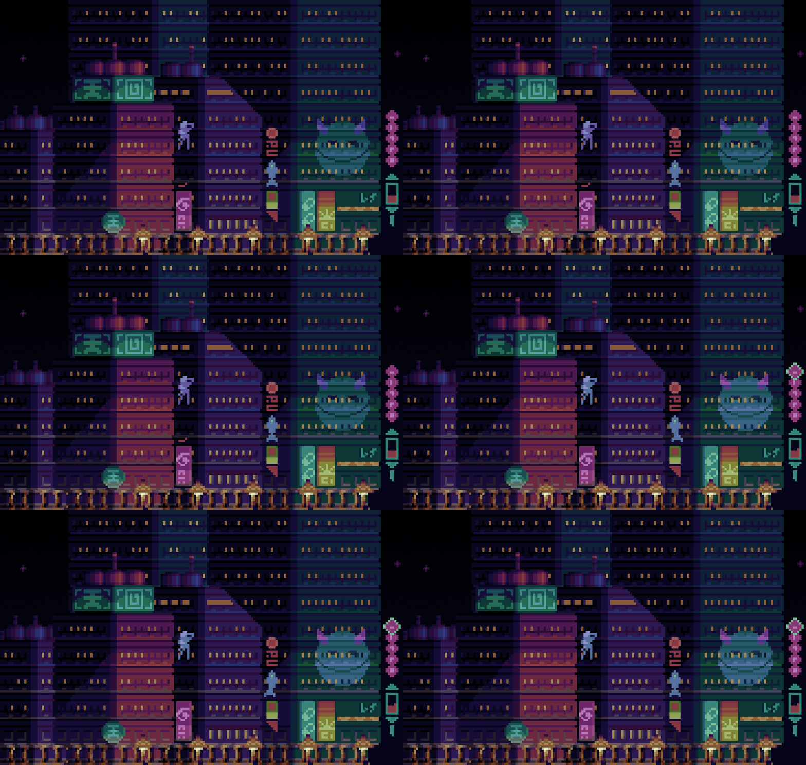
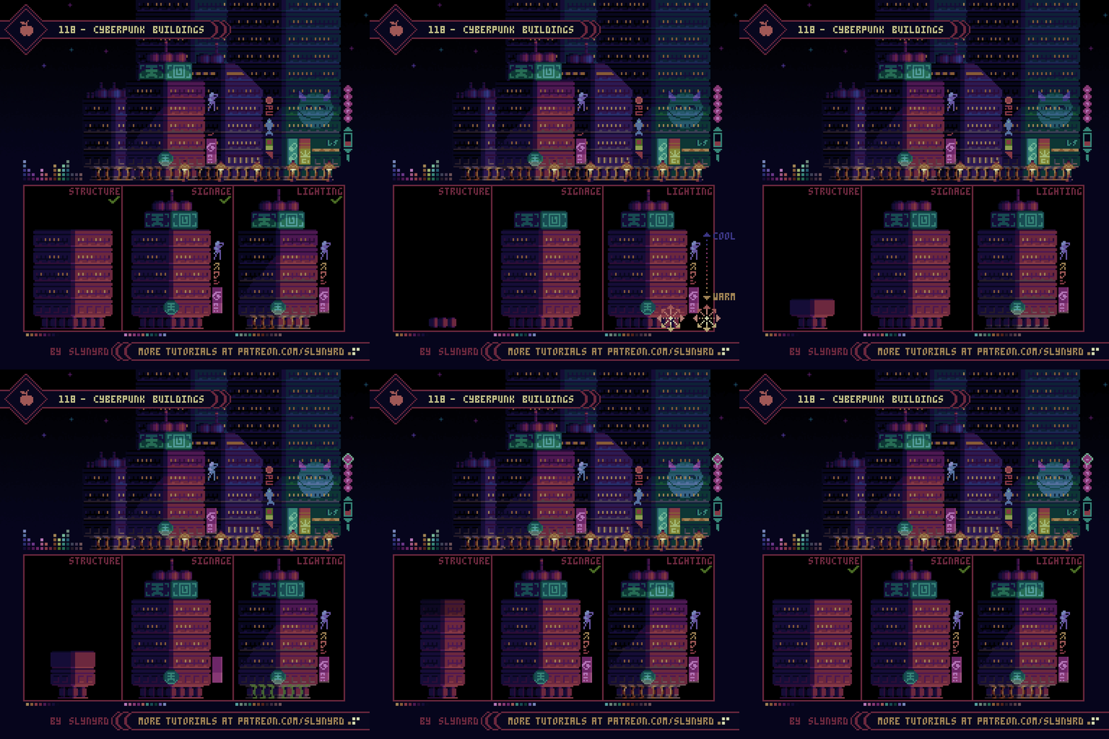
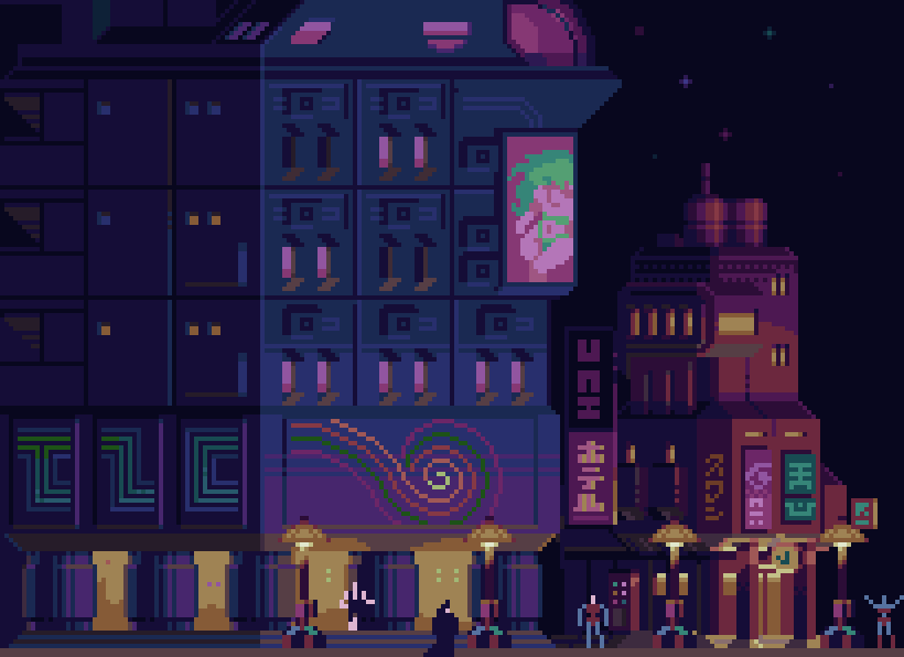
While there is much room for architectural innovation in cyberpunk, I chose to keep the basic structure of my building simple to clearly illustrate the lighting effects. Convincing night lighting, and plastering everything in neon are the main ingredients to capturing the cyberpunk feel. The base cyberpunk environment is usually made up of drab browns and grays while the color infusion comes from lighting, and neon signage. I chose more distinctive colors for my buildings while incorporating atmospheric lighting to get a little realistic grit. The main light source comes from the street level, provided by street lights and the general glow of shops and neon. Note how the surfaces facing downward on the lower portion of the building use warm desaturated hues. This is to pick up some of the ambient color coming from the dull dirty streets. Naturally, the street level light source loses its luminosity with distance, which is represented by vertical color gradation on the sides of the building. Since the street light is warm, while the cool night sky rests above, the color gradates from warm at the bottom, to cooler with elevation.
Save time by designing the building with a modular approach. Like a real building, I design with single story block units that can be duplicated to expand the building to any size. After realizing a whole building with logical layout and proportions, I can then go back and add variation to the overall structure. This results in unique, yet physically believable buildings.
The real fun comes with the neon veneer. Considering holograms, and the advancement of projection/display technology, anything is possible. Also the symbolism of a deactivated hologram exposing nothing but lifeless concrete and glass definitely says cyberpunk. However, there’s something about the weight and physical clutter of neon signage that’s essential to the urban jungle habitat.
Once you’ve mastered the basic buildings, you can use the same approach to lighting with more complex designs.
Final Thoughts
If you’ve stuck around this long you should have a pretty good idea what cyberpunk is all about. If you’re still not sure, go watch Akira, Blade Runner, Ghost in the Shell, and treat yourself to the fantastic illustrations of Syd Mead. These are some of the important founding visual works of the aesthetic, however, taking into mind the social commentary element, the vision of cyberpunk continues to evolve as culture and technology shift in the real world.
The emphasis on gloomy city life has long kept this country boy away from dabbling much in the aesthetic with my pixel art. But after a deeper study I think I’ve misunderstood cyberpunk. It’s not a celebration of nihilism, consumerism, transhumanism, and so on. It’s a commentary that heeds the warning of a grim future based on the technological and sociological implications of today. In this sense, it offers a beautiful playground to explore what it really means to be human. Yes, I must explore this more.
RESOURCES
Please consider supporting my work by becoming a Patron. Among many other rewards, Patrons can access resources to compliment my tutorials. But most importantly, you allow me to continue making new content!
Alternatively, you can support me by making a one-time donation
Assets featured in this Pixelblog are available in Cyberpunk Assets Pack
Source files used in the making of this Pixelblog are available in Cyberpunk Source Files
Get caught up on all my downloads
You made it to the end of the article. Thank you for reading!
-By Raymond Schlitter
