This blog will give me a chance to go into more detail on art, game design, and features. Since this is the first devlog I'm going to tell the basic story of our development history and games.
Read MorePixel
Remnant Devlog 2 /
When I first began work on this project in January, I had little experience with pixel art and never created it for an actual working title. Therefore, the more I do and learn about pixel art, the worse my earlier work on Remnant appears. This growing awareness began to significantly hamper my motivation to continue working on this title. Fortunately, I have grown enough to see the weakness in my work, and divulged the opportunity to make things better while the game is still in early development.
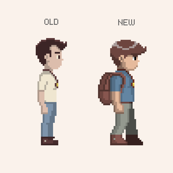
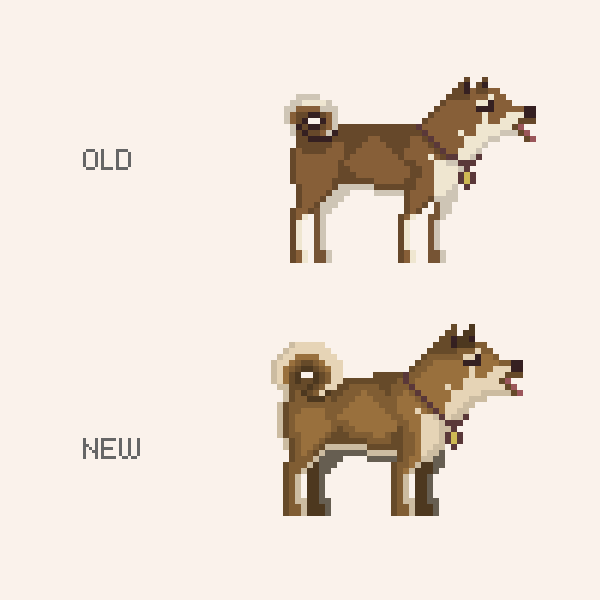
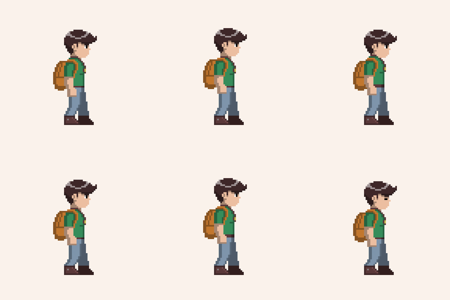
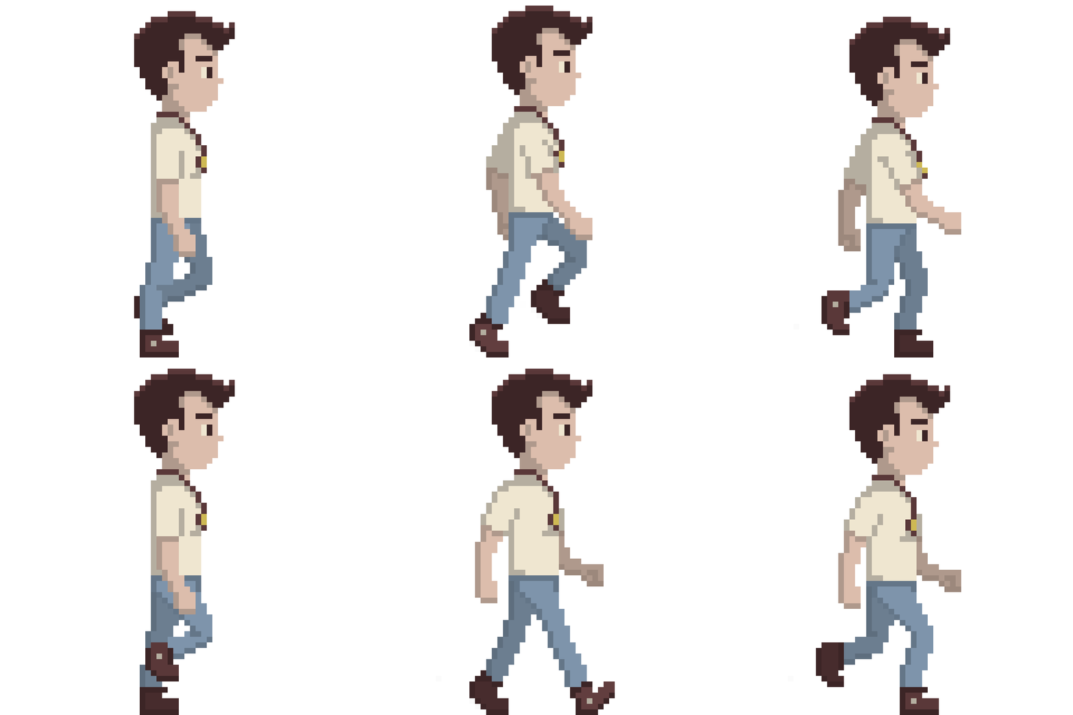
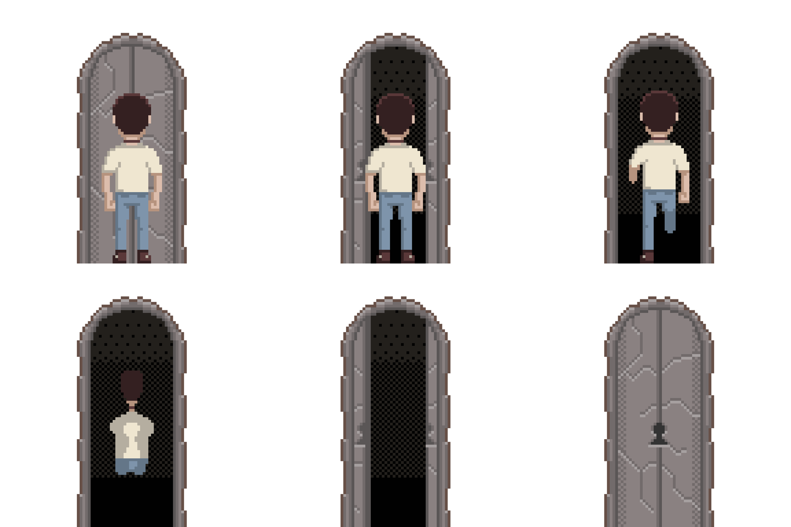
Over the past two weeks I've been revamping nearly all the graphical assets with a much greater focus on defining the overall style and staying consistent by sticking to a few key design points. The first point is the character's physique. I've decided to make the characters more stocking and 'game-like' without sacrificing realism. The next point is color. This time around I've been much more careful about color selection as I build and refine one consistent palette. The final point is to push the animation further by making everything more bouncy and lively. I'm hoping these points will help give the graphics a distinct flavor.
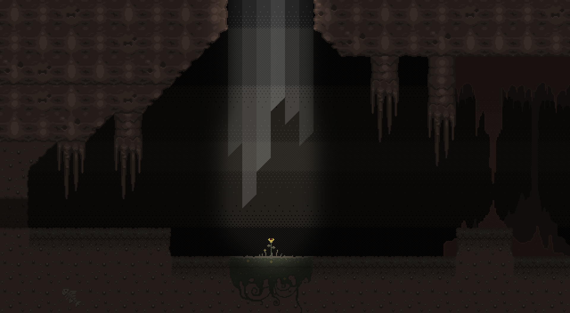
The shot below exemplifies a little bit of everything I've been doing to improve the visuals.
New tiles are not only attractive, but keep focus in the playable area.
I was especially troubled by my first attempt at the character designs. Some of these new designs are still being developed, yet the improvements from the bland old versions are apparent.
Great improvements have also been made to the tiles and environmental sprites. The color palette is doing well to supplement colorful accents to the predominantly brown hues.
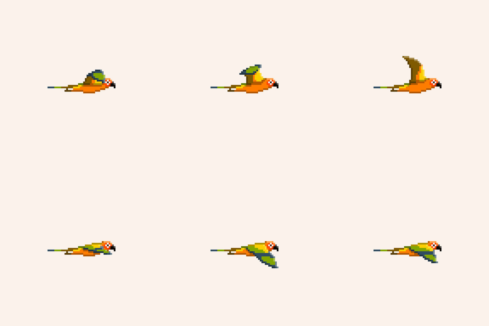
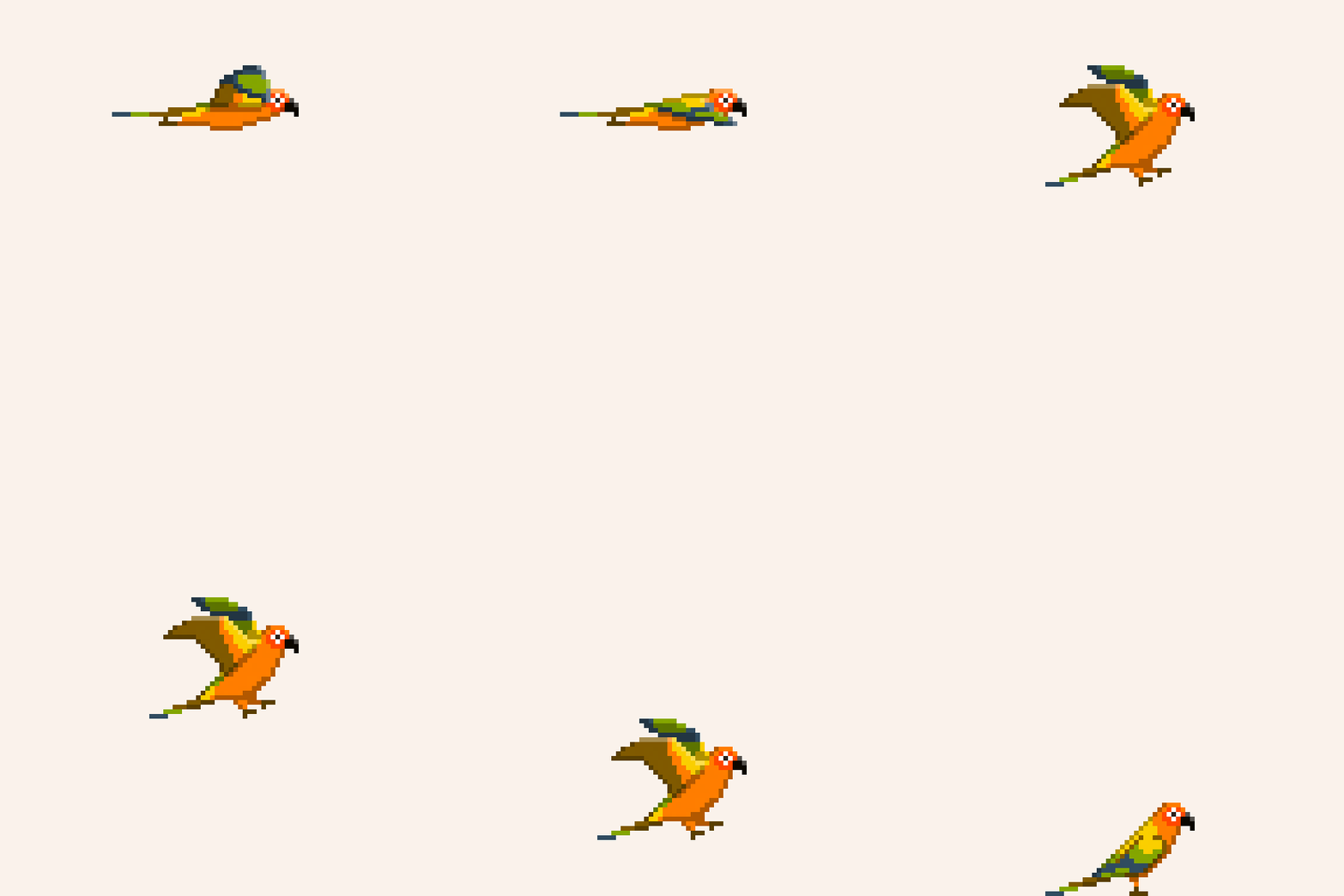
Another new addition is progress on the bird character. This particular bird's flight abilities were handicapped by a life in a cage. However, By pressing and holding a button the player can fly for a short time before a stamina meter depletes.
Lastly, I want to show a sample of revised animation for the human's idle animation. While simple, it captures the lively spirit I want to infuse into all of the animation. Don't mind the working color scheme.
That's all for now. Hope to have more animation to show you next time.
Remnant: Devlog 1 /
Since early January 2015 I began my first game dev project after making a partnership with an aspiring programmer via twitter. I've been wanting to somehow get involved with the game dev scene for quite some time, so I jumped at the chance. Since that time, progress on Remnant has been up and down, but overall steady.
Remnant is a two dimensional puzzle platformer, with a twist. In this darkly wondrous world, the player receives a mysterious necklace from his dying grandfather. Rune magic imbued in the necklace allows the player to shape shift into various animals. The unique abilities of each animal form must be used throughout the game in order to progress through a subterranean labyrinth and uncover a shocking secret that won’t stay buried forever.
As the game is based in 2D pixel art, my first task was making 32 x 32px tiles for the environment. As simple as it seems, making a cool looking texture for dirt in such a small space definitely requires a special sense. Fortunately, my lifelong passion of gaming has instilled me with such a sense, however, I still have much growing to do.
Beyond making tile sets, this learning experience has expanded to involve me in character design, animation, level design, story telling, concept art, and really all faucets of game design outside of actual coding.
look forward to future devlogs detailing more specifics about the game as it develops. Follow me on twitter to get the most current peak at new content.
Pulse City /
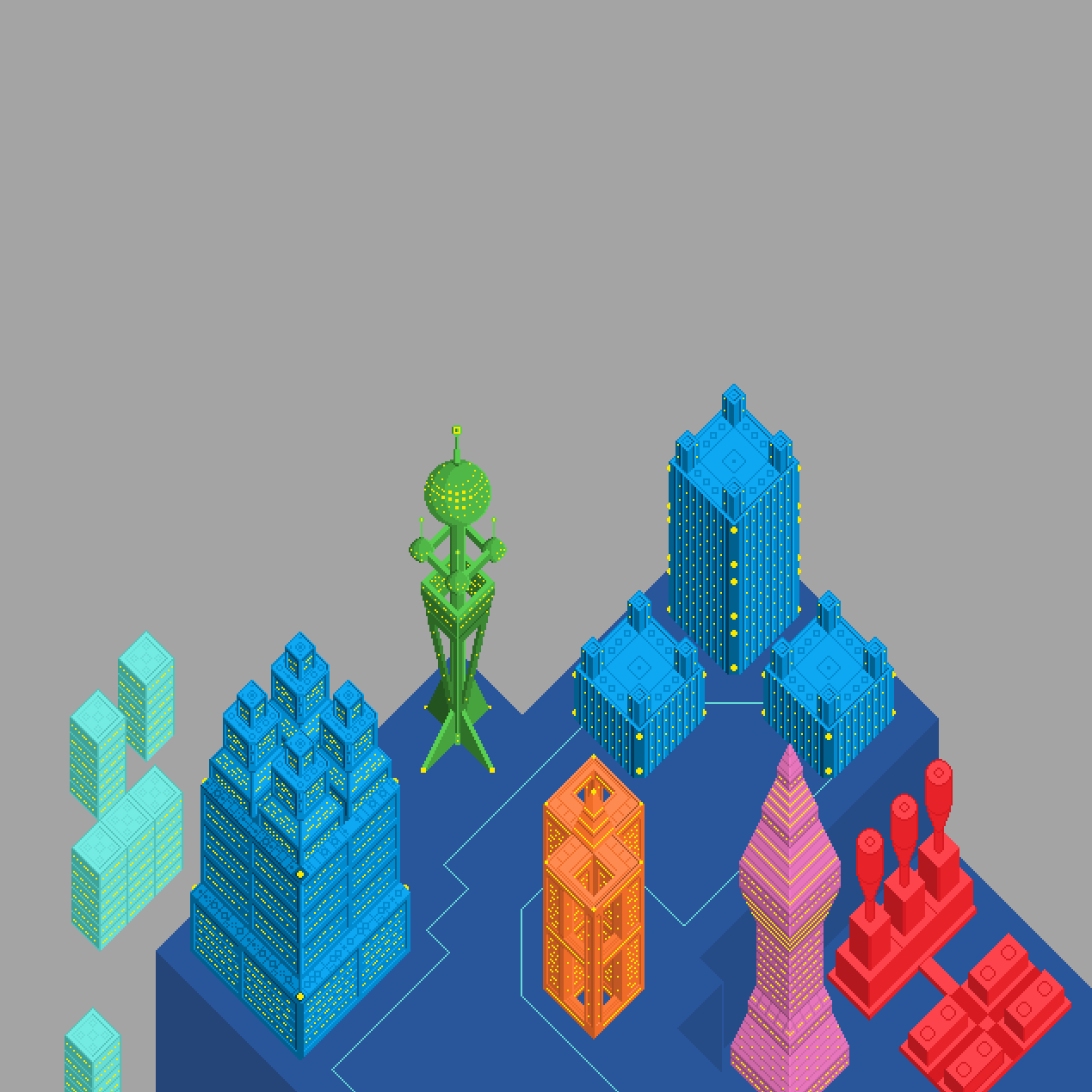
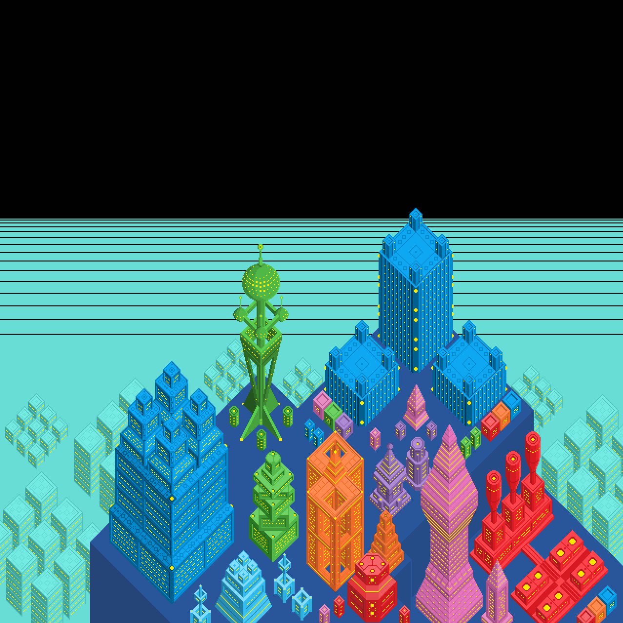
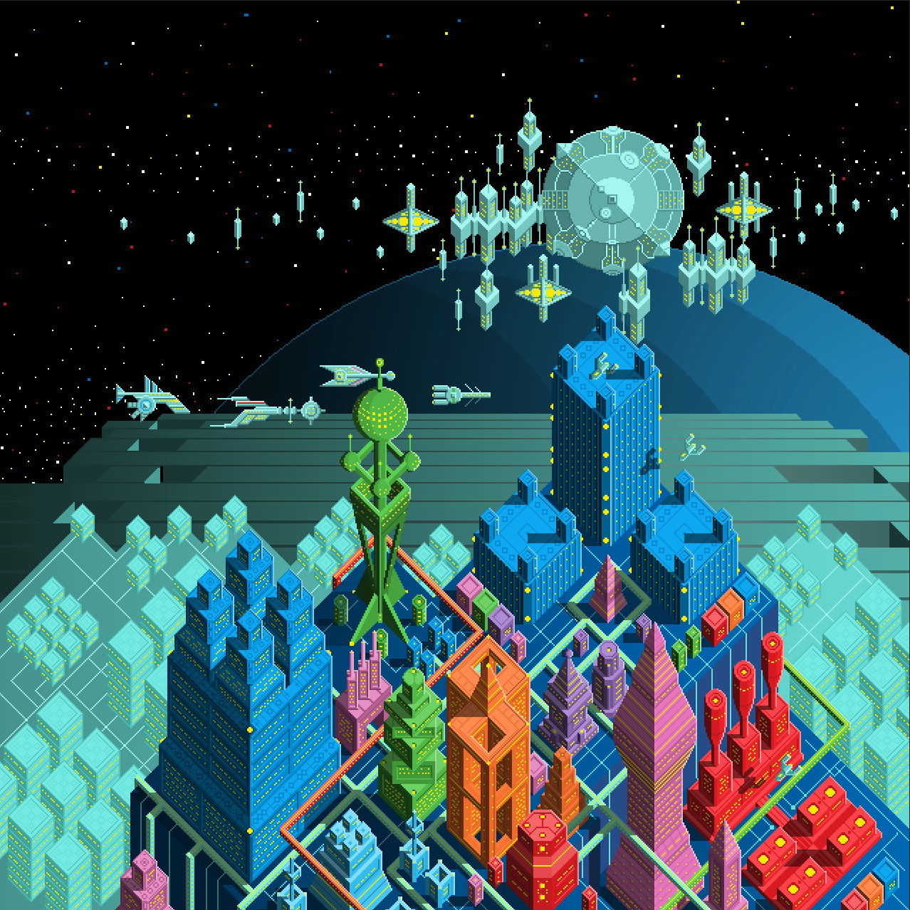
What started as a simple study in perspective quickly exploded into a vibrant sci-fi world, as I became inspired to make it a plausible concept for a city builder/alien invasion defense game. Behold, the Pulse City.
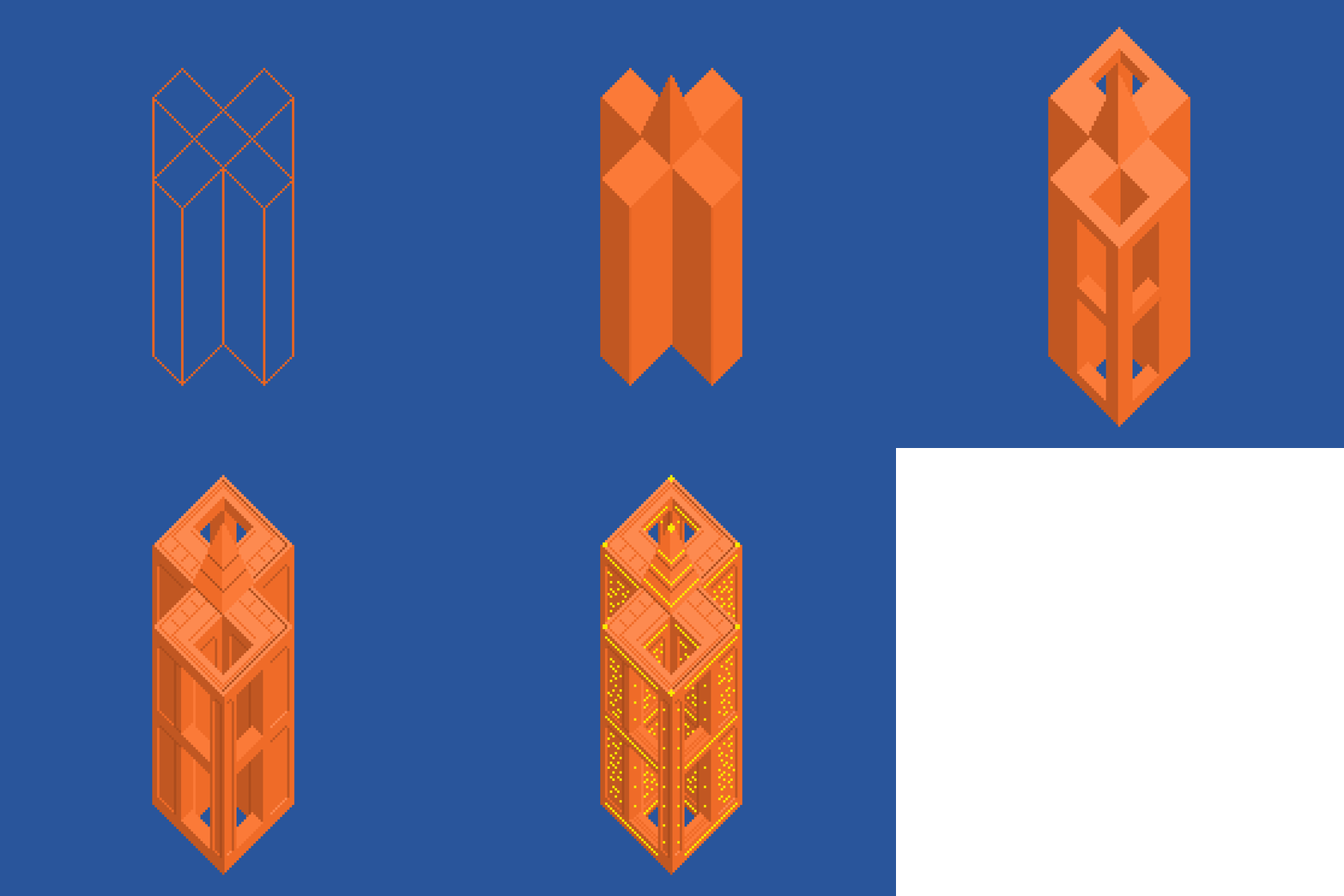
For this isometric study I used an exaggerated perspective by making nearly all the vanishing lines at 45 degree angles. This technique offers efficient production of geometric forms. However, the repetition of shapes tends to make things look flat. While flat graphics can be charming, I wanted to convey a great deal of depth. In order to do so I used overlapping, vertical hierarchy, and even some atmospheric perspective by varying the level of detail.
In the images you can see a great deal of the process. I started by simply designing one building at a time. Once I completed a handful of unique structures I began playing with the composition. From that point on it was just a puzzle of finding the perfect placement for all the structures, and building new ones where needed. I used the same process to fill out the background with dozens of unique ship designs and the orbital defense colony.
Prints and more!
Beat Diver /
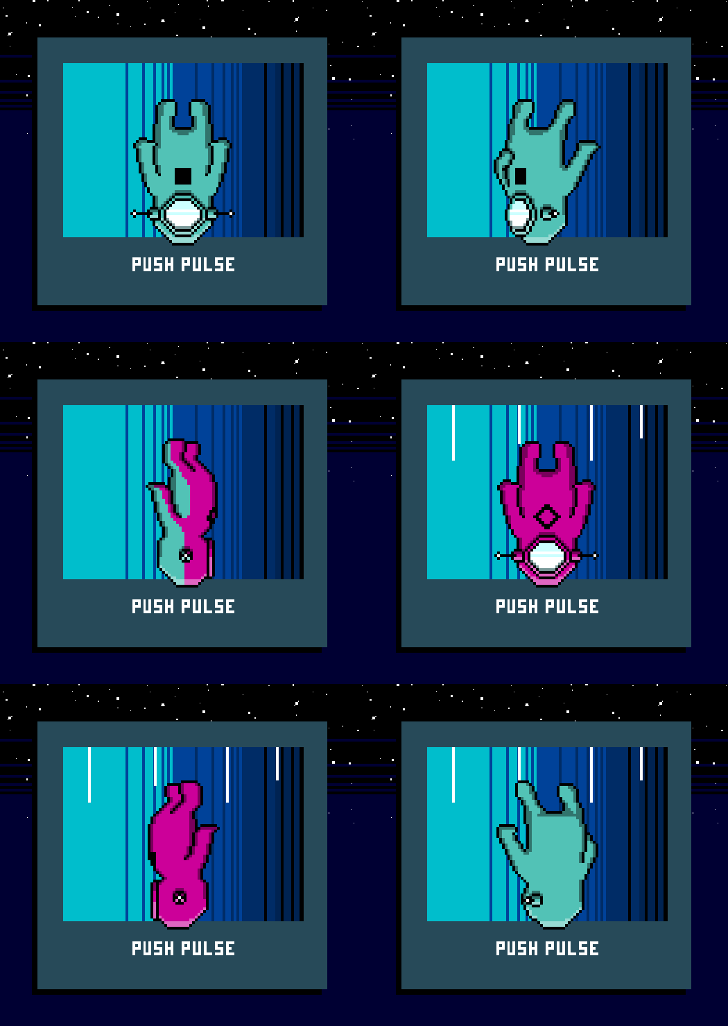
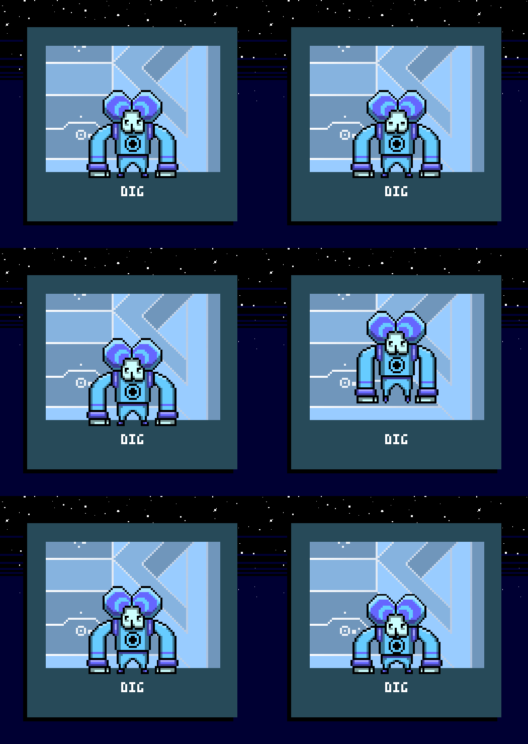
What is that mad beat coming from the depths of planet Boom? The schizophrenic PushPulse, and his partner Dig, search out the source for their own groovin' collection of tunage. Introducing Beat Diver! A wonderful rhythm game concept. Dive down psychedelic chasms collecting beat bits to the rhythm while avoiding obstacles.
PushPulse makes the dives, collecting the appropriate colored beat bits as either of his two halves. Dig stays in orbit and intercepts the beat transmission to help predict where the next beat bits will come from.
PushPulse can flip his persona at the press of a button changing his waveform and track pan. If you listen to the sample track I made you can hear this concept in action. Collecting the beat bits while in the wrong form will result in a penalty.
Every dive is capped off with an epic boss battle.
