When I first began work on this project in January, I had little experience with pixel art and never created it for an actual working title. Therefore, the more I do and learn about pixel art, the worse my earlier work on Remnant appears. This growing awareness began to significantly hamper my motivation to continue working on this title. Fortunately, I have grown enough to see the weakness in my work, and divulged the opportunity to make things better while the game is still in early development.
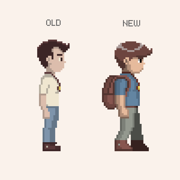
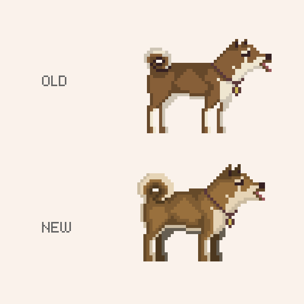
Over the past two weeks I've been revamping nearly all the graphical assets with a much greater focus on defining the overall style and staying consistent by sticking to a few key design points. The first point is the character's physique. I've decided to make the characters more stocking and 'game-like' without sacrificing realism. The next point is color. This time around I've been much more careful about color selection as I build and refine one consistent palette. The final point is to push the animation further by making everything more bouncy and lively. I'm hoping these points will help give the graphics a distinct flavor.
The shot below exemplifies a little bit of everything I've been doing to improve the visuals.
New tiles are not only attractive, but keep focus in the playable area.
I was especially troubled by my first attempt at the character designs. Some of these new designs are still being developed, yet the improvements from the bland old versions are apparent.
Great improvements have also been made to the tiles and environmental sprites. The color palette is doing well to supplement colorful accents to the predominantly brown hues.
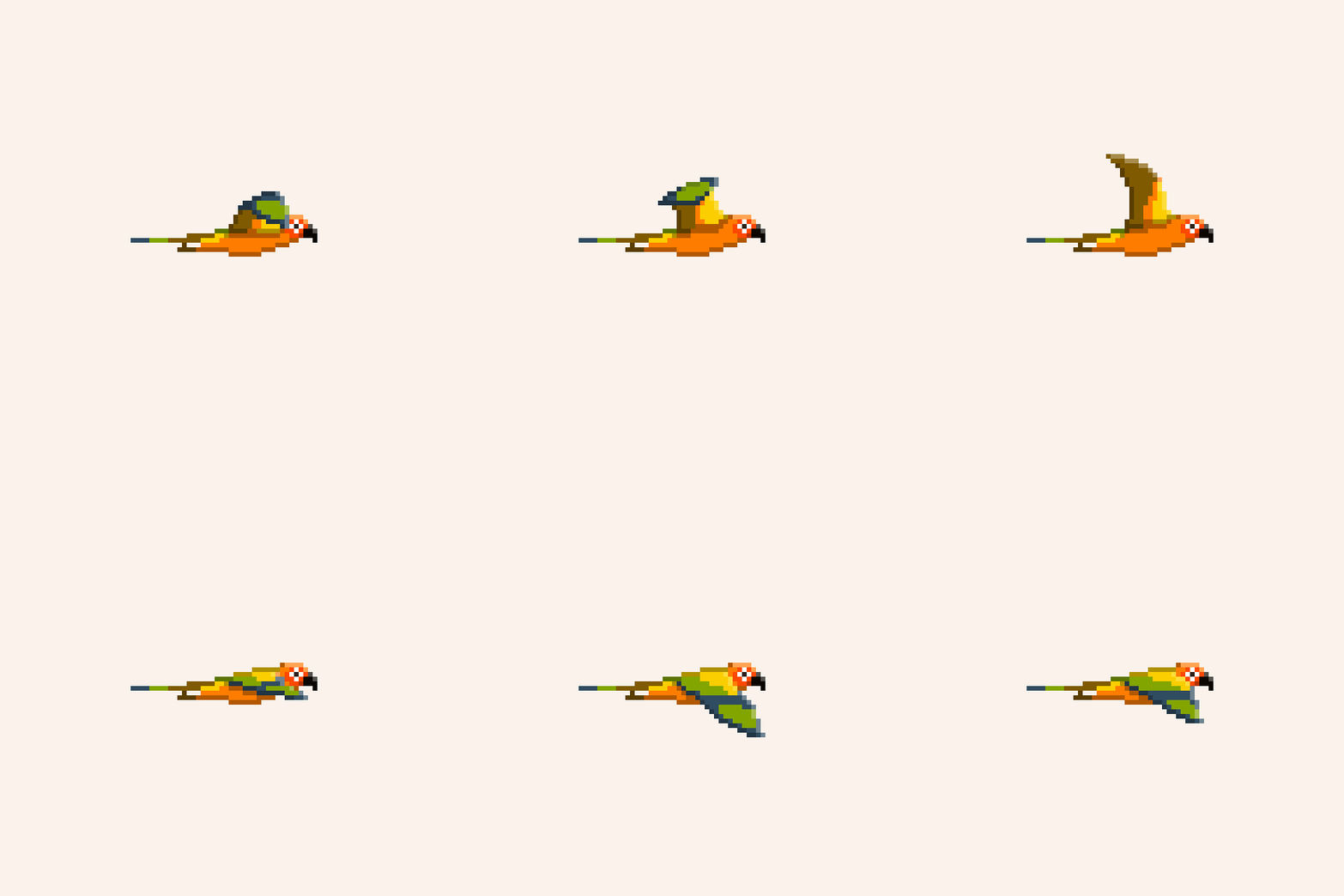
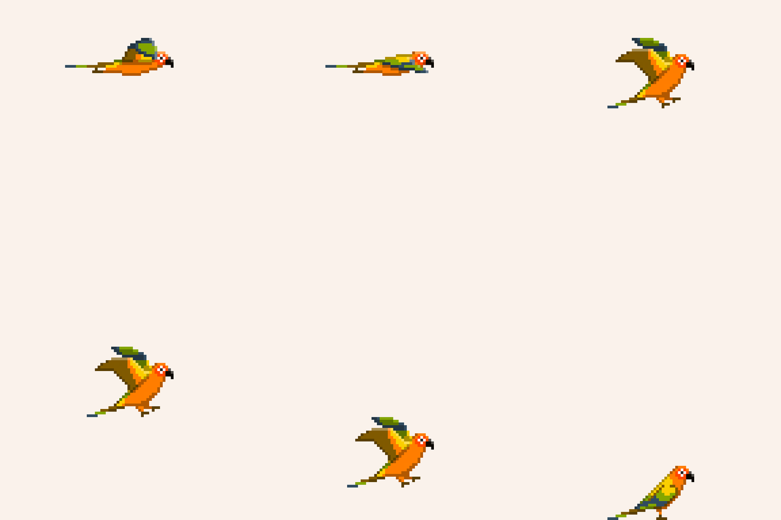
Another new addition is progress on the bird character. This particular bird's flight abilities were handicapped by a life in a cage. However, By pressing and holding a button the player can fly for a short time before a stamina meter depletes.
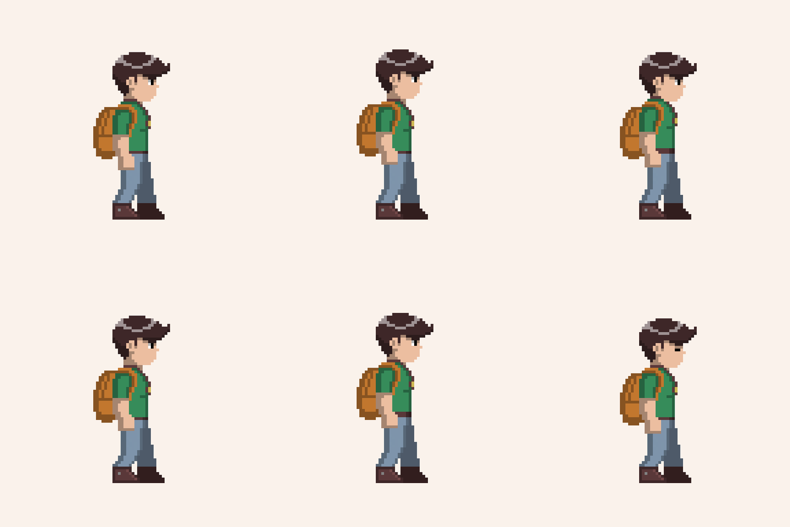
Lastly, I want to show a sample of revised animation for the human's idle animation. While simple, it captures the lively spirit I want to infuse into all of the animation. Don't mind the working color scheme.
That's all for now. Hope to have more animation to show you next time.
