Pixelblog - 25 - Motion Cycles by Raymond Schlitter

Intro

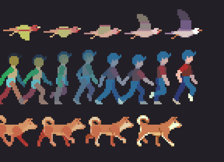
Everyone and everything gets around in their own way; some on two, some on four, and some like to soar. In this lesson I present motion studies on 3 different subjects that are essential to hang on any animator’s tool belt. First, we’ll take a look at bipedal locomotion with a human walk cycle, then we step it up to four leg action with a dog walk cycle, and finally take to the skies with a study on the wing motion of birds.
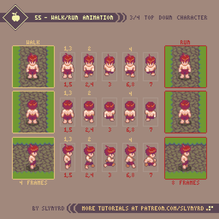
Title_Image_25_2.png

Human Walk

A human walk cycle is always a good place to start your animation studies, or to polish your skills. In my opinion, the subtle movements of a walk make it a bit harder to animate than a run cycle. I cover run cycles in Pixelblog 8.

63-Human_Walk.gif

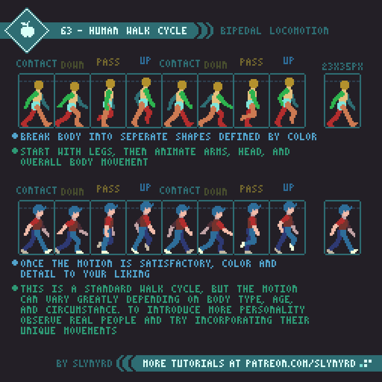
I present a standard walk cycle here with some exaggeration to help illustrate the subtle mechanics of the motion. Start by making a figure with the body parts clearly defined by color. It’s much easier if you animate one section at a time for all frames. Animate the legs first, then the arms, head, and overall body movement. Take careful note of the position of all the body parts in every frame.

Once the animation is satisfactory you can color and add details. The more detailed the design, the more difficult it will be to keep the movement clean. I recommend keeping your characters simple, especially if you are new to frame animation.

This is a standard walk cycle, but the motion can vary greatly depending on body type, age, and circumstances. To introduce more personality, observe real people and try incorporating their unique movements into the animation. For example, a carefree child marches with pride, the elderly shuffle slowly with hunched backs, the drunk sway and stumble, and so on.

Dog Walk

Quadrupeds are animals that walk on 4 legs. While they exhibit some of the same mechanics seen in bipedal locomotion, the additional set of legs further complicates things. You should have a firm grasp of 2 legged walk cycles before attempting to animate a 4 legged walk.

64-Dog_Walk_2.gif

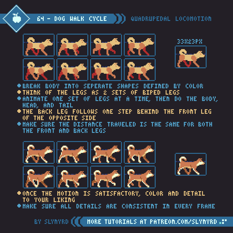
I chose Shiba Inu, to illustrate quadrupedal locomotion. I’ve never owned one, but surely they’re the cutest!

Same as the human, break the anatomy down into separate body parts defined by flat colors. Think of the legs as 2 sets of biped legs. The bone structure is different than a human but the principle stepping motion is very similar. Animate one set of legs at a time, then do the body, head, and tail.

Observe how the back leg follows one step behind the front leg of the opposite side. Make sure the distance traveled is the same for both the front and back legs, or the body will appear to stretch and contract like an accordion.

Pay close attention to every body part in every frame and make sure the energy of the motion is consistent throughout. The up down motion of the back pelvis and front shoulders undulate with opposite but equal motion, creating a balanced rhythm across the back.

When dogs and other quadrupeds begin to run they actually bound, with the right and left legs working more in parallel. I’ve done one personal study of a bounding dog before and hope to cover it in a later lesson.

Bird Flight

Now you’re probably tired of all those legs, so let’s lighten things up and take to the sky with some simple wing motion.

65-Bird_Flap.gif

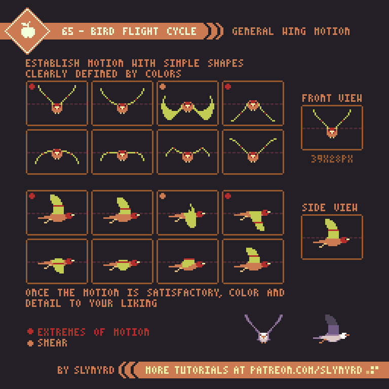
I modeled this example after medium sized sea birds, which can provide a template for many bird species and winged creatures.

As with the previous studies, establish the motion with simple shapes made of flat colors. From the front view my wings are simply a wireframe. Make sure to mark the joint placement on the wings. This helps prevent the wings from looking too rubbery by providing a clear folding point.

I went with 8 frames to stay consistent with the other studies and to clearly describe the full arch of motion, however, I think a convincing wing motion can be done with a few less frames. The extremes of motion are keyframes. so you should start with these. then do the smear and take it from there.

Start with the front view before attempting the side view. Animate only the wings first, then add the overall bobbing motion last.

Once the motion is satisfactory, you can color and add details. Notice how I thickened up parts of the wings and added visible tail feathers in my finished version of the front view.

FINAL THOUGHTS

I use a fairly realistic style with some degree of exaggeration for these studies in order to best illustrate the basics of the motion. If I were making sprites for a game I would go for more stylized designs with personality, and possibly with less frames.

In order to develop animation skills one must learn to keenly observe the world around them and the manner in which all things move. However, without tangible practice it’s hard to make those senses kick on. Once you actually go through the exercises you’ll suddenly start noticing all kinds of little nuances of movement in real life. But it won’t stick if you don’t keep practicing. Animation requires a lot of repetitive practice on a regular basis. At least it does for me. So I’ll try my best to keep on practicing and sharing the fruits of my studies with you. Much more to learn!

RESOURCES

Was this article helpful? If you find value in my content please consider becoming a Patron. Among many other rewards, Pixel Insider members get extra resources to compliment my tutorials. But most importantly, you allow me to continue making new content. 

Assets featured in this Pixelblog are available in Anatomy & Animation Assets Pack.

Source file used in the making of this Pixelblog is available in Tutorial 63 Source File

All contents of this lesson use my custom palette Mondo

Get caught up on all my downloads

If you're not ready to commit to the subscription model of Patreon, make a one-time donation and receive exclusive art and resources. Help continue the content by providing me a living. Thank you! 

Pixelblog - 24 - Items by Raymond Schlitter

Intro

Items come in various forms and are used in almost every video game. Often they are found scattered throughout the game world and picked up by the player. Many games also feature inventory systems and the ability to purchase and sell items. Considering the prevalent use of items in video games, clearly depicting them with proficiency is surely a valuable skill for pixel artists. In this lesson I will cover some of the most common items that appear in video games and how to bring them to life with simple animations.

Common ITEMS

Hearts, gems, coins, fruit, and an assortment of common game goodies! Use this reference to help inspire your item creation.

60-Item_Reference_Simple.png

For this reference I used a 16x16 pixel limitation, side-view projection, and every item has about 6 colors or less. The size of your items should be determined by what looks good in relation to your character and the environment. For example, If your environment is made out of 16x16px tiles, then 16x16px should be the perfect relative size of the items, as they will fit nicely into the level designs.

I kept the style fairly generic without an obvious theme to make the reference more universal, however, you should stylize your items to best fit your game. Whatever the style, make sure it’s consistent and the items feel like part of the same universe. For example, I probably wouldn’t have skeleton keys and key cards in the same game, but you never know. Also, make sure the projection is consistent. If your game is top-down these items would probably look out of place and need to be titled forward a bit.

I encourage you to make your own unique items, just be careful to make them understandable to the player. Gamers are accustomed to these common items and have a pretty good idea of what they might do, but unique items require more effort from the player to learn.

Idle Animations

Items that are picked up in the playing field sometimes need a little idle animation to stand out as an item, or just to give them some life.

61-Idle_2.gif

Idle animations should be simple and non-distracting. Some idles suit certain items better than others. For example, shine animation might look odd on food items. Furthermore, rotation animation is overly complex to make for anything but the simplest items. Bounce animation makes sense for items setting on the ground, while bob works best for floating items. However you choose to animate your items, it should be consistent across the board. It might be okay to use different idles for different items in some cases, but it should be a consistent system. For example, currency items shine, while power ups bob. Some games use both floating items and items that sit on the ground. In that case there could be a general rule that floating items bob and ground items bounce. It’s also possible to combine animation concepts, like shine plus bob. Just be careful it doesn’t become too noisy and detract from the readability of the item.

FEEDBACK ANIMATION

Visual feedback from item collection makes picking up items more satisfying, but it also provides a function. The function is to inform the player of the effect of the item, and to emphasize when you’ve picked up an item with more clarity, which is especially important in visually busy games with lots of action.

62-Feedback_Small.gif

This illustrates several examples of item feedback in the traditional arcade context, where the item takes effect by simply touching it with your character. In the case of currency, or non consumable items, the feedback animation plays in the spot of the item. On the other hand, items that do have an effect follow you and play on top the character sprite. This isn’t a rule, but it sure feels intuitive to me.

These are simple ideas that can be translated to all kinds of games. The sparkle animation works well as a generic effect for currency, or non consumable items. Since it’s likely you’ll see this effect a lot, I recommend making a few different small sparkle animations and combining them with some randomization.

The power up animation can be used for all kinds of items that increase your stats in some way. A simple color swap and the same animation could be reused for various items.

The HP up animation shows a bit more unique example of feedback animation. Furthermore, It’s possible to make all kinds of creative feedback, but foremost, make sure it helps inform the effect of the item without eccessive noise. As always, consistency is also important. Make sure all feedback has a similar balance and style. The more important or beneficial the item, the more special the feedback can be.

While I illustrate feedback in the context of a traditional side-scroller, it can and should be implemented in all kinds of games. Feedback on top the character is always good as you are sure to see it, but it could also be applied to UI elements, such as a life bar or profile pick. Some games where you don’t even see your character still have feedback by overlaying colors and effects on the screen. Needless to say, item feedback is important information.

TItan_Feedback_2.gif

Above is a montage of the various feedback animations featured in Hyper Echelon. Notice how they are all unique but have consistent style and the same radial flash appears in all of them.

FINAL THOUGHTS

Whenever beginner pixel artists ask me to assign them homework to help them get started, I usually suggest they draw small items with few colors. This allows them to practice the fundamentals without being overwhelmed. What’s more, they get the satisfaction of making a complete asset that could potentially be used in a game. Games aside, the ability to reduce objects into easily recognizable iconic images is a valuable skill for any artist, especially when working under the limitations of pixel art. So have fun making items until your heart’s content. Although small, the skills to make something epic can be achieved through humble item making.

Work through the backlog of Pixelblogs for more fundamentals on pixeling. In particular Pixelblog - 6 - Lighting, and Pixelblog - 21 - Top Down Objects contain relevant content. Also, if you want to make a simple animated character like in my example, check out Pixelblog - 8 - Intro to Animation.

RESOURCES

Was this article helpful? If you find value in my content please consider becoming a Patron. Among many other rewards, Pixel Insider members get extra resources to compliment my tutorials. But most importantly, you allow me to continue making new content. 

Assets featured in this Pixelblog are available in Items Assets Pack.

Source file used in the making of this Pixelblog is available in Tutorial 62 Source File

All contents of this lesson use my custom palette Mondo

Get caught up on all my downloads

If you're not ready to commit to the subscription model of Patreon, make a one-time donation and receive exclusive art and resources. Help continue the content by providing me a living. Thank you! 

Pixelblog - 23 - Parallax Scrolling by Raymond Schlitter

Intro

Parallax scrolling is a technique used with 2D art where background images move slower than foreground images to capture a sense of depth. Just by applying motion, a scene can immerse you in an endless landscape and tell grand stories. In this lesson I will focus on how to make stand alone parallax animation loops with pixel perfect motion. Furthermore, I will detail my personal technique using Photoshop, which can also be translated into various pixel art apps that allow animation.

Desert.gif

The first thing to consider is the scene you want to animate. Parallax scrolling is well suited for layered scenes that exhibit atmospheric perspective, such as landscape scenery. Parallax will enhance the sense of depth but it may not be convincing if your scene doesn’t already convey depth when static. For more about making landscape scenes with atmospheric perspective, check out Pixelblog 11.

58-Parallax_Reference.gif

Of course, clouds are always a great subject to parallax. I recommend starting with something simple, like clouds or stars to practice on the execution of the animation before attempting complex scenery. Since you need very long or tall images to run across the canvas, it’s best to make images that can loop at the seams of the canvas, and repeat them. The drawback is some layers can look monotonous when repeated many times in the loop. Balanced layers without dominant points of interest help hide the loop.

Pixel Perfect Movement

Pixel perfect movement is movement that only moves in increments of pixel units. Pixel art is created at 1x resolution (one pixel unit equals one pixel on screen) and usually animated on the same scale. It’s possible to upscale pixel art assets and give them smooth sub-pixel movement in a game engine or animation software, but fundamentally speaking, you can’t move a half pixel.

With movement being strictly tied to whole pixel increments, the pixel dimensions of the canvas become critical. For movement to be smooth and steady the scroll rate should be the same amount of pixels each frame. To do so, the pixels moved per frame must divide into the dimension of the canvas the motion runs along, so choose an even value that divides into many whole numbers.

59-Parallax_Perfect.gif

The canvas in my example is 96 pixels wide, which can divide by 1,2,3,4,6,8,12,16,24,32,48. This is a good size as it gives a lot of options for perfect scroll rates, and you can see the jumps between the increments follows a consistent upward curve, which will result in natural jumps in speed between layers.

Before you get too far along it’s good to test out the motion of your layers to make sure the relative speed feels appropriate for the perceived depth of the image. Generally, I start with my furthest background layer scrolling at 1 pixel per frame, and each layer that gets closer to the viewer scrolls at the next faster perfect rate. Sometimes when I want movement slower than 1 pixel per frame I do 1 pixel per 2 frames, which requires the image to repeat twice on the same screen, as it only travels halfway across the canvas throughout the loop. However, I try to avoid slower than 1 pixel per frame, as the motion can look a bit jittery.

Made in Photoshop

Now I’ll take you through my process to animate parallax scenes in Photoshop, using the frame animation tools. Frame animation in Photoshop is pretty bare bones, but it always gets the job done. With proper planning and organization, I’ve managed to create a number of complex animated scenes with it. There’s something deeply satisfying and almost hypnotic about creating the perfect animation loop under the limitations of frame animated pixel art.

Screen Shot 2019-11-16 at 2.13.33 PM.png

First I choose my canvas size(96x56px) and create my scene out of several layers.

Screen Shot 2019-11-16 at 2.26.13 PM.png

As soon as the final image size is established I like to extend the canvas width by a large even amount of pixels just to make plenty of room to work with. Image-Canvas Size (⌥⌘C). The anchor point stays centered.

Screen Shot 2019-11-16 at 8.59.34 PM.png

Now I can make sure my images connect and see how they look when repeated.

Screen-Shot-2019-11-16-at-2.28.00-PM.jpg

Once I’m satisfied with the composition I make a guide that measures screen widths on a new layer. I number the increments that divide into final image width(96px). The guide is made long enough to accommodate the fastest moving layer.

Screen-Shot-2019-11-16-at-2.28.51-PM.jpg

Using the guide I loop out each layer by screen widths. The number of repeat screen widths will equal to the number of pixels moved each frame when animated.

Timeline.gif

After extending all my layers I turn on the Timeline to animate (Window-Timeline). Then click in the bottom left to covert to frame animation.

Frame_delay_2.gif

I set the frame delay before I make more frames. The frame delay determines the playback speed of the animation. Clicking on Other… allows me to set a custom delay for much faster playback. I set it to 0.08s in this example.

New_Frame_2.gif

I add one new frame in the timeline, which creates a duplicate of the previous frame.

Screen-Shot-2019-11-16-at-2.28.51-PM.jpg

Frame 1 still looks like this.

Screen-Shot-2019-11-16-at-2.43.50-PM.jpg

In frame 2, I slide each layer to the left the distance of how many repeat screen widths it has, coming all the way to the right edge of the static background. With the start and end point of my animation set I can turn off the guide layer.

tween_motion.gif

Next, I select both frames and click on the Tween command.

Screen Shot 2019-11-16 at 2.40.31 PM.png

The Tween command adds frames between two existing frames and interpolates any change in position, opacity, and layer effects. In this case, it will automate the movement of my layers between frame 1 and 2 with however many frames I specify. I want my total frame count to match the pixel width of the final canvas size of 96px. Since the centered image in frame 2 is the same image as frame 1, this layer will be trashed after I tween. Therefore, the number of frames added is the final canvas width -1. So in this case, I add 95 frames.

Trash_Frame.gif

This results in 1 extra frame at the end, which needs to be deleted to make a seamless loop.

Screen Shot 2019-11-16 at 2.42.37 PM.png

After I’ve tweened the motion I set my canvas size back to the final desired width of 96px. Adjusting the canvas to a smaller size masks the data that is off the screen, so I can always go back to the wide canvas and everything will still be there.

Parallax_No_Car.gif

Boom. The movement of each layer is consistent in every frame, and the loop is perfect.

Screen-Shot-2019-11-16-at-7.17.06-PM.png

After I’ve animated my parallax background I can go back and add details, like an interesting subject that moves with the camera. In order to keep the complete animation a perfect loop, any constant looping animation that is added to the parallax must loop in a number of frames that divides into the total number of frames. In this example, I add a car that animates in a 4 frame loop. To add the car I create each state of the animation on a separate layer. I then have to go through all the frames 1 to 96, and cycle the visible layer to animate it. This step can be tedious if the animation has many frames, but is made much easier by assigning keyboard short cuts for Go To> Next Frame, and Go To> previous frame.

Screen-Shot-2019-11-16-at-7.03.31-PM.png

To save my animation as a gif I use Save For Web (File-Export-Save For Web ⌥⌘⇧S). This brings up a panel with several options. In the top right I set the file type to GIF in the second drop down. The settings for the selected file type is optimized by default but can be further tweaked if needed. In the bottom right I can choose the size if I want to upscale. For pixel art the size should be scaled only by multiples of 100% and the quality set to nearest neighbor. Also, I make sure the looping options is set to forever to make the gif endlessly loop.

When working in Photoshop the playback speed of the timeline can be quite laggy, which makes it hard to see what the animation actually looks like. To work around this I frequently export it as a gif and jump to it in the finder to preview it in real time speed.

Intro_Parallax.gif

Let’s go road trippin’ forever. Feel that parallax pull you in.

Key Points

  • Parallax scrolling is well suited for layered scenes that exhibit atmospheric perspective, such as landscape scenery

  • Screen width = total number of frames in loop - choose even value that divides into many whole numbers.

  • Make image loops on edges of the canvas so you can repeat the image to extend it

  • Times image repeats = pixel movement per frame (scroll rate)

  • Balanced layers without dominant points of interest help hide the repeating images

  • Any constant looping animation that is added to the parallax must loop in a number of frames that divides into the total number of frames

  • Animate with software that can tween the motion between the start and end point of the loop

  • If done correctly the scroll rate of every layer should be the same every frame, and the animation should loop seamlessly

Final Thoughts

There’s something about turning a static scene into an endless expanse that feels like magic. I started using this technique in the early days of my pixel art journey, but my proficiency and execution has greatly improved over the years. So I think even beginners can try this tutorial and learn through practice. The animation is actually a piece of cake. Making quality art with depth and balance is the main challenge of creating an attractive loop. Plan well and don’t rush the art. However, it’s good to do motion tests before spending too much time on your art, especially if you don’t have a good feel for the speed of pixel movement. Happy parallaxing my friends!

Resources

Was this article helpful? If you find value in my content please consider becoming a Patron. Among many other rewards, Patrons can download resources to compliment my tutorials. But most importantly, you allow me to continue making new content. 

Assets featured in this Pixelblog are available in Parallax Scrolling Assets Pack

Source files used in the making of this Pixelblog are available in Parallax Scrolling Source Files

Get caught up on all my downloads

If you're not ready to commit to the subscription model of Patreon, make a one-time donation and receive exclusive art and resources. Help continue the content by providing me a living. Thank you! 

-By Raymond Schlitter

Pixelblog - 22 - Top Down Character Sprites by Raymond Schlitter

Intro

Welcome back to the charming world of top down pixel art. In the previous 2 Pixelblogs we covered basic ground tiles, and various environment objects. Now, in the 3rd part of the top down series we’ll bring the world to life with fully animated character sprites.

Title_Image.png

Character sprite Process

In order to animate a top down character you will need to represent the sprite in at least 4 directions. Unless you’re using dramatic directional lighting, or your character has an asymmetrical design you wish to accurately display based on orientation, the side facing version can simply be reflected for right and left movement. Therefore, our first goal is to create a character facing in 3 directions of the screen; up, down, and to the side.

54-Character_Sprite_2.png

Before you jump into character design it’s important to establish the sprite size, as the size of your characters can strongly affect the look and feel of your game. Generally, tile size is the best gauge for determining sprite size. As shown in the lower section of the above tutorial, relative sprite size usually conforms to a tile unit, or multiples of the tile unit. The height and width can multiply independently. For example, 1 tile wide by 2 tiles tall is one of the most common sprite sizes, and is the size I’ve chosen for my example.

Basing the character size on tile units allows the sprite to naturally fit in the grid-like structure of the tile based world, with simple collision bounds also defined by tile units. While modern tools allow one to break the grid and create sprites and environments of arbitrary size, the snug logic of the grid-based approach is still common convention.

Note, the frame of the sprite size is relative and the character doesn’t have to completely fill it edge to edge. However, you don’t want there to be too much empty space around your character, as to avoid pronounced gaps with adjacent sprites and parts of the environment with collision. Conversely, pixels spilling out of the frame may lead to unwanted overlap. With the top down viewpoint there is implied depth along the Y axis, as we assume objects lower on the screen are closer. Therefore, it looks perfectly natural and improves the sense of depth to allow the top half of a 2 tile high sprite to overlap sprites that are just a bit higher on the screen. However, overlap along the X axis is arbitrary and confusing to the eye.

Walk and Run Animations

Once you have created the idle position of the sprite facing 3 directions you can begin creating a walk/run animation. It’s best to keep the sprite very basic at this point and add details after you are satisfied with the motion.

Animation_Dummy.png

I often establish the animation with a dummy sprite composed of clearly defined solid color body parts like the above image. In this case, since the sprite is quite small and some of the lighting details effect the appearance of the motion, I skipped the dummy step and straight up animated the details on the first pass. However, I recommend always starting with a dummy, especially if you are working with larger more detailed sprites.

55-Walk_Run_2.gif

While my walk cycle is 4 frames and the run cycle is 8, you don’t really need to create that many unique poses. The walk cycle borrows all its frames from the run cycle, but simply omits the frames where the character is in full stride, and the playback speed is slower. The frames with the arms swinging can simply be reflected for the up and down facing versions.

Once you are satisfied with the animation you can use these frames as the base for all characters in your game with similar proportions. I suggest starting with a basic nude, which you can easily build off and accessorize.

Although we only have the sprite in 4 directions, you can still implement 8 direction movement and it will look acceptable when any of the 4 directions veer off at an angle. Applying 4 directions to 8 directional movement was common practice with many 16-bit games and still looks good to me. Secret of Mana, and A Link to the Past, are a couple examples that come to mind. But if you want to get fancy, you can try adding the 4 angles. I think the absence of the angles only becomes jarring if the sprite is large and detailed.

Character Sprite Reference

After you have created a base model for a character sprite, the real fun of designing unique characters can begin.

56-Example_Characters.png

As a basic proportion guide, I created various heights to distinguish between male, female, young, and elderly. Of course, there can be exceptions, and I permit some wiggle room for slight variation in height between the same types. However, when working with such limited information, I find it best to stick to a system and not challenge the player’s expectations too much. Remember, the part of the sprite in the upper half of the frame can overlap sprites, so no need to worry about the empty space at the top of the frame.

The smaller the sprite the more condensed and abstracted the proportions tend to become. When working with limited size the head usually takes up a third to half of the total sprite. This is to emphasize the expressive features of the character, which helps the player form an emotional connection to the characters. Going for realistic proportions at such a small size will result in a stick figure, which can be an interesting style, but lacks personality. While a small canvas seems to allow little room for stylistic choice, there is always potential for creativity. I challenge you to create your own unique style of characters.

House

Wherever you have people, you are sure to find dwellings. I just couldn’t help myself, and had to make a bonus tutorial for creating a house!

57-House.gif

The size of the house is also based on tile units, so it logically fits into the game world with no odd gaps or unwanted overlap. Furthermore, it could be broken into tiles and expanded into different structures by adding various filler and connection tiles. For now, it’s just one large sprite.

The scale of buildings in top down games is often shrunk in relation to the characters, appearing tiny on the outside, then magically become spacious when you step inside. This partly originates from technical limitations, but also makes navigating a village much more practical, especially if the game doesn’t have a run feature. While it’s still an acceptable convention and has a certain charm, I like my buildings to at least have a believable scale in relation to the character sprites. Once you go inside, it’s still perfectly acceptable to expand the layout of the building.

Screen Size

The screen size/native resolution of your game should be established in the early stages of development, as it can strongly affect aesthetics and gameplay. When working with pixel art it’s especially important to pick a screen size that can perfectly scale to fit common displays and remain pixel perfect. 1920x1080p is one the most common display resolutions, and many displays have a 16:9 ratio. Therefore, the basic guideline I use is to make sure your native resolution perfectly multiplies into 1920x1080. However, you should also consider other common displays, such as 1366x768.

480x270px native resolution feels just right for this mockup.

480x270px native resolution feels just right for this mockup.

In order to preserve the pixel art aesthetic there’s a limited range of acceptable resolutions. Too high resolution and it no longer appears as pixel art. Too low resolution and it becomes abstract blocks. This leaves us with a handful of acceptable options that perfectly scale into 1920x1080, and closely fit other common displays.

320x180(6x) Quite chunky when viewed on a large display but still an acceptable retro look
480x270(4x) A good fit for my top down mockup made with 16x16px tiles
640x360(3x) This is the resolution of the shmup I’m making, Thyrian Defenders

Of course, your resolution is not limited to these options. There are complex scaling solutions that allow other sizes to display with a pixel perfect look, but my technical knowledge is very limited on the matter. If you choose an arbitrary resolution your game may not be able to display pixel perfect at full screen, leaving borders around the play area. However, I find this more acceptable than distorting the pixel units in order to fill the entire screen.

When choosing a size It’s important to consider the relative size you want your sprites to appear on screen and how this may affect gameplay. The higher the resolution the smaller the pixel units become, or more zoomed out everything will appear. Therefore, the higher resolutions might be a good fit for something with fast scrolling, and fast moving sprites. If you’re going for something less twitchy, or simply want a retro look, perhaps you want to try one of the lower resolutions. Ultimately, screen size is something you should mock up and test for yourself before deciding on.

Final Thoughts

Well, this is the 3rd and final part of my multi-part series on top down subjects. From the start, I had a general plan with the intention of creating a cohesive game world with lessons that build upon each other. Honestly, I wasn’t quite sure what I would end up with when all I had were grass and dirt tiles, but with each lesson the world grew more lively. Now, it’s starting to feel like a real game, and I almost wish it was. I hope you have learned much on this journey with me. I know I have. Although it’s a bit sad, I’ll move on to a new subject in the next Pixelblog, but I don’t think you’ve seen the last of this world. There’s still plenty of opportunity to expand this world with new lessons on top down subjects.

RESOURCES

Was this article helpful? If you find value in my content please consider becoming a Patreon member. Among many other rewards, Pixel Insider members get extra resources to compliment my tutorials. But most importantly, you allow me to continue making new content. 

Assets featured in this Pixelblog are available in Top Down RPG Starter Assets Pack

Source file used in the making of this Pixelblog is available in Tutorial 55 Source File

Get caught up on all my downloads

If you're not ready to commit to the subscription model of Patreon, make a one-time donation and receive exclusive art and resources. Help continue the content by providing me a living. Thank you! 

-By Raymond Schlitter

Pixelblog - 21 - Top Down Objects by Raymond Schlitter

Intro

In Pixelblog 20 I introduced the fundamentals of making tiles with various 16x16 pixel grass and dirt textures from a 3/4 top down projection. Now I will continue developing the environment with some natural, and man made objects. Since the base ground is made of 16x16 tiles it’s important to consider how the objects will fit onto the tilemap. In this case, I break my objects down into 16x16 tiles so they can easily be used in a tile editor and laid out in a logical manner.

Title_Image_Edit.png

Tree

Of course, we’ve gotta have trees. A grassy environment without trees just feels lonely. So let’s get to it and spring up some green darlings!

51-Tree.gif

The ball shape design is a cute approach, but more importantly, simple shapes with symmetrical balance create visual stability, fit together nicely onto the tilemap, and look good when used in repetition. Furthermore, they can be placed in staggered overlapping rows to create a solid forest pattern with no odd gaps or noisy pixels. To keep the asset feeling fresh, try a simple color swap here and there. A more unique, asymmetrically shaped tree looks good when used sparingly to create a point of interest, but will look odd if often repeated on the same screen. This is a general rule for any kind of objects used in repetition.

Using simple shapes and visual symmetry, a pleasing canopy of dense forest can be made with a single base asset.

Using simple shapes and visual symmetry, a pleasing canopy of dense forest can be made with a single base asset.

Rocks

Well, we have grass, dirt, and trees. What next? You guessed it, rocks of course!

52_Rocks_2.gif

This approach exhibits a blocking technique, which is basically throwing down the basic shapes with solid colors and progressively refining the details as you introduce more colors. I usually use this technique if the sprite is not very big(low res). However, for larger sprites that are especially angular I sometimes start with an outline approach.

When designing your rocks it’s good to think about the geology of the area and what type of rocks you would realistically find in the environment. I imagine my rocks are some kind of limestone found in a prairie land. Moreover, I use warm colored blocky forms with a hint of smoothness, as these sedimentary rocks are susceptible to erosion and oxidization. Whatever the style of rock they will often share some of the same, or very closely related hues found in the dirt. Otherwise they are likely to look out of place. For more about rocks check out Pixelblog 13.

Man Made Objects

No matter what the environment, it seems treasure chests just seem to pop up out of no where. Curious, isn’t it? May as well cover some other common man made objects while we’re at it. I’m sure a village can’t be far away.

53_Man_Made_Objects.png

Here are some common man made objects you often find scattered around human settlements in top down rpgs. All except the large treasure chest snuggly fit into a 16x16 tile. This makes it so they can be cleanly placed on the tilemap, and fit together nicely when used in repetition. The large treasure chest is a bit irregular, sort of half filling a 32x32 space. However, in this case I think it’s okay, as it would be a rare object, usually placed off on it’s own.

Due to the precise geometry of man made objects the consistency of the sense of perspective is especially apparent. Make sure all your objects adhere to the same projection rules. For more about graphical projection, and 3/4 top down in particular, check out Pixelblog 3.

Cast Shadows

Shadows.png

Cast shadows help make objects feel like they actually connect with the ground. It’s best to keep them subtle and not cast out long in any particular direction, as to minimize conflicts with overlapping adjacent tiles. In some cases where the shadow can easily be contained within the frame of the sprite, such as my tree, it’s okay to bake the shadow into the same asset. However, in most cases I make the shadows on separate tiles and place them on a different layer than the sprites. This allows me to just have one base sprite, and create shadows for different surfaces as I need them.

Final Thoughts

After creating the base ground tiles in the previous blog the real fun is just beginning. It can be tedious at first, but once you start to develop a substantial set of assets it becomes addictive to create tiled environments. I find myself wanting to flesh out this world with more and more assets! In the next Pixelblog, this world will truly come to life with the introduction of character assets.

RESOURCES

Was this article helpful? If you find value in my content please consider becoming a Patreon member. Among many other rewards, Pixel Insider members get extra resources to compliment my tutorials. But most importantly, you allow me to continue making new content. 

Assets featured in this Pixelblog are available in Top Down RPG Starter Assets Pack

Source files used in the making of this Pixelblog are available in Basic Nature Source Files

Get caught up on all my downloads

If you're not ready to commit to the subscription model of Patreon, make a one-time donation and receive exclusive art and resources. Help continue the content by providing me a living. Thank you! 

-By Raymond Schlitter

Pixelblog - 20 - Top Down Tiles by Raymond Schlitter

Intro

Like most pixel art inventions, tiles are a product of limitation. Back in the day when computers had very little memory, developers were able to cleverly fill the screen with animated graphics by breaking everything into small square images that can be repeated and seamlessly fit together in various combinations. Constructed in a grid, these small squares are referred to as tiles for obvious reasons. Tiles can not only greatly reduce memory costs, but also the time it takes to create art for levels. Additionally, the precise structure of tile-based environments provides a logical base to map gameplay onto. When done well, tiles create a consistent aesthetic that marries perfectly with pixel art. Even with the powerful computers and art creation tools of today, the tradition of tile-based graphics remains strong.

This is the first of several lessons that build upon each other as I create the assets for a cohesive top down game world. In this lesson I focus on several different 16x16px tiles from a top down 3/4 projection. I think this is a good place to start with tile making, as the small tiles can be edited easily, and complete scenes can be made without a need for background tiles.

Title_Image.png

While tile-based graphics may be described as an economical approach, don’t let that fool you into thinking it’s easy to make tiles. Tile making is a precise art form that requires supreme attention to detail. Although part of the charming aesthetic can be attributed to repetition, you don’t want the tiles to be too obvious. The trick is in trying to hide the patterns within consistent non-distracting textures.

Grass Tiles

The good ol’ grass tile. This is where the grand journey begins. It may appear simple, but a perfectly balanced grass pattern that looks good tiled over a large area is difficult to achieve in so few pixels.

48-Grass_Tiles.gif

Ultimately, a grass texture made up of only one tile becomes monotonous, no matter how awesome the tile is. I find it works well to mix in spaces of flat green with textured areas of differing vegetation density, which can create visually pleasing gradations. The variation feels natural, while the negative space helps reduce noise and lets the environment breath. Don’t forget occasional flower variants to add a splash of life.

Grass_Sample.png

Dirt Tiles

Where there is grass there is surely dirt. Let’s dig in!

49-Dirt_Tiles.gif

Most likely you’ll want to combine grass and dirt tiles. In that case, it’s important to think about what style will mix well with your grass tiles. Dry and cracked, muddy slop, flat clay; dirt comes in many different consistencies and colors. It doesn’t hurt to consider the geology of your environment.

Connection Tiles

Now we are going to gracefully merge the grass and dirt tiles into a set of connection tiles. I bet you can hardly contain your excitement!

50-Grass_Dirt_Connection_Tiles_2.gif

I decided to combine the dry dirt texture with a simple green grass, as the busy dirt pattern contrasts well with the more airy grass texture. However, there is no right or wrong. Play around with different combinations of textures and style of grass edging. Once you have grass tiles, dirt tiles, and a set of connection tiles, the real fun of arranging the tiles into level maps can begin! Well, it’s still a bit simple for a game level, but at least you can create an interesting base ground to begin building a world on. More to come in the next lesson!

Key points

Balance - Strive to achieve a homogenous distribution of visual weight within a tile. If any area of the tile has a visual dominance the pattern will become too obvious. Include clusters that overlap the edges and loop around the tile to help hide the seems.

Consistency - Define key clusters and shapes and repeat them in several cases to create a pleasing consistency. Avoid touching key clusters with other key clusters, as they clump into different irregular clusters and create noise. Touching corner to corner is okay.

Limit colors - You only need a few colors to make a rich texture. Too many colors and the texture will become blurry. Also, strong contrasting colors in the case of a texture pattern may result in displeasing noise.

Contrast - Consider contrast when combining different textures in the same environment. A busy texture next to another busy texture may exhaust the eyes with too much noise. Negative space is your friend.

Reflect - Often tiles can simply be mirrored to create tiles of different orientation. This saves time, and the symmetry creates a pleasing consistent look.

Resolution - You can make tiles any size you want, but the larger the more laborious. Anything over 32x32px seems like overkill for pixel art. 16x16px is probably the most common size and is sure to do your pixels justice.

Software

In order to proficiently make tiles, it’s essential that you can see how the seems are connecting in real time. Some software lacks this feature, while some does it better than others. Here’s a bit of info on making tiles in the programs I’m familiar with.

Pyxel Edit

I purchased this program for the purpose of making tiles, as it’s specifically designed to make the process easier. For the most part it does just that by allowing you to create and save tiles into an atlas, which can then be stamped onto a tile map. You can edit any placed tiles and it will update them all in real time, allowing you to easily refine tiles while building scenes.

Pyxel_Edit_Screen.png

Everything is pretty straight forward and easy to learn with this program, thanks to the clean ui with helpful hover hints. To make a new tile click the + button in the tile window. Place as many of the tile on the canvas as you want with the tile placer tool(a), then draw on any of those tiles and watch them all fill in. Press the tab key to show what tiles are placed where so you don’t lose track of where you placed blank tiles. This is important, as you can also draw freely on any layer without using tiles.

Aseprite

I haven’t used this program much for tiles but it seems to offer a reasonable workflow. A full on tile editor is reported to be in the works. I will definitely give it a spin when it comes out.

Aseprite_Screen_3.png

For now, the most handy feature is ‘Tiled Mode.’ Start with a small canvas exactly the size of the tile you want to make. Then, turn on ‘Tiled Mode’ under ‘View’ in the menu bar and choose the axis to have the image tiled.

Tiled_Mode.png
Aseprite_Screen_2.png

Now you can see how your image tiles and anything you draw will live update in all the cells. Easy peasy tile making in just a few clicks!

Photoshop

I use Photoshop for just about everything, except making tiles. However, if you take the time to customize your setup and implement a few tricks, it becomes a reasonable process.

Photoshop_Screen_1_1.png

For general workflow, make each tile on its own layer and organize your finished tiles in a separate project file off to the side, which can then be used as a tile atlas.

Photoshop_Screen_2.png

The pattern fill function can be useful for tile creation. Select the area you want to turn into a pattern, then choose ‘Define Pattern’ under ‘Edit’ in the menu bar. Name your pattern in the following prompt.

Photoshop_Screen_3.png

Once you have a pattern saved, select an area on the canvas you want to fill with the pattern, then choose ‘Fill’ under ‘Edit’ in the menu bar.

Photoshop_Screen_4.png

Choose ‘Pattern’ in the fill options window.

Photoshop_Screen_5.png

Choose your pattern and select ‘OK.’ Your pattern will then automatically tile itself to fill the area you selected on the canvas.

Photoshop_Screen_6.png

While Photoshop doesn’t have a tiled mode or live update, smart objects provide a close alternative. To make a smart object, right click/control click on a layer and choose ‘Convert to Smart Object.’ In this case there should only be one tile on the layer. You don’t have to make a precise selection around the tile, just select the layer and convert it to a smart object.

Photoshop_Screen_7.png

After you convert the tile into a smart object you will notice a small document icon on the layer. Double click this icon or right click/control click the layer and choose ‘Edit Contents.’

Photoshop_Screen_8.png

The tile you converted to a smart object will then open in a separate file. You can now make edits in this window, and as soon as you save it (command S) the changes will appear in your main project that contains the smart object. So it’s almost like a live update, you just have to save every time you want to see the changes.

With any pixel art design and no matter what program you use, it’s very helpful to have a preview window open that displays the scene from a zoomed out view, allowing you to see how it appears from a normal viewing distance while staying focused in on a specific tile/area. Basically, it cuts out the need to constantly zoom in and out.

I normally don’t place much importance on software, but when it comes to tile making it can make all the difference. Personally, I struggled a lot with tiles until I started using Pyxel Edit. However, I only use it for tiles and prefer Photoshop for just about everything else. End the end, use what you got, what you can afford. There’s always a way.

FINAL THOUGHTS

Honestly, this was one of the most challenging tutorials for me to put together, but I’m so glad I did it. Much was learned in the process. I hope these tutorials and tips help you on your way to becoming a tile master. I intend to continue the lesson in the next Pixelblog with more top down environment objects, and eventually create an animated top down character. Stay tuned as I flesh out this world and pass on the knowledge and assets.

Just a tease of what’s to come…

Just a tease of what’s to come…

RESOURCES

Was this article helpful? If you find value in my content please consider becoming a Patreon member. Among many other rewards, Pixel Insider members get extra resources to compliment my tutorials. But most importantly, you allow me to continue making new content. 

Assets featured in this Pixelblog are avialable in Top Down RPG Starter Assets Pack

Source files used in the making of this Pixelblog are available in Top Down Grass Dirt Tiles Source Files

Get caught up on all my downloads

If you're not ready to commit to the subscription model of Patreon, make a one-time donation and receive exclusive art and resources. Help continue the content by providing me a living. Thank you! 

-By Raymond Schlitter

Pixelblog - 19 - Mecha Mania by Raymond Schlitter

Intro

It’s all about the giant robos! While the term mecha can encompass all things mechanical, It’s most often used to describe huge robots piloted by humans. Mecha can vary greatly in form and size but are most often humanoid, and quite large. Nowadays, with drone technology the idea of piloting a mechanical hulk seems quite impractical, but there’s no emotion without a human in the heart of the action. Furthermore, the idea is greatly celebrated in works of art and fiction. To become a mechanical giant sure has its appeal.

Title_Image.png

In this lesson I will focus on 3 different mecha designs, all presented in my favorite 3/4 side-view. I find this projection describes angular forms with clarity, and the illusion of depth captures a sense of weight. Therefore, a great way to present mecha in my geometric style. The level of detail in the following tutorials may be quite a challenge for beginners, however they build off concepts presented in several of my previous lessons. If you feel overwhelmed, I suggest reviewing Pixelblog 3, and Pixelblog 12.

Humanoid Mecha

45-Humanoid_Mecha.gif

The intuitive pairing between human form and machine provide the best overall tactical balance on the battlefield. A robust choice of projectile and melee weapons further enhance versatility.

Of course, I had to start off with a humanoid design, the most common representation of mecha. The human figure provides a sense of scale. If you want to make the robot feel larger, juxtapose with a smaller human, or vice versa for a smaller scale. However, in staying true to mecha tradition, it’s important to imagine a space for a pilot. As you can see from the cutaway diagram, the cockpit is already pretty cramped at this scale.

I like to save the paint job for last and use striping that wraps around the forms, further enhancing the sense of depth. Once a design is established you can play around with different poses, and try adding weapons. I rank this medium difficulty for pixeling, as well as piloting.

Tank Mecha

46-Tank_Mecha.gif

While the tank mecha lacks the mobility of the humanoid, the solid footing provided by tank tracks allows for heavy weaponry. A variety of side arms paired with the mega canon make this an offensive powerhouse!

You could swap out the side arms with a variety of weapons, or humanoid arms if you like. I went with a set of sidewinder missile launchers. No cutaway provided but I imagine there’s a nook in there for the pilot, cozied up next to that huge canon. I rank this easy for pixeling, also the preferred training machine for new pilots.

Scorpion Mecha

47-Scorpion_Mecha_2.gif

Combining the best of both worlds, the scorpion mecha provides high mobility and deadly firepower. The biggest downside in this particular model is the exposed cockpit leaves the pilot vulnerable. But at the same time it provides maximum visibility, and makes for a hard target.

This design was a bit too complex to break down all the details into animated steps. However, it follows the same principles shown in the humanoid and tank designs. I rank this hard for pixeling, and a bit of a wild ride that should only be piloted by a pro.

Final Thoughts

Well, that was fun! Surprisingly, I haven’t explored the world of mecha much in my pixel art, yet it’s a perfect fit. Definitely plan to do more in my art, possibly more tutorials, too! If you’re into it.

As always, I want to stress the importance of self discovery. Feel free to go off the rails whenever inspiration strikes. Try out your own paint jobs, weapons, and body parts. Most importantly, have fun!

RESOURCES

Was this article helpful? If you find value in my content please consider becoming a Patreon member. Among many other rewards, Pixel Insider members get extra resources to compliment my tutorials. But most importantly, you allow me to continue making new content. 

Assets featured in this Pixelblog are available in Mecha Mania Assets Pack

All assets in this feature use my custom palette Bright Future

Get caught up on all my downloads

If you're not ready to commit to the subscription model of Patreon, make a one-time donation and receive exclusive art and resources. Help continue the content by providing me a living. Thank you! 

-By Raymond Schlitter

Pixelblog - 18 - Age of Flight by Raymond Schlitter

Intro

Thanks to my dad’s experimental aircraft business, I was privileged to grow up around airplanes and spend a fair amount of time in the cockpit as a kid. It’s no wonder my art often features a variety of flying machines. In particular, I’ve always been fascinated with the Wright brothers and the early age of flight that ensued after they first took to the skies in 1903. So much innovation and fantastic looking contraptions in the form of biplanes, triplanes, and dirigibles.

Title_Image.png

Aircraft

Awkwardly large to be airborne, airships always have a fantasy aspect to them, even the ones in real life. If we didn’t have video documentation of the Zeppelins, and dirigibles used by the US Navy in the first half of the 20th century, I’d have a hard time believing they actually existed. Of course, we have modern day blimps, but they don’t capture the imagination like their hulking predecessors.

42-Airship.gif

Although most of those early dirigible designs crashed and burned in catastrophic fashion, their bold designs still capture our imagination and make us ask, what if? What if, they figured out how to make it safe and practical? Who knows what kind of contraptions would be in the skies today. Perhaps, explorers would have traded in their sales and fashioned dirigibles to their ships.

43-Biplane.gif

While airships proved to be too dangerous and costly, small airplanes took to the skies in droves. In the early days, the biplane, and even some triplanes dominated. With a great roll rate and slow stall speed, multi-wing designs were advantageous for the military operations of WWI. However, advances in materials and design would eventually give monoplanes the same advantages, without the extra drag and poor visibility. While modern day biplanes are still good for aerobatics, they’re more about nostalgia than performance.

My above biplane is based on the Fokker DVII, a German WWI plane. I economized some details to adapt to my pixel style, but it’s a fairly accurate representation.

ClouDscapes

The marvel of flight lofts our view into the skies, where we can not only see the earth from a new perspective, but also allows us to be amongst the ethereal beauty of cloudscapes. Here’s a quick reference of the main cloud types to help inspire your sky backgrounds.

44-Cloud_Types.png

Apparently, there are more than 100 specific cloud types, but all variations fit into these 10 main types. Some of these are hard to distinguish, with only altitude being the main difference.

Cumuls - Small puffy clouds with flat bottoms, found at low altitude. Spaced out enough to still be sunny.

Stratus - Low, flat, relatively featureless gray clouds that sometime come with light precipitation.

Stratocumulus - Low fluffy clouds, similar to cumulus, but darker and thicker with only patches of sky peering through.

Altocumulus - Common mid altitude that dot the sky in round heaps or sometimes parallel bands. The heaps are sometimes likened to sheep’s wool.

Nimbostratus - Low, gray clouds thick enough to blot out the sun, usually bringing heavy precipitation.

Altostratus - Mid altitude, thick flat clouds that blanket the sky in a gray haze, but the sun stills dimly shines through.

Cirrus - High altitude clouds that appear as thin white wispy strands, streaking across blue sky.

Cirrocumulus - Formed at high altitudes from ice droplets, and sometimes called cloudlets, these clouds appear in white patches, often arranged in rows.

Cirrostratus - High altitude, transparent, whitish clouds that are wispy like cirrus clouds but thicker. Light refraction caused by the ice crystals in the clouds often creates a halo around the sun.

Cumulonimbus - These are large towering clouds that span the low, middle, and high altitudes. They are flat and dark on the bottom, and mushroom into anvil shapes the top of the billowing towers. These are thunderstorm clouds and are sure to bring sever weather.

Final Thoughts

When I make step by step tutorials, I expect many will follow along pixel by pixel, but it is always my hope that some will discover something on there own along the way. In fact, I encourage you to iterate and modify at every step to really make a design of your own, simply using my direction as a foundation.

I hope you’ve enjoyed our little journey through the clouds. Personally, I can never get enough aircraft and clouds in my pixel art. It was difficult to narrow it down and focus on just a couple designs. Expect more aircraft related topics in the future!

RESOURCES

Was this article helpful? If you find value in my content please consider becoming a Patreon member. Among many other rewards, Pixel Insider members get extra resources to compliment my tutorials. But most importantly, you allow me to continue making new content. 

Assets featured in this Pixelblog are available in Age of Flight Assets Pack

All assets in this feature use colors derived from Bright Future

Get caught up on all my downloads

If you're not ready to commit to the subscription model of Patreon, make a one-time donation and receive exclusive art and resources. Fan support is necessary to keep producing content. Thank you! 

-By Raymond Schlitter