Thyria, Thyrian Defenders, Hyper Echelon?: A Devlog by Raymond Schlitter

The long haul

Hello, hopeful new recruits. I know your triggers are itching to blast some mecha goons out of space after all these years of development. I moved gamedev updates to my Patreon content years ago, but as we sit on the cusp of release, a full blog post is warranted to cover the happenings and my thoughts as we near the end of our long journey.

It’s too hard!

We began beta testing in late January, which is still ongoing. Overall things have gone pretty smooth, and we’ve made many major improvements thanks to our testers’ feedback. While the graphics and audio have received much praise, the difficulty factor has been the most common critique. The game is geared for hardcore players by design and does require repeated plays to advance, but we still want to make the game accessible to an audience beyond shmup junkies without spoiling a meaningful challenge. In order to ease the difficulty and strip out some grinding, we’ve made many significant changes. Such changes include universal slowing down of enemies and projectiles in early missions, increased fire rate, increased ability to earn GP faster, increased invulnerability period after taking damage, auto-shields on fatal hits, complete removal of tedious objectives, minor level design changes, and the inclusion of a full tutorial mission. In spite of all this, we still have users requesting an easy mode.

NO Easy mode

While I’m generally against the whole idea of accessibility modes, I understand the implementation for certain types of modern games. For example, easy mode makes sense In the case of a story driven graphical powerhouse where much of the enjoyment is derived from the cinematic experience. However, hand holdy mode is not appropriate in the case of a skill based game where the core enjoyment comes through the gameplay and satisfaction of overcoming challenges. Although our game has some nice graphics and presentation, it definitely is the latter type of game that focuses on skill based gameplay. So, while we’re open to balancing changes, we believe a full on easy mode would undermine the design.

Varied repetition and Organic Difficulty Curve

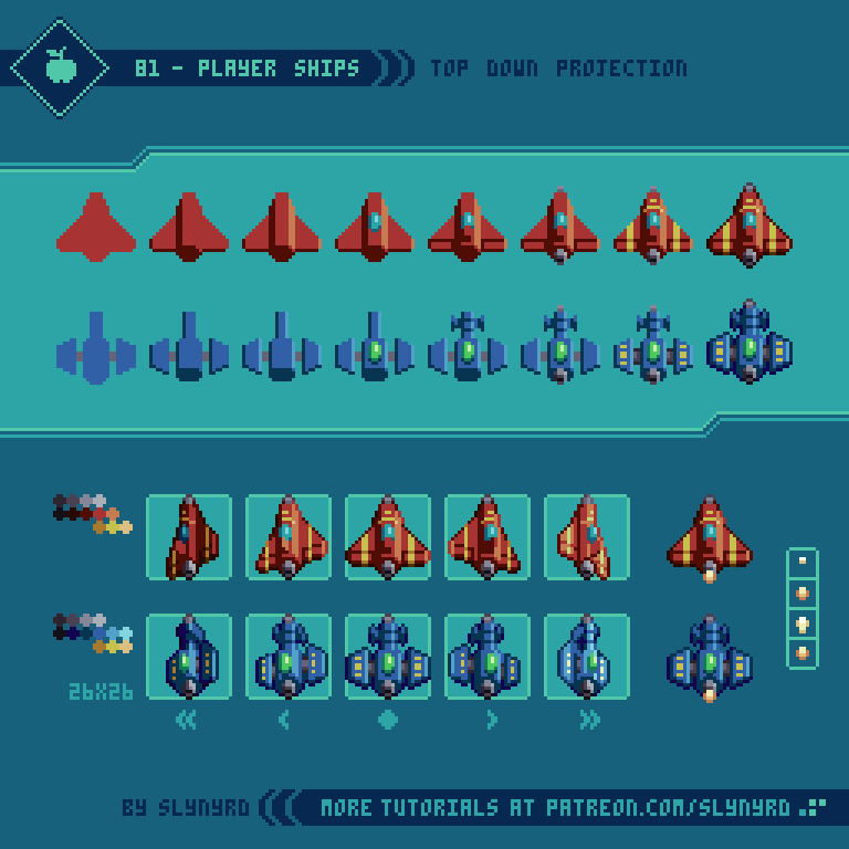
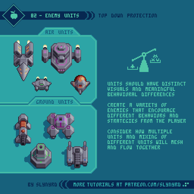
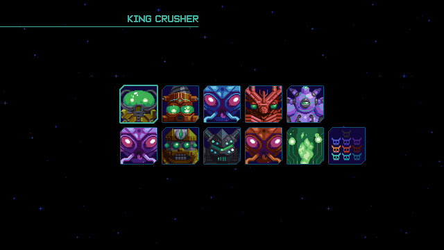
To advance you must do more than survive, you must earn medals by completing 4 specific objectives in each level. Repeated plays are by design, and you should not feel defeated for not completing all objectives when you finish a mission. To break the monotony, each objective emphasizes different strategies, and you should only try to achieve one per run until you get the hang of it, and/or have a power advantage with upgrades. The feel of the level is always changing as you upgrade your ship and wingmens’ abilities, and improve in skill. When you unlock more wingmen you also have that variation to play with.

Our game actually has 4 difficulty tiers for each mission, rookie, ace, veteran, and master. You start on rookie and have to complete all 4 objectives on that setting to unlock the next difficulty. Therefore, easy mode is essentially baked into the experience as the first few missions on rookie. Once you get to the 4th mission things really start to heat up, and you are forced to hone your skills. However, even if you aren’t very good at the game, the upgrade system works as a built in handicap, as you are able to keep any GP you acquire in a level, even if you die or quit mid mission. You should have several missions and difficulty tiers open by this point to allow yourself a variety of meaningful activities as you improve your ship. Moreover, GP need only be gained organically as you make legitimate attempts at clearing level objectives. Therefore, it’s possible to beat the game without true grinding, however, the option to grind is always there.

Extra Modes

Enjoy endless score chasing fun in Survival mode.

Enjoy endless score chasing fun in Survival mode.

Should you fall weary in the mission mode, you can play the procedural survival mode for a refresh, or practice the bosses in boss rush mode. After chasing a score in the chaotic patterns of survival mode for a while you might return to mission mode finding your senses heightened. Getting all the way through a level only to be crushed by a boss? Why not master that boss in boss rush mode before raising the stakes? All the tools are there to allow the player to improve and continue advancing.

Master the bosses in Boss Rush mode to insure victory in the main game, and compete for the best time on the leaderboards.

Master the bosses in Boss Rush mode to insure victory in the main game, and compete for the best time on the leaderboards.

Inclined to give up, or conquer?

I’m somewhat perplexed by how many gamers these days will gleefully cut down trees or kill slimes in some vapid environment for hours on end, but they’re not willing replay a handcrafted 5 minute mission a few times to learn its thoughtful design. I get it. Sometimes you just want to kick back and zone out on some casual gameplay. But personally, I get the most enjoyment out of games that demand skill. I think it’s fun to suck at something and gradually get better. Having this demeanor towards all challenges will increase your chances for success and fulfillment in life. I know it’s a game, but it’s not just a game. We learn a great deal through play. The games we play, and the stories we tell have profound influence on our psychology. No participation trophies here.

Finding our audience

Since challenging skill based gameplay is usually the standard when it comes to shmups, they tend to attract a niche audience of hardcore players. Therefore, we felt secure in emphasizing the challenge as we designed the game. Strangely, we seem to attract an eclectic audience of few hardcore shmup players so far. This may partly be due to the colorful aesthetic. Or, it’s because our name is attracting fans of the game Tyrian, which apparently includes many difficulty modes to allow players to ease into the game. Well, I’m sorry to burst your bubble, but our game is not inspired by Tyrian at all.

Not Tyrian

At the start of development we had never even heard of Tyrian. The origin of our title ‘Thyrian Defenders’ comes from our original fictional universe it takes place in, which we named ‘Thyria’, simply because we really like the sound of the word. Turns out a total coincidence that a really similar word is used for a game title in the same genre. We came aware of this unfortunate coincidence some time ago, but we thought the different spelling and phonetic would be enough to bury the past with an exciting new experience. Also, we figured the association couldn’t hurt, because it’s the same genre, and fans of another vertical shmup would likely enjoy ours. However, we’ve come to understand that Tyrian is a much different game than ours, and approaching our game with false preconceptions seems to hinder the ability to enjoy our game for what it is.

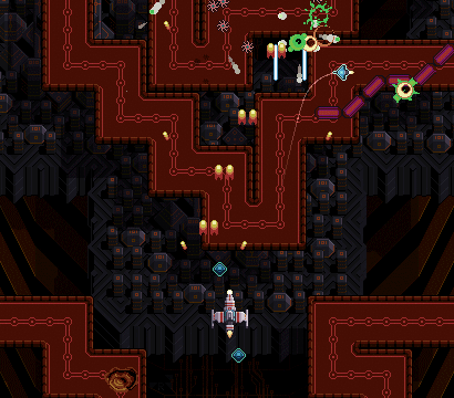
We were actually working on a canceled project before this that takes place in the same universe called ‘Thyria’ and nobody made an association to Tyrian, because it was a different genre(platformer). But now that it’s a vertical scrolling shmup, it’s become obvious we must distance ourselves with a completely different title. By the way, very few people have ever pointed out our true inspirations, as it is definitely not Tyrian. Ever play Skyforce?

Hyper Echelon

The evolution of our name and logos over the years.

After a couple weeks of brainstorming for a new name, we have arrived at ‘Hyper Echelon’. Since we’re going to participate in the Steam Next Fest, we had to notify them of our new name ASAP. So, I hope you like it, as it’s pretty much already official. Well, let me tell you why it’s a good name.

First, the phonetics are pretty, and it feels sufficiently shmupy. What’s more, the meaning is totally appropriate. Basically, it means beyond rank, higher than top class. You’re going to need to ascend into such an echelon if you want to defeat the final boss in this game. Also, we have a lot of tiers in the game such as the difficulty levels, the different star systems, and the rank system that grades your performance. We want to emphasize this aspect of the game, as it very much a game about skill.

We considered synonyms for the word hyper, but found it sounded best phonetically, and had the most spacey feel. Also it appears in several instances through the game. You must get through multiple Hyperspace missions, and destroy the Hyperqueens in order to step up to more advanced star systems.

The meaning doesn’t end there. Echelon can also refer to a flight formation of units stepping off to the back right or left, just like the way the titan and wingmen are arranged! We think that’s really cool since the wingman feature is one of the distinct aspects of the game.

We had become quite attached to Thyrian Defenders over the years, but we’re quite happy with everything entailed in Hyper Echelon. It captures the spirit of the gameplay, and implies a hardcore nature to the game. Hopefully that will speak more to hardcore shmup fans in general, and distance us from the Tyrian nuts. Nothing against Tyrian fans, but you must understand how annoying the constant association is when you’re trying to make your own IP.

It’s always strange to change names, but I’ve settled into it. My only concern is if it sounds lame or silly in some other languages/cultures. Let me know what you all think.

The new logo in pixel form

This is the current iteration of the new logo. I liked the old logo, but the font didn’t seem to fit the new words, both visually and in meaning. We want to emphasize the second word ‘echelon’, while with the old name both words were of similar emphasis, and ‘Thyrian’ was distinguished with the wings. Hence, the total overhaul. I think it’s about there, but I might find a way to make it better yet.

The new logo in vector form

While the old logo was a work of art in itself, it lacked functionality. There were a few too many letters in the title, and the font was very chunky, making it difficult to read at a glance. Especially when scaled down, it became noisy and barely readable. This new logo is instantly readable and is able to remain consistent in all formats. Also, I like the color variation.

It’s strange to get used to a new name, but it had to be done. Hope you’ll grow into it. At the time of writing this, we still haven’t implemented the name change in the game, and on all marketing materials. Please be patient as we phase out the old name across all channels.

Well, we’ve hit about every pitfall out there in this gamedev cycle. Hopefully this name change is the last, but I’m not counting on it. Thanks to everyone who’s supported us on the journey. I believe a game will be released at some point.

-By Raymond Schlitter

Pixelblog - 32 - Shmup Design Part 2 by Raymond Schlitter

Intro

Strap in for another round of space shooting goodness, as I expand on several aspects of shmup design. Building from the designs I created in Pixelblog 31, I will now introduce examples of player shot types, pickups, and environment assets. By the time we reach the end of this lesson we’ll have enough elements to create a full fledged shmup level!

Parallax.gif

Player Shot

If you’re going to shoot em’ up you’re going to need a weapon. The primary shot of the player in shmups is foundational to the overall gameplay and should be developed with care.

85-Player_Shot_Fast.gif

Here I cover 3 conventional types of weapons that are commonly found in the genre.

Vulcan - The most common type of player shot found in shmups is a linear string of bullets, which evolves into a spread shot through some kind of upgrade system. This provides a great balance for all types of players. Usually it starts as an unimpressive but practical pea shooter, and becomes significantly more satisfying as it spreads out.

Laser - A linear beam that widens and becomes more powerful through an upgrade process. The small area of coverage requires precise aim but it makes up for it with sheer power and the ability to shoot through multiple solids. Furthermore, it may be a hard sell for a beginner, but can become the most effective choice once familiarized with the level design. My laser stays on for a duration with brief stoppages between shots. This makes usage a little more strategic, but I would make the off period so brief, as to make auto fire still very effective. A constant beam might provide slightly more power but I predict it would feel a bit noisy to always be on and become exhausting. The interval approach seems more interesting to me.

Homing - The homing shot eliminates the need for precise aim by automatically seeking out the nearest enemies. This advantage makes it a great choice for the beginner who is not yet familiar with the level design. With upgrades these spinning bullets become larger, more powerful, and side pods provide additional bullet streams. In order to keep this from being an overpowered handicap, homing shot deals the least damage of the bunch. While effective against swarms of small enemies its advantage is minimized against large strong enemies and bosses. Furthermore, it makes the beginner instantly feel powerful, but the advantage of homing becomes less significant as the player memorizes the level design.

Key points

Geometry - This describes the flight path and area of effect. The geometry strongly impacts the player’s behavior. For example, your flight path when using homing will differ from when using laser.

Fire rate - Generally, the faster the fire rate the more powerful and satisfying the weapon feels. However, if each bullet deals a great deal of damage, a high fire rate can become overpowered. Also, consider how an extremely fast fire rate creates noise by jamming the screen full of bullets.

Power - The amount of damage dealt should be balanced in relation to geometry and fire rate. For example, homing should be relatively weak, or it will become overpowered and unbalanced due to it’s seeking attribute. On the other hand, the laser needs to be quite powerful for its narrow area of effect to still be useful. Power should also be carefully balanced in relation to fire rate. Generally, a slow fire rate should be compensated with power, and fast fire rate should have the power toned down.

Appearance - This refers to the visual appearance of the projectiles. While mostly cosmetic, the visual style should fit the behavior. For example, an arrow shaped projectile would look awkward as a homing bullet unless it rotated to always point in the direction it moves. Moreover, I chose to make my homing bullets spinning ellipses, which look interesting and lend them selves to omni-directional movement.

Obviously, all these characteristics are interconnected and should be carefully balanced together.

Pickups

Pickups are a staple of most game genres, and have an especially prominent place in shmups.

86-Pickups_Long.gif

Pickups should generate excitement and make the experience more dynamic. To do so they should all have distinct meaning, and a varying range of rarity. This set exhibits many examples of the conventional pickups found in shmups, with a touch of unique character to fit my design aesthetic.

The following describes the above pickups from top to bottom. The specific attributes and quantities are a personal choice. As the developer, you are free to implement ideas in any manner you like.

Power up - P stands for Power up! These are how you turn your pea shooter into a glorious spread shot. Each one you get levels up your shot to a max of 5 levels.

Speed - Boost the speed of your ship. Each one you get adds a speed tier to a max of 3. The tiers can be cycled through, so you can adjust your speed depending on the situation, as speedy movements can be a disadvantage when navigating through tight spaces.

Bomb - Bombs are a special weapon that destroy all surrounding enemies and projectiles. Bomb pickups give you an extra use. You start with one by default and can bank up to 3. One bomb equals use.

Life Token - The classic one up item. A life token gives you an extra ship.

Heart - Completely restores your ship’s armor if you’ve taken damage. It’s common for shmups to strictly have only one hit kills, but I think a life meter system promotes a more dynamic and interesting experience. However, I still think taking damage should be of high consequence. For this project, I’m going with a 3 hit system where most hazards dish out a single hit, but some less common threats could inflict 2 at once, or instant death. I would likely also include a small heart pickup that only replenishes one hit of armor.

Pazul - A fictional resource that fills a shield meter. The more you fill the meter the longer the shield lasts when you use it. As with the heart, I would likely include one or two more sizes of the pickup to make the mechanic more dynamic, and the pickups more exciting to collect.

Key Points

Appearance - In concerns to the visual design, pickups should read well and have a distinct appearance that sets them apart from other sprites, as to not be confused for a hazard. A lively idle animation goes a long way here. There are many simple idle animations you can apply, which can be observed in my examples.

Distribution method - The distribution method must also be considered. For example, it could drop from specific enemies, be given by a special neutral unit, or simply just enter the screen randomly. Try to think of a fun and engaging method that best suits the gameplay.

Movement - With all the action happening in a shmup, just getting a pickup can be an interesting challenge in itself. For example, it could drift side to side as it comes down the screen, bounce off the borders of the playing field in angular patterns, or simply sit in the place it spawns from.

Space Environment

We’ve covered all manner of sprite designs commonly included in shmups, but we’re still missing a huge piece of the puzzle where much of the artistry lives - the environment design.

87-Environment.gif

Here I present a practical approach to environment design with a space scene. The first thing to consider is if, and how you can interact with elements in the background. For example, I want to be able to have enemy ground units and buildings on the nearest background layer that you can destroy. To do so, this ground layer must appear fairly close to your ship but still maintain the illusion that you’re flying over it at a consistent altitude. Some games incorporate a secondary weapon for shooting things on the ground, like a mini bomb that you see dropping to the ground in front of you. This helps preserve the sense of depth, but personally, I find this mechanic tedious. Furthermore, I prefer to have your main stream of bullets collide with both ground units and air units. As long as the background layer with the enemies on it doesn’t appear so far away the collision remains believable. I just imagine there’s an imperceivable degree of auto-targeting going on.

Key Points

Layers/Parallax - It’s key to incorporate multiple layers into the background, so you can apply the magic of parallax scrolling. At minimum, you need at least 2 layers for parallax scrolling, but I think it really comes alive with 3, as in my example. When creating multiple background layers you should consider scale, and how color is used to capture atmospheric perspective.

Foreground - In some scenarios you can also have a foreground layer, such as clouds that pass overhead. However, if you do incorporate a foreground layer, make sure it doesn’t dramatically impede your vision of the play area, or appear like it will collide with you. Generally, I avoid having fully opaque foreground objects, but don’t rule it out. If they are off to the sides and pass by quickly, it could work. The trick is designing the foreground objects so they obviously appear above you and not on the same layer as you. Sorry, I didn’t attempt a foreground in my example.

Tiles - I used tiles to create the ground layers. This is not a technical requirement for pixel art games, it’s simply an efficient way to design environments with few assets. What’s more, tiled designs tend to capture that cozy retro aesthetic that makes pixel art so charming. On the other hand, if the tile design is uninspired it can appear monotonous. If I were to create an entire level with the above concept, I would surely add more variation. I like to combine many small generic tiles with large custom assets, which brings me to the next key.

Landmarks/Visual pacing - An interesting and varied background obviously enhances the aesthetic experience, but it also contributes to the gameplay. The key to winning in shmups is memorization. Furthermore, It’s important to create a memorizable background that doesn’t give you a feeling of deja vu. Just a glance at the background should always help orient the player as to where exactly they are in the level. While it’s possible to memorize a level based purely on enemy patterns, it’s so much more intuitive to also have cues from the background to tell you what’s coming next.

The occasional unique landmark is the best way to create a memorable background. Also, the generic sections can be memorable by mixing up the visual pace. For example, a large chunk of land that fills the entire screen, followed by small scattered islands, a brief section of open space, a large chunk of land running along the right side of the screen, then the left side of the screen… You see what I mean? Don’t just make a homogeneous flow of the distribution of the assets, vary the visual pace.

Final Thoughts

Part 2 of the shmup design series down! I actually wasn’t sure if I would have enough material to make a substantial follow up to Part 1. However, as I created this feature I started to think I might need to go for a part 3 to fully flesh out the project! While I covered many aspects of shmup design, we still have no UI, or bosses… Tell me if I’m forgetting something else meaty. In particular, I feel a UI is needed to bring the whole vision together. Let me know your thoughts in the comments below.

If you’re enjoying this series you’ll certainly get a kick out of my game Thyrian Defenders, due out this spring. Many of the concepts presented here I learned through my experience creating TD. So, if you really want to see what’s possible with my design approach, check it out!

RESOURCES

Was this article helpful? If you find value in my content please consider becoming a Patron. Among many other rewards, Patrons can access resources to compliment my tutorials. But most importantly, you allow me to continue making new content. 

Assets featured in this Pixelblog are available in Space Shooter Assets Pack

Source file used in the making of this Pixelblog is available in Tutorial 86 Source File

Get caught up on all my downloads

If you're not ready to commit to the subscription model of Patreon, make a one-time donation and receive exclusive art and resources. Help continue the content by providing me a living. Thank you! 

-By Raymond Schlitter

Pixelblog - 31 - Shmup Design Part 1 by Raymond Schlitter

Intro

Short for ‘shoot em’ up,’ ‘shmup’ seems to be today’s most common term for this classic video game genre. When I was a kid we just called them shooters, but that term is now associated with the first person variety of shooting stuff. So what’s a shmup all about? Gameplay and visual style varies upon design, but generally I think of a shmup as game where you control a small sprite in a conventional 2D space where you must shoot up hordes of enemies while dodging a multitude of attacks. This simple concept provides a welcome entry point for inexperienced game developers, and a wellspring of potential to the creative mind; the perfect playground for kenetic game design.

Mock_up.png

As I said, shmups come in many flavors, but in this lesson I focus my designs within a consistent style in order to create a feasible well developed game concept. Drawing from my experience developing Thyrian Defenders, I present a vertical scrolling arrangement with a space themed aesthetic. However, the fundamental ideas presented here translates across a wide variety of shmups.

As I have much experience in the shmup department, this will likely span into a multi part series. For this first lesson I’m focusing on sprite design, projectiles, and some basic enemy behaviors.

Support

Before we get started, I’d like to ask for your support. If you think I do a good job and enjoy my content, please consider becoming a patron, or making a donation. Not only does your support help me continue creating content, but it also grants you access to a treasure trove of exclusive materials!

Resolution

If you are intending to create a game with your designs, it’s important to have a resolution/screen size in mind from the outset. Resolution not only effects the aesthetic, but also the gameplay. As far as visuals, the smaller the resolution the blockier the graphics will be, as the pixels will be more noticeable. Nothing wrong with that if you are a pixel lover, what’s more, it takes less time to create small assets. On the other hand, increasing resolution exponentially increases the amount of time it takes to create assets. The pixel art aesthetic is all about reading the intention within the clusters. If the resolution is so high I can’t recognize the pixels, I don’t really see the point of it being pixel art. In regards to the common 16:9 screen ratio, I think the golden range is from 320x180px to 640x360px. For this tutorial, my designs are based on a target screen size of 480x270px.

When it comes to gameplay, the size of the player’s sprite in comparison to the overall screen size is the critical factor. A small character on a large screen will accommodate fast paced gameplay and lots of elements on screen, while a character that fills a large portion of the screen will permit fewer sprites on screen, and less time to anticipate attacks due to the tight space.

Player Ships

With all that considered let’s get started with the player sprite. Depending on the theme of your shmup the player might be a helicopter, a flying robot, or a witch on a broom. I’m keeping things pretty traditional and using space planes, which can operate in space or atmosphere.

81-Player_Ships_P.gif

As I mentioned before, the size of the player’s sprite in relation to the screen is key. If too large it will make you an easy target, but if too small it will be hard to keep track of, and may lack character. Choose what you think will best accommodate the style of gameplay you have in mind.

To bring alive the feeling of flight it’s essential to show some degree of roll when moving side to side. At minimum, one left and right frame in addition to the center frame can get the job done, but I like to have two frames for each side of increasing degree of roll. This makes the animation appear smoother, and allows two different degrees of roll determined by the speed of lateral movement, which is particularly nice if the game supports analog input.

As in my example, a directional light source coming from the side requires unique frames for each side. This gives a realistic feeling of depth, but all sprites and environments in the game must have the same lighting treatment in order to preserve the illusion.

Try to make a distinct, yet simple ship design. The more complex and detailed it is the harder it will be to animate. I like to put some kind of striping on the wings to give it more character, and it helps emphasize the depth of the roll if animated well. Also, thruster animation is a must!

Enemy Units

Now we need some things to shoot. Enemy units make up a large portion of the game design and should be crafted with care. Every unit should bring something new to the experience both in visuals and behavior.

82-Enemy_Units_P.gif

I’ve designed a batch of units that have overall visual consistency to imply they are all part of the same faction, yet they are distinguished in shape and color. These are not intended to be a complete set for a specific level, just some general types that fit the space them and could be plugged in anywhere. If I have a specific environment concept, I would introduce unique units that better fit the theme of the specific stage. In the end, I would also like to have greater variation in size by including several larger units and an occasional miniboss. Furthermore, I consider these as familiar types that can be used throughout the game, which could evolve with subtle iterations to keep things fresh. Such designs make for a good starting point, allowing you to quickly scrap together a variety of sequences and groupings to get a feel for the action.

In terms of behavior, each unit should bring new meaning to the experience by encouraging different strategies from the player. The following are several characteristics to consider with unit design.

Speed - The speed at which the unit itself moves and the speed of its projectiles, if it has them. Fast moving units are often counter balanced with lower HP and meek projectiles, while slow units typically have high HP and greater firepower.

Hit Points - Higher HP enemies are usually isolated instances and will need to stay on screen longer for the player to be able to destroy them, while low HP enemies can make brief appearances and often come in groups. Units that take a single shot to kill I refer to as popcorn. These rarely present much challenge, but bring a greater sense of action to the overall experience.

Size - A wide spectrum of size across the enemy roster keeps things interesting. The bigger it is the more fun it is to kill. However, small enemies are also satisfying to kill when you are greatly outnumbered. Large enemies tend to have high HP and firepower, but slow movement, while small enemies typically have low HP and fast movement.

Geometry - Perhaps the most impactful characteristic is the movement paths of the units and projectiles. Break things down into geometric concepts such as straight lines, zig-zags, loopty loops, s-shapes, spirals, and so on.

Color - Depending on specific game mechanics color can be more or less meaningful. Furthermore, certain colors might signify certain attributes. Special mechanics aside, a wide array of colors keeps things interesting. I stuck to a gray base for my generic examples, but I would probably splash more paint on them depending on how they contrast with a specific environment.

Projectiles

You can’t call it a shoot em’ up if it doesn’t involve a great many projectiles.

83-Projectiles_P.gif

Reading projectiles and making precise evasive maneuvers is the heart of a shmup’s challenge. Therefore, the most important aspect of projectile design is visibility. While it can be fun to befuddle the player within chaos, the projectiles should always be readable across all backgrounds.

To keep things visually stimulating, projectiles should come in a wide variety of shapes, sizes and colors. The following are keys to creating fun and highly visible projectiles.

Color - Usually projectiles are the most vivid objects on the screen. Use bright saturated colors to set them apart from the background. Same as with enemy units, color might signify meaning depending on special mechanics. Regardless, I like to match the projectile color with the unit color.

Size - The bigger it is the easier it is to see, but the more space it takes up on screen. At a certain point large projectiles look goofy and ruin the overall aesthetic. On the other hand, super small projectiles tend to get lost in the action are less impressive. Include a wide variety of sizes for interest. Generally, the bigger it is the more damage it causes.

Shape - Unique shapes can help projectiles stand out, and provide more visual interest than simple balls.

Outlines - In order to keep projectiles readable on top of all backgrounds, outlines are almost certainly necessary. For insurance, I sometimes use a double outline made of a bright and dark color. Since I don’t intend to have swathes of white or super bright areas in the background, I often use white outlines. This also, sets them apart from all other sprites, which use dark outlines.

Flashing Effect - This not only improves visibility, but also make the projectile feel alive and dangerous. Simply alternating between two frames gets the job done. The more the frames contrast the more intense the effect. However, too much contrast can make it harder to track when it’s moving quickly. Experiment with many colors and sequences.

Rotation/Motion - Subtle expansion and contraction can be applied to any shape for a pulsing effect. Rotation can be applied to shapes like stars, squares, and oblong ovals. You can also try to make them appear to spin on the z axis for a 3D effect.

Explosions

With all this shooting things are bound to go kaboom!

84-Explosions.gif

This explosion is designed for a top down projection, but can also work in the side view. Its symmetrical expansion is best suited for aerial units, but doesn’t look too shabby on the ground units either.

I like to start with circles that expand into thin rings, which allows me to easily establish the overall size and expansion rate. I also like to incorporate the dominant colors in this first step. Once I have my circle guide I convert it into organic fiery blobs. Some trial and error will be required for polished motion within the clusters, but as long as you adhere to the circle guide the overall expression will be preserved. The following are some key tips.

Start by making circles that become thinner rings as they expand.

Hot air expands quickly and slows as it cools. Therefore, the explosion expands rapidly at first, and slows significantly before it dissipates.

The color starts white hot and fades to warm hues, then to gray as it dissipates into smoke.

The blobs start as consistent shapes and become more numerous and complex with expansion, as the darker areas encroach into them.

Once the blobs reach max expansion they slowly rise and dissipate into smoke.

The rings from the guide can be converted into a shockwave effect with minor modification.

Final Thoughts

I’ve learned a great deal from developing Hyper Echelon over the past several years, and I’m excited to pass on the knowledge in the hope to inspire many more awesome shmups. The concepts described in this tutorial should provide a solid base to begin designing a shmup on, but there’s a lot more I’d love to cover. Bosses, environments, and power ups are just a few more huge aspects to the game design. I feel a sequel coming!

RESOURCES

Was this article helpful? If you find value in my content please consider becoming a Patron. Among many other rewards, Patrons can access resources to compliment my tutorials. But most importantly, you allow me to continue making new content. 

Assets featured in this Pixelblog are available in Space Shooter Assets Pack

Source file used in the making of this Pixelblog is available in Tutorial 83 Source File

Get caught up on all my downloads

If you're not ready to commit to the subscription model of Patreon, make a one-time donation and receive exclusive art and resources. Help continue the content by providing me a living. Thank you! 

-By Raymond Schlitter


Pixelblog - 30 - Food by Raymond Schlitter

Title_Animation.gif

Intro

Burgers, tacos, sushi, pasta - we’ve got it all in the pixel cafeteria! Welcome to another exciting edition of the Pixelblog. In this scrumptious episode I present a wide variety of popular foods and even show a step by step process for creating an original restaurant design. Can’t say I’ve illustrated much food in my days, and even less in the pixel form. Well, I’ve been missing out. Capturing just the right colors and forms not only stimulates the eyes, it incites hunger. You know you got it nailed when you start salivating. Bon appetit!

Food Sprites

To start things off I created a variety of food sprites. As an American, I focused mostly on western food styles, although many dishes originate from countries around the world. In the end, I chose foods that are easily recognizable and I personally enjoy. However, many of these choices do not reflect my typical diet, as I strive to remain thin and healthy.

78-Food_Sprites_2.png

All sprites are roughly within 32x32px. I’ve always admired the exquisite life-like food illustrations in Japanese anime. Furthermore, I tried to channel some of that vibrant realism into my sprites. I used photo references and sampled colors directly from the photos. However, I maintained limited colors and tried to reuse many of the same colors across all items for a consistent pixel art aesthetic. Also, I decided to go with outlines to keep them relatively cartoony and pop off the screen. I’m afraid excessive colors and no outlines would result in them simply looking like down scaled photos.

Ramen

For a step by step tutorial I chose Japanese style ramen, as it’s a fun process to fill up the bowl with ingredients, and the many variations of the dish promote creative exploration. My final sprite is roughly 48x48px.

79-Ramen.gif

For this version I kept it pretty simple with a spicy miso broth, topped with seaweed, bamboo shoots, egg, pork cutlet, bean sprouts, and green onion. Ramen sometimes, includes corn, wakame, kim-chi, narutomaki, and many other ingredients are possible. Have fun creating your favorite recipe!

Restaurant

It’s hard to find a healthy meal when eating out in the United States, especially when it comes to fast food. However, I’ve always enjoyed the dining experience and appreciate the design of restaurants, from the architecture to interior decor. American fast food restaurants in particular have charming designs that are actually very well thought out to be instantly recognizable, maximize appeal, and communicate the style of food. Is there a more iconic symbol than the golden arches? It’s like a beacon to your stomach that says, fat, salt, sodium.

80-Restaurant_2.gif

I felt it was time to return to my classic design approach using simple geometry for this tutorial. I borrowed colors from my food sprites with a few additions and tweaks for the color palette. My fictional fast food restaurant is appropriately called FAT’S. Maybe not the place you want to be seen eating often, but they have a fine selection of burgers and sandwiches. Kind of like Arby’s but with killer burgers instead of the roast beef sandwiches. If you’re ashamed to dine in we also have a drive through.

I stuck to a simple building here, but it would be a lot of fun to flesh out the concept with a more detailed logo/sign, interior design, staff uniforms, and menu items. Hopefully, I inspire some to take their design further.

FINAL THOUGHTS

Drawing food is very relaxing and just what I needed at this time. The only problem is you literally get hungry staring at virtual food for hours. If you’re not getting hungry your illustration must not be effective. It’s not all fun and games though. Food is fuel for life, and a major part of all cultures. Food has appeared in art throughout the ages, bringing greater context, and a human quality we can all relate to. In the context of video games, food has a prominent place, often used as a mechanic to recharge the player’s health. Many games solely focus on preparing and serving food, establishing an entire genre in itself. Therefore, it is well worth learning how to illustrate.

RESOURCES

Was this article helpful? If you find value in my content please consider becoming a Patreon member. Among many other rewards, Patreon members can access resources to compliment my tutorials. But most importantly, you allow me to continue making new content. 

Assets featured in this Pixelblog are available in Items Assets Pack.

Source file used in the making of this Pixelblog is available in Tutorial 79 Source File

Get caught up on all my downloads

If you're not ready to commit to the subscription model of Patreon, make a one-time donation and receive exclusive art and resources. Help continue the content by providing me a living. Thank you! 

-By Raymond Schlitter

Pixelblog - 29 - Anime Faces and Hair by Raymond Schlitter

Intro

With Japan’s prolific export of creative media over the decades, anime aesthetics have become commonplace all around the world. Considering the seminal contributions made by Japan in the gaming industry, it should be no surprise to find anime influence especially prevalent within video games. Needless to say, these charming doll faces with sparkling eyes are no stranger to the pixel form. Despite this prevalence, pixel art is not very conducive to capturing the fine line work of hand drawn anime. Like any pixel art translation, It requires careful analysis, simplification through abstraction, and precise pixel placement. But no worries, in this lesson I clearly break down each facial feature one at a time with guidelines for placement and proportions. Further allowing one to ease into the subject, this lesson focuses only on faces and hair, presented with neutral expressions and mechanical viewpoints.

Like any pixel art translation, It requires careful analysis, simplification through abstraction, and precise pixel placement.
Title_Image.png

While there are a diverse range of styles within the anime aesthetic, they are all unified by some common characteristics. I would say the most notable feature is big brilliant eyes, followed closely by the wild shiny hairdos that can be any color. Anime characters can appear quite outlandish, but it’s all inspired by real life. Ultimately, the aesthetic is an idealization of reality to effectively illicit emotion from pure form. What I present here is a general form based upon my studies and personal pixel inclinations.

Ultimately, the aesthetic is an idealization of reality to effectively illicit emotion from pure form.

Front View

First, let’s start with the straight on front view to get a clear sense of the proportioning and placement of the features.

75-Portrait_2.gif

Think of seeing a face through a subtle fisheye lens. Big eyes, little pouty lips, and an almost non existent nose mark the common traits here. Some features are exaggerated and some are subdued, but positioning of features follows accurate anatomy.

Think of seeing a face through a subtle fisheye lens.

Side View

Now let’s round the corner and look at that profile.

76-Anime-face_Side_view.gif

The nose is much more prominent from the side view, but the high and long types are less traditional, than the little swooped button noses which is natural considering the origins of anime. The features presented in the chart are supposed to mirror the features from the front view tutorial, however, there combination examples vary.

Hair

Bout time we get some lettuce on those shiners.

77-Anime_Hair.gif

As I mentioned in the intro, hair is one of the top defining characteristics to an anime personality. This is a trade off for downplaying the mouth and facial movement, but it’s also just a clever way to easily distinguish characters. I like to imagine flow lines of the main locks, which usually stem from a cowlick towards the back of the head. Then I blob in the hair with a single color. Next I refine the shape as I work in shadows, and highlights to finish.

hair is one of the top defining characteristics to an anime personality

FINAL THOUGHTS

Anime was just starting to boom in the west when I was a young boy. I spent many allowance bucks on VHS tapes at the music shop in the mall. When I first got into it there was only a single row of tapes on a shelf to choose from, but only a few years later anime had its own dedicated aisle. I’d like to think me and my brother’s avid patronage was the main stimulus for the boom. Obviously, I grew up with the stuff and once even dreamed of creating my own anime. I’m excited to bring this style into my pixel toolbelt and intend to expand on the topic in upcoming features.

RESOURCES

Was this article helpful? If you find value in my content please consider becoming a Patreon member. Among many other rewards, Patreon members can access resources to compliment my tutorials. But most importantly, you allow me to continue making new content. 

Assets featured in this Pixelblog are available in Anime Faces and Hair Asset Pack

Source files used in the making of this Pixelblog are available in Anime Faces and Hair Source Files

Get caught up on all my downloads

If you're not ready to commit to the subscription model of Patreon, make a one-time donation and receive exclusive art and resources. Help continue the content by providing me a living. Thank you! 

-By Raymond Schlitter

Pixelblog - 28 - Side View Tiles by Raymond Schlitter

Intro

Even with the unlimited potential of technology these days, tile based graphics remain a powerful and efficient way to create game worlds. If you are new to making tiles I suggest reviewing Pixelblog 20, in which I introduced the fundamentals of tile making with top down tiles, and how to best make them with specific software. In this lesson I will guide you through tile creation in the most common projection used in 2D games - the side view.

Title_Image_2.png

From the foreground to multiple background layers, in the following tutorials I present a variety of tiles for creating a complete environment.

SLY16

Due to the limitations of consoles like the Megadrive, 16 color palettes really hit a sweat spot with pixel art aesthetics. While I’ve made several specific palettes within this range, Sly16 checks all corners of the color wheel. The mindset was to create a retro-inspired limited palette you can create entire game worlds with. To put it to the test, I created everything in this feature with it. To my surprise I never really felt a need for more colors, and the limitation actually frees me from excessive deliberation with color choice.

Sly_16.png

I started by plucking colors from my Mondo palette then refined with testing, and the inspiration of other palettes. I’m always open to future revisions, but I’m quite happy with the current state of the palette. Patrons can download Sly16.

Basic Ground Set

As with my previous tile lesson, I’m using 16x16px tiles. This is one of the most common tile sizes for pixel art games, as it is small enough to work efficiently with but still packs enough pixels for a surprising amount of detail. Also, it’s always a safe bet to work with a size that is a power of 2, as these values have the most consistent multiples, making it easier to create balanced textures. Ultimately, you can make tiles any size you want. They don’t even have to be square, but why complicate things? The basic guidelines I suggest are that your tiles are an even number and square. It all depends on the look you are going for. 

72-Rocky_Grass_Tiles.gif

I start with very basic color blocking to capture the most prominent fields of color and define the orientation of the tiles. It is in this first step where I establish a region on the outer face of the tile that appears to tilt towards the background. For example, on the ground tiles with grass, it appears you are seeing part of the grass from the top, like a 3/4 tilt. Furthermore, the corner tiles tilt on the two outer sides, appearing like a cabinet projection. Creating tilted edges like this is critical to achieving depth.

In the rough clustering phase I blend the clusters into the color fields to imply the general textures and begin to smooth out the color transitions.

In the fine details phase I add highlights, push the shading, and refine the clusters to be more descriptive. However, I still like there to be some good chunky clusters in there. Too much detail can end up looking blurry, or noisy.

You can see the grass would have an abrupt flat top if not for the extra grass and plant tiles. The player would walk on top the ground tile and overlap the grass tiles, making it appear like he’s really a part of the environment. This shows how you can add varied edging to your tiles while preserving clean collision bounds.

Platforms and support tiles

level design possibilities are greatly opened with the ability to place a stand alone platform anywhere on screen. However, my rational nature makes it hard to accept floating platforms without some kind of logical explanation, like it’s imbued with magic or hover technology. These explanations are acceptable to me for moving platforms, but for static platforms I usually go out of my way to visualize a logical support structure for platforms.

73-Platforms_Support.gif

The support tiles are designed to look like they are in the immediate background so it’s obvious you can pass in front of them but close enough they appear to be connected to the platforms. Besides providing a logical support structure to platforms, these tiles also add an interesting background layer, which can also be used purely for visual interest without platforms attached.

Background Tiles

Of course, the goal with the background is to create depth, but also to further contextualize the environment without compromising the readability of the foreground. Moreover, I like to make several simple background layers, and let the sum of the parts create visual richness, rather than having only one or two very detailed background layers. The more layers you have the more depth you can achieve from parallax scrolling, but just a few is usually enough for convincing depth.

74-Background_Tiles.gif

Overlap and the use of subtle outlines allow me to get a lot out of my 16 color limit. Had I used I larger palette I could push for more detail and even more layers in the BG to capture a more realistic sense of atmospheric perspective. However, I’m pleased with the depth I’ve achieved with limited colors, and quite like to colorful retro look. Put it in motion with parallax scrolling and you’ll really sink into the image.

You can see my clouds bleed into the background in places but there is always enough information to imply the shape of the clouds. I would definitely avoid color bleed on sprites and things you interact with, but it is acceptable with passive background elements so long as the object remains readable.

KEY POINTS

These are mostly the same points I describe in my top down tiles lesson with a few new tips relevant to side view tiles.

Balance - Strive to achieve a homogenous distribution of visual weight within a tile. If any area of the tile has a visual dominance the pattern will become too obvious. Include clusters that overlap the edges and loop around the tile to help hide the seems.

Consistency - Define key clusters and shapes and repeat them in several cases to create a pleasing consistency. Avoid touching key clusters with other key clusters, as they clump into different irregular clusters and create noise. Touching corner to corner is okay.

Limit colors - You only need a few colors to make a rich texture. Too many colors and the texture will become blurry. Also, strong contrasting colors in the case of a texture pattern may result in displeasing noise.

Contrast - Consider contrast when combining different textures in the same environment. A busy texture next to another busy texture may exhaust the eyes with too much noise. Negative space is your friend.

Reflect - Often tiles can simply be mirrored to create tiles of different orientation. This saves time, and the symmetry creates a pleasing consistent look. However, this will only work if you have a symmetrical light source, or ambiguous omni lighting. In may example, light is always coming from directly above, making it possible to mirror right and left side tiles.

Resolution - You can make tiles any size you want, but the larger the more laborious. Anything over 32x32px seems like overkill for pixel art. 16x16px is probably the most common size and is sure to do your pixels justice.

Variants - Variant tiles of the same use add interest and reduce repetition. A well designed tile set shouldn’t need a lot of variants, but at least one variant of tiles that are often strung together in repetition will suffice. For example, my clouds have two different middle bottom tiles that I mix up to keep it looking organic.

FINAL THOUGHTS

Building off my experience from creating the top down tile series, I found the process to go quite smoothly. Also, I have worked with side view tiles in the past for a couple of game dev projects, and I’ve become more proficient with using Pyxel Edit, a pixel editor focused on tile creation. Check out Pixelblog 20 to learn more about it.

Making tiles can feel very tedious at the start, but once you have enough tiles to start making something they become a powerful and fast way to create large environments with relatively few assets. Once you feel that power it becomes addictive and you just want to keep building the world. I’d love to expand on this concept in following lessons much like the top-down series. Characters, animations, items, ui, different environments; let me know what subject you are most interested in learning.

Title_Image.png

RESOURCES

Was this article helpful? If you find value in my content please consider becoming a Patreon member. Among many other rewards, Patreon members can access resources to compliment my tutorials. But most importantly, you allow me to continue making new content. 

Assets featured in this Pixelblog are available in Side View Rocky Grass Tiles Pack

Get the original palette used in this lesson- Sly 16

Source files used in the making of this Pixelblog are available in Side View Tiles Source Files

Get caught up on all my downloads

If you're not ready to commit to the subscription model of Patreon, make a one-time donation and receive exclusive art and resources. Help continue the content by providing me a living. Thank you! 

-By Raymond Schlitter

Pixelblog - 27 - Under the Sea by Raymond Schlitter

Intro

At a fundamental level, visual art is observation and interpretation of the natural world we live in. Therefore, in order to become a well rounded artist, it’s imperative to keenly study the many realms of nature and depict what you see. No matter how strong your sense of imagination is, frequent natural studies will prove to sharpen your vision. What’s more, you will develop a deeper understanding of the objects you depict. After all, anything imagined must have a source of inspiration in the real world.

Title_Image.png

In a constant quest to strengthen artistic vision and broaden visual vocabulary, I’ve covered several natural studies in previous lessons, such as plant life, and rock formations. In this lesson I dive into one of the most beautiful and mysterious environments on the planet - the ocean! Broad and diverse the world of the ocean is, for it can’t be covered in one lesson. Moreover, for this lesson, I focus on corals and algae. Also, as a bonus I included a submarine tutorial, so we have a watercraft to explore this wonderful world in.

Coral

One of the most unique lifeforms in the ocean, corals come in many forms. Sometimes appearing as rocks, or plants, corals are in fact animals. Actually, a single coral is made up of thousands of tiny animals called polyps. Wow!

69-Corals_P.png

As you can see there are two main kinds of corals, hard and soft. Hard corals are made of calcium carbonate, and the polyps create an exoskeleton, making them hard as rock. Hard corals grow in colonies, eventually forming coral reefs. Hard corals commonly come in yellows and rust colors.

Soft corals are also made of calcium carbonate, but with a blend of protein, which makes them less rigid. Although rooted, a lack of an exoskeleton allows soft corals to sway back and forth. Soft corals come in a wide range of vivid colors.

ALGAE

Commonly referred to as seaweeds, algae make up most of the plant life in the ocean. As a fan of Japanese cuisine I was already familiar with a few species, but I was surprised to discover there is an extensive list of known species, and they exhibit great diversity in appearance.

70-Algae_P.png

Although they may be called seaweeds, algae are not plants. Algae use chlorophyll for photosynthesis and have plant-like cell walls, however, they do not produce seeds or flowers like plants do.

At the basic level, algae are classified as 3 main types; brown, red, and green.

Brown algae is the most prevalent, and touts the largest species. Seaweeds known as kelp are brown algae.

Red algae get their red color from a pigment called phycoerythrin. The ability to absorb blue light allows red algae to live at greater depths than either brown or green algae. A sub group of red algae called Coralline algae contain calcareous deposits, which makes them hard like corals. Pink Plates is an example of Coralline algae.

Green algae is the least common but there are still more than 4000 species on the planet. These algae come in three forms: unicellular, colonial, or multicellular. However, the diversity among green algae is not as great as among red and brown algae, with most species appearing like some kind of sea lettuce.

Submarine

While it’s not really in line with the topic of natural studies, it’s equally important to study man made objects. The value comes from observation. However, I find natural subjects to be more insightful and inspiring. Anyway, figured we needed a watercraft for this underwater adventure.

71-Sub_P.gif

After studying several different subs, I came up with this general design, which exhibits the main parts needed for proper operation. The hull is a pressurized container that makes up the main interior space where the crew operates from. The conning tower is a raised platform on top the ship from which the ship can be operated when on the surface, and contains the periscope. The rudders control the direction of the ship. Vertical rudders control the yaw, or left and right movement, while the horizontal rudders allow the vessel to dive and ascend. Obviously, both are necessary. Finally, the propeller provides propulsion. As long as you have these basic components, it should be a convincing sub design. Play around with different shapes, dimensions, and colors!

FINAL THOUGHTS

Growing up as land locked as it gets in Kansas, I’ve always thought of the ocean as an exotic and majestic realm. The first time I went to a large aquarium in Tokyo I was blown away by the lifeforms on display, and infinitely inspired. Although I had been to the ocean before and had a basic education on marine life, it was like discovering a whole new world. With this lesson I decided to start with the basic life forms, but there is so much more to explore. I’m sure I will revisit underwater environments, and cover different kinds of sea life in the future.

RESOURCES

Was this article helpful? If you find value in my content please consider becoming a Patreon member. Among many other rewards, Pixel Insider members get extra resources to compliment my tutorials. But most importantly, you allow me to continue making new content. 

Assets featured in this Pixelblog are available in Under the Sea Assets Pack

Source file used in the making of this Pixeblog is available in Tutorial 71 Source File

Get caught up on all my downloads

If you're not ready to commit to the subscription model of Patreon, make a one-time donation and receive exclusive art and resources. Help continue the content by providing me a living. Thank you! 

-By Raymond Schlitter

Pixelblog - 26 - UX/UI Design Basics by Raymond Schlitter

Intro

Imagine a game with beautiful graphics and tight controls, but the text is barely readable, the icons don’t make sense, and many useful features are buried in clunky menus. Doesn’t sound so fun, does it? Obviously, the quality of the user interface can make or break a game. Therefore, If you want to make games, you will need to have UX/UI design skills. So what’s this jargon all about? In the first part of the lesson I explain the terms and what they focus on. After the basics we get into designing UI assets that commonly appear in games.

UX vs UI Design

UX refers to user experience and UI is the user interface. I’m sure most of you are familiar with these terms, but there seems to be a lot of confusion about the difference between the two. Well, here’s the way I see it.

66-UX_UI.gif

UX - User experience involves the feel of the design determined by how the user interacts with the visuals. Furthermore, UX design focuses on the feel of the design and the user’s overall experience with it. For example, how easy is it to save your game, change your gear, disable audio, and accomplish various desired tasks? These are some of the concerns of UX design.

Design goals of UX design
• Intuitive and easy to use - The user can smoothly navigate the interface without thinking.
• Interaction feels satisfying - The experience gives you the right thing at the right time.
• Fast and responsive - Smooth, prompt functionality keeps the user from disengaging the habit.

UI - User interface is all the actual visual assets the user interacts with, for example, gauges, fonts, icons, and menus. UI design is the practice of creating these assets and incorporating them into the interface in a manner that is intuitive and smoothly guides the user through the experience.

Design goals of UI design
• Consistent visual language - Color, shape, size, fonts, and positioning of all UI elements should follow consistent rules to bring order and distinct character to your game.
• Aesthetics fit the game concept - Visual style matches the mood of game and the means of implementation intuitively informs gameplay.
•Highly readable, not distracting - Graphically reads well in all situations but does not hinder gameplay and engagement.

As you can see, these disciplines overlap and are both necessary for a successful design. Unreadable text and awkward button placement are examples of bad UI that consequently makes for a bad UX. Conversely, no matter how beautiful the UI looks, it won’t make up for bad UX, such as long loading times and overly complicated menu trees.

PLayer Health

Representation of the player’s health status is one of the most common ui assets. Here’s a look at some general styles and how to make them unique to your game.

67-Player_Health_Long.gif

Every style has pros and cons. Use a style that is most intuitive for the gameplay. Large unique shapes like hearts are graphically charming, but lack technical accuracy, and take up quite a bit of space on screen. On the other hand, numbers are very accurate, but hard to read in the heat of the moment.

Iterate the design to create something unique that visually and conceptually fits your game. This can be done by manipulating basic design elements such as color, shape, and orientation. Some games go beyond basic shapes and use more conceptual representations of player health. For example, in Doom you see the character’s face turn more bruised and bloody as the health percentage drops. In Aladdin for the Sega Mega Drive the player health is represented by the amount of smoke coming from a genie lamp. I always appreciate creative ideas like this, but you must be careful the gauge is still readable.

Player heath is usually the most important status to keep your eye on. Therefore, It should always be readable but never distracting to gameplay and the user’s engagement in the experience.

Common Resources

Beyond player health there are several resources you often see used in games. Let’s explore some common resources to help inspire your game UI!

68-Common_Resources_P.gif

However you choose to represent your mechanics in the UI, make sure to follow the aforementioned design goals and make sure everything is consistent. For example, it would be odd to mix different styles of gauges in the same UI, like vertical and horizontal styles. However, in the case of unique mechanics it can be intuitive to represent them in all in a unique manner.

As for animating your UI, remember function comes first. Although these animations look neat, they could be distracting. If you are directly controlling a character you can see on screen, strong feedback is usually displayed over the actual sprite, and a funky UI could actually distract from where you’re supposed to be focusing. But, you’d have to really push it, and any life you can give the UI with animation is generally welcome.

FINAL THOUGHTS

UX/UI design may not seem like the most exciting aspect of making a game but it’s surprisingly fun! While it can be tedious to create an effective and consistent UI, it’s extremely satisfying to see it functioning properly. Much of a game’s character and professional polish shines through in the UI. Therefore, it’s important to treat the UI with just as much passion as the gameplay, character animations, or any other aspect of the game.

There’s much more to be covered on UX and UI. I hope to continue this topic in an upcoming Pixelblog!

RESOURCES

Was this article helpful? If you find value in my content please consider becoming a Patreon member. Among many other rewards, Pixel Insider members get extra resources to compliment my tutorials. But most importantly, you allow me to continue making new content. 

Assets featured in this Pixelblog are available in UX/UI Assets Pack

Source file used in the making of this Pixelblog is available in Tutorial 68 Source File

Get caught up on all my downloads

If you're not ready to commit to the subscription model of Patreon, make a one-time donation and receive exclusive art and resources. Help continue the content by providing me a living. Thank you! 

-By Raymond Schlitter